How Blue Became a Symbol of Luxury
Can a Single Colour Define a Brand?
For Tiffany & Co., the answer is a resounding yes.
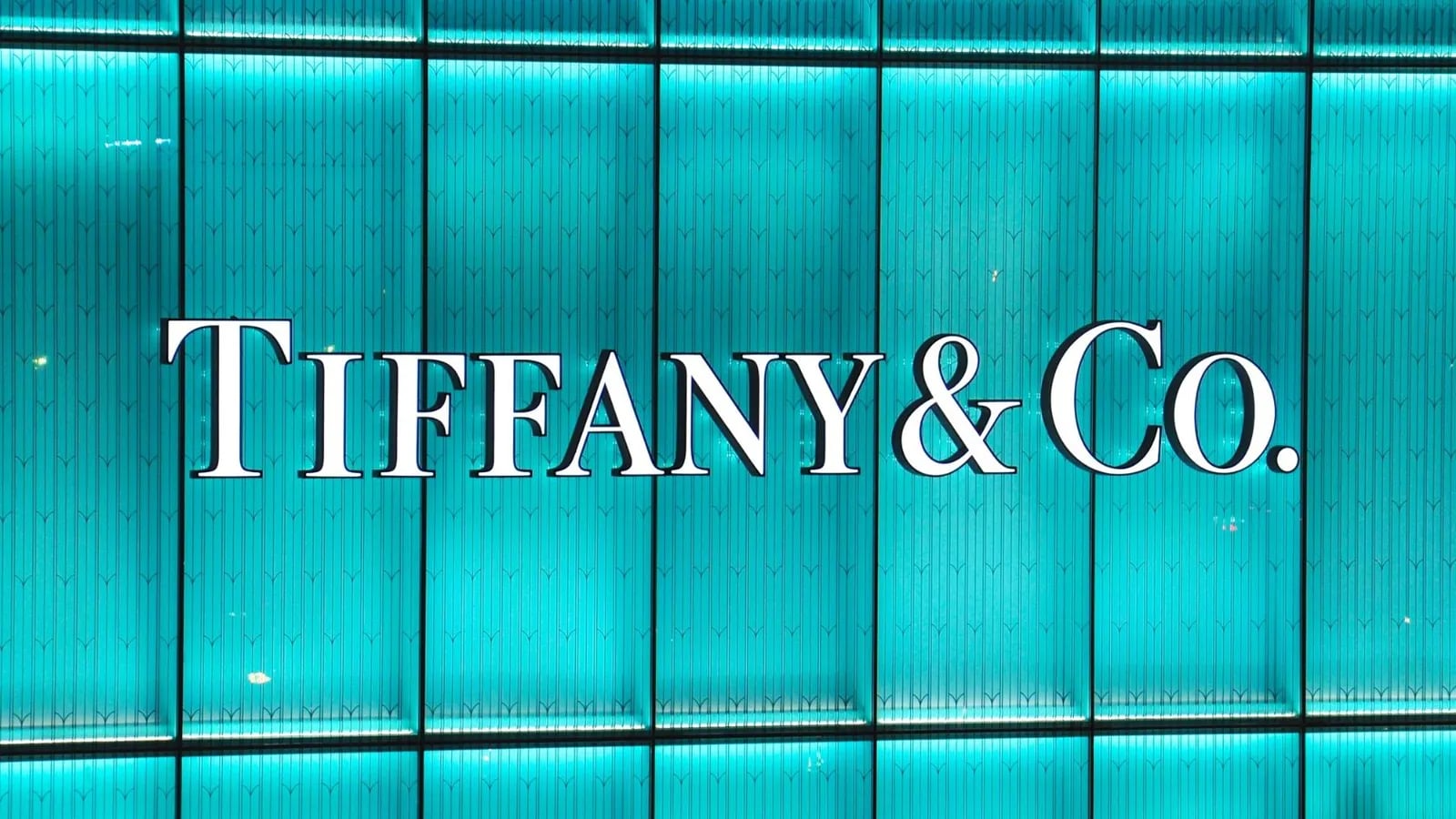
Since 1845, their iconic "Tiffany Blue" has been synonymous with luxury and sophistication. One glance at that blue box, and you know exactly what it stands for, timeless elegance, premium craftsmanship, and the anticipation of something extraordinary.
The Story
When Tiffany & Co. introduced their first catalogue in 1845, they chose a specific shade of blue for the cover. Over time, that colour became more than a hue, it became a representation of exclusivity and luxury.
Today, "Tiffany Blue" is a trademarked colour. No other brand can use it.
The power of that blue box goes beyond packaging. It created a sense of anticipation and desire. Customers don't just buy jewellery, they buy into the experience.
Why Colour Is a Brand Asset
Colour is one of the most powerful and underutilised tools in branding. Research shows that colour increases brand recognition by up to 80%. When you own a colour, truly own it through consistent, long-term use, it becomes a shortcut in the customer's mind.
Tiffany Blue doesn't need a logo. It doesn't need a tagline. It just needs to be seen.
The Lesson
A distinctive brand element, like a colour, can become one of your strongest assets.
- Is there a visual element in your brand that could become iconic?
- What unique aspect of your branding immediately tells people who you are, without words?
- How can you create consistency that makes your brand instantly recognisable?
Build recognition, loyalty, and emotional connection through consistent visual identity, and it will compound for generations.
Your first strategy conversation is on us.
Have a chatThe brand for business.