
Naked Accounting: a brand built on plain, honest numbers
- Client
- Naked Accounting
- Industry
- Finance, Accounting & Legal
- What we did
- Brand strategy, Visual identity, Website design, Photography
Accounting has a reputation for jargon and complexity. Many clients feel lost and disconnected from their own numbers.
Naked Accounting set out to be the opposite: plain, honest and easy to deal with.
The short version
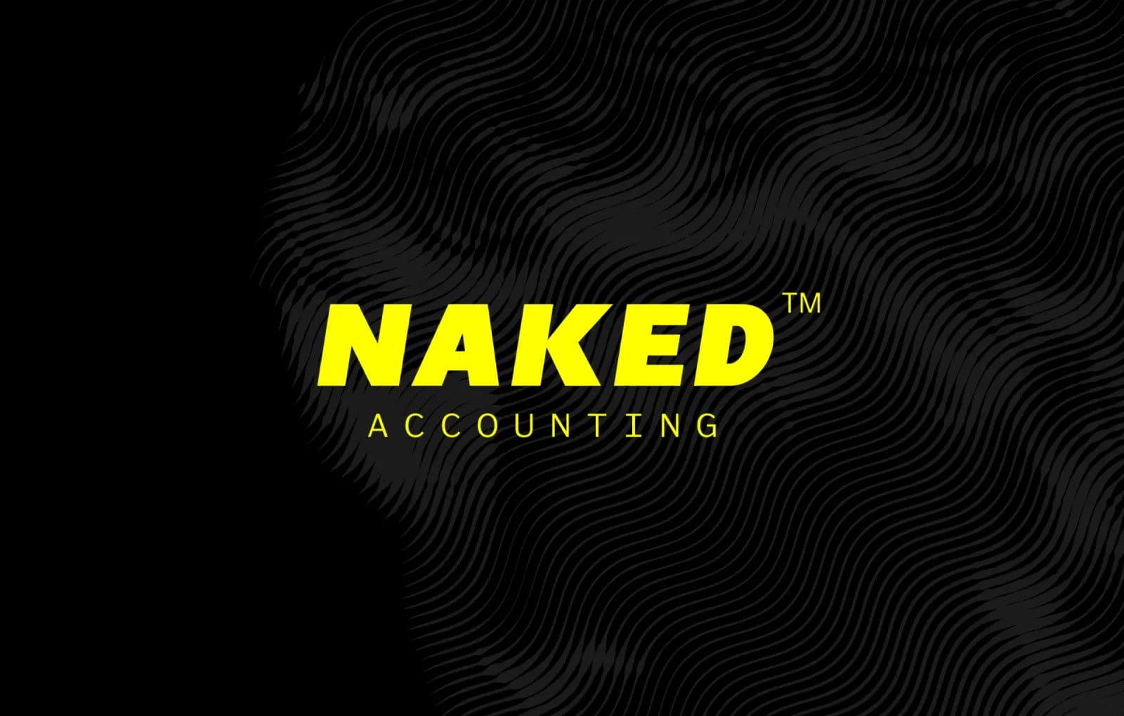
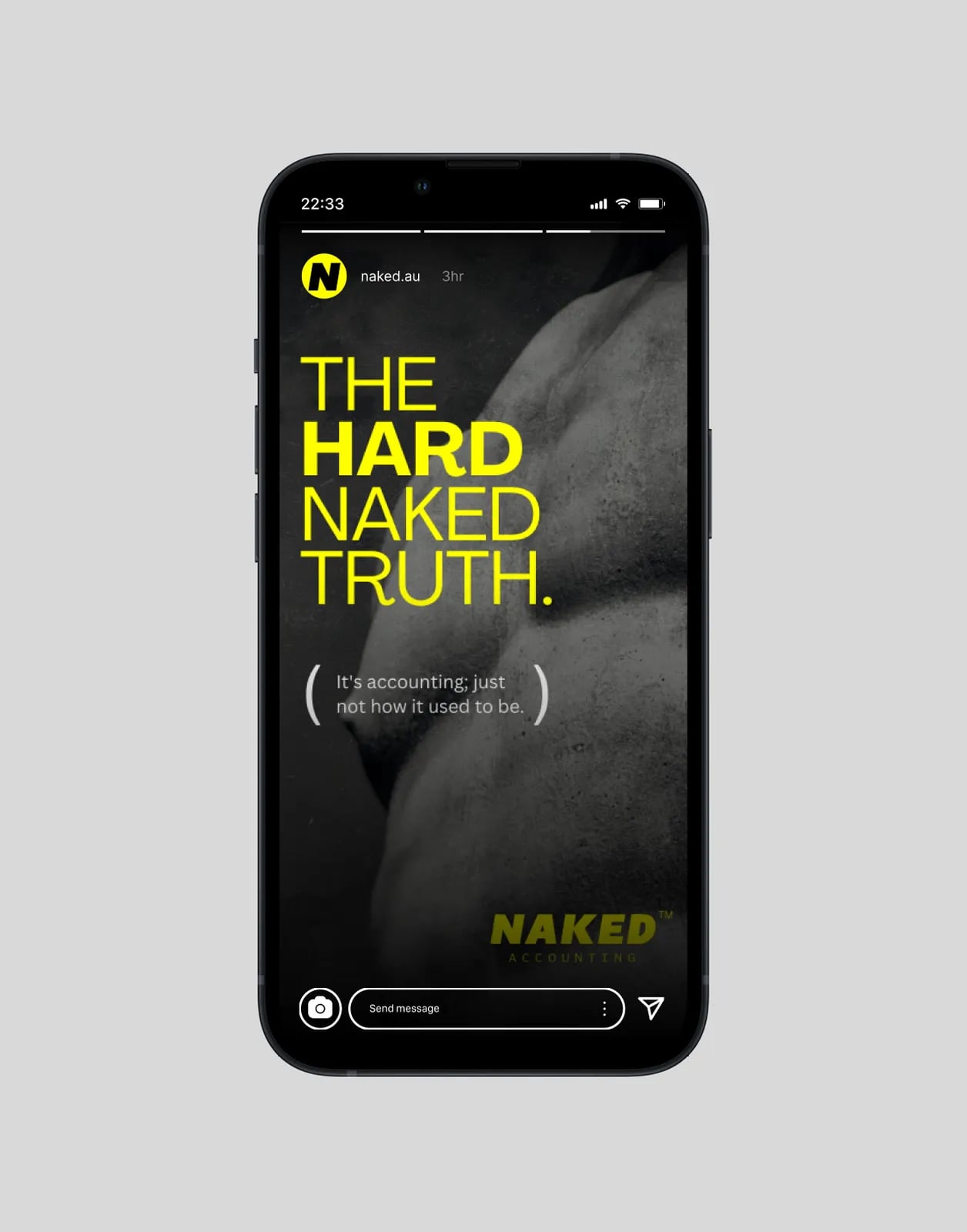
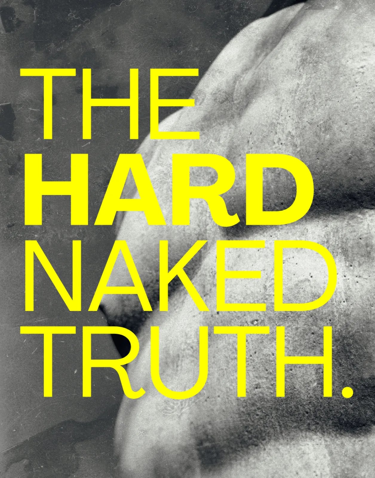
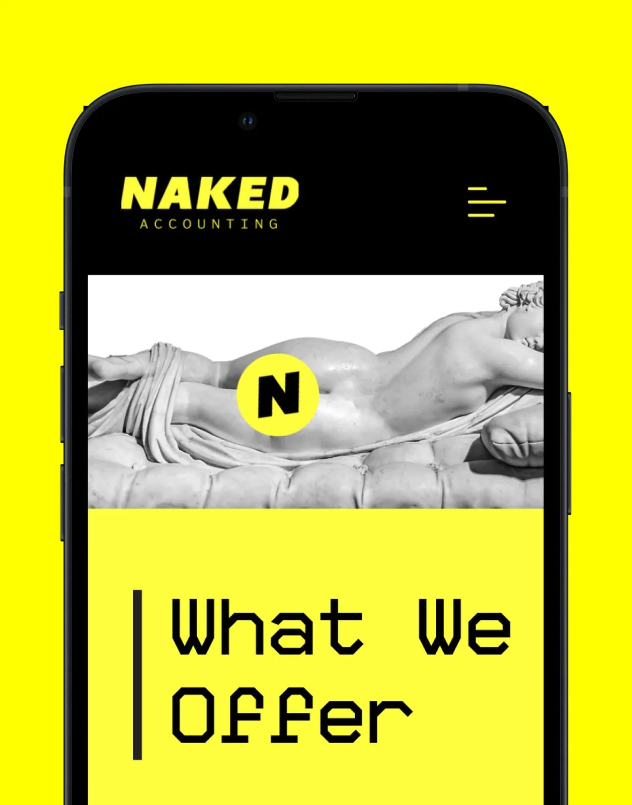
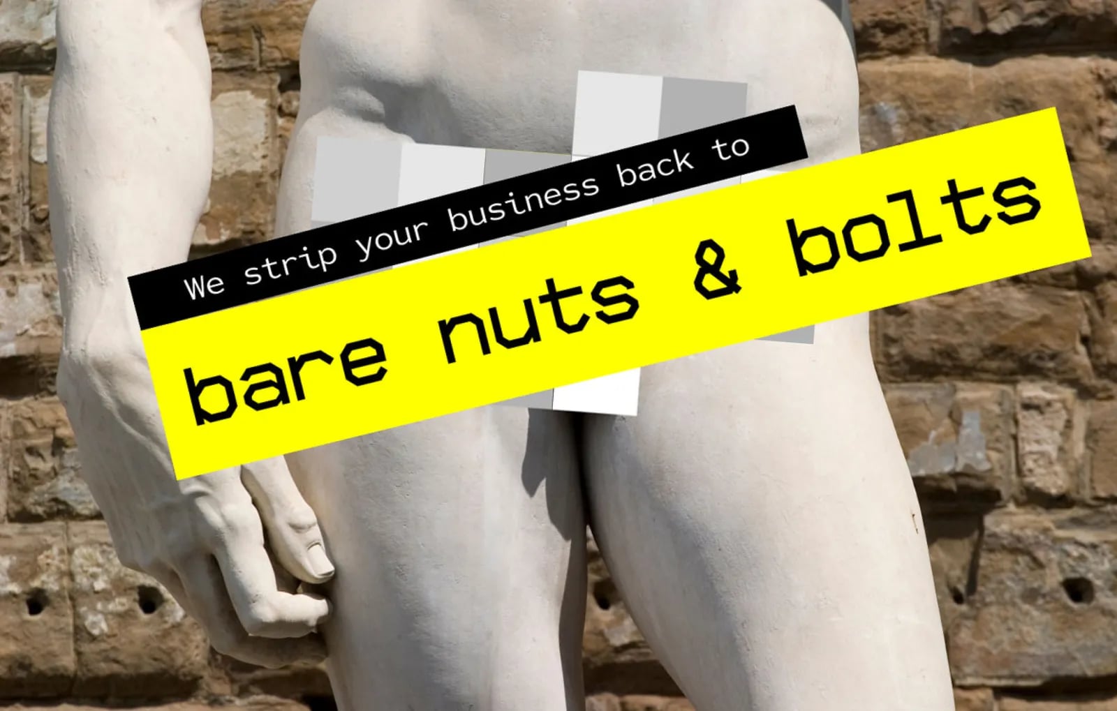
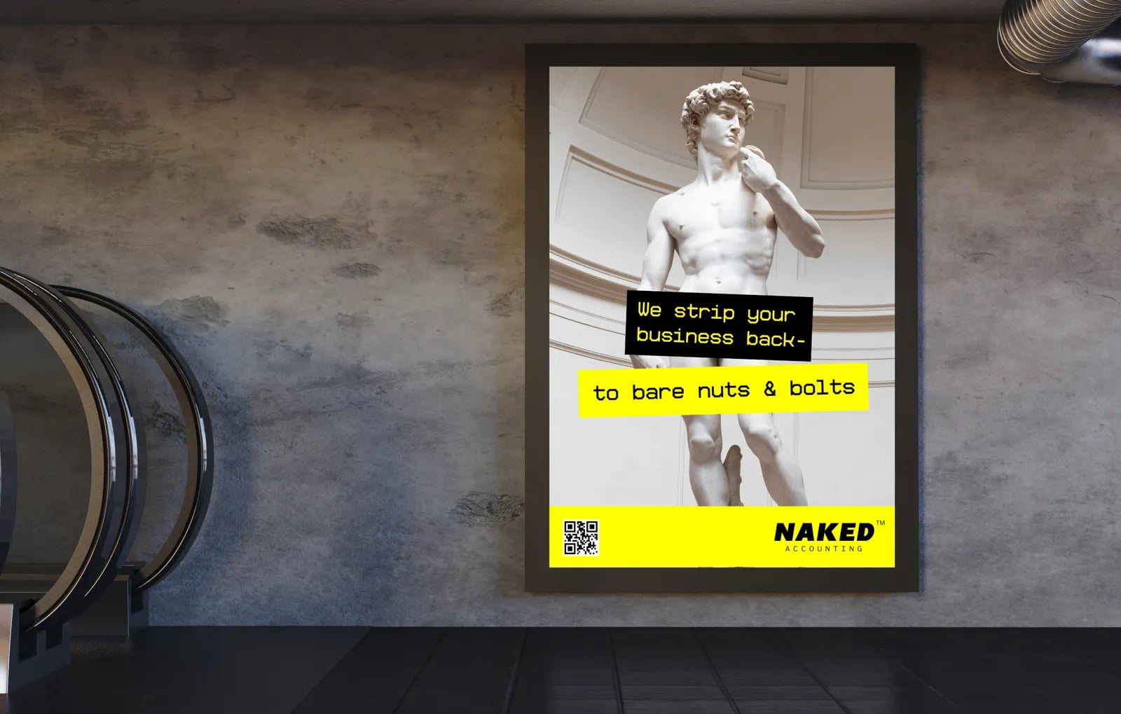
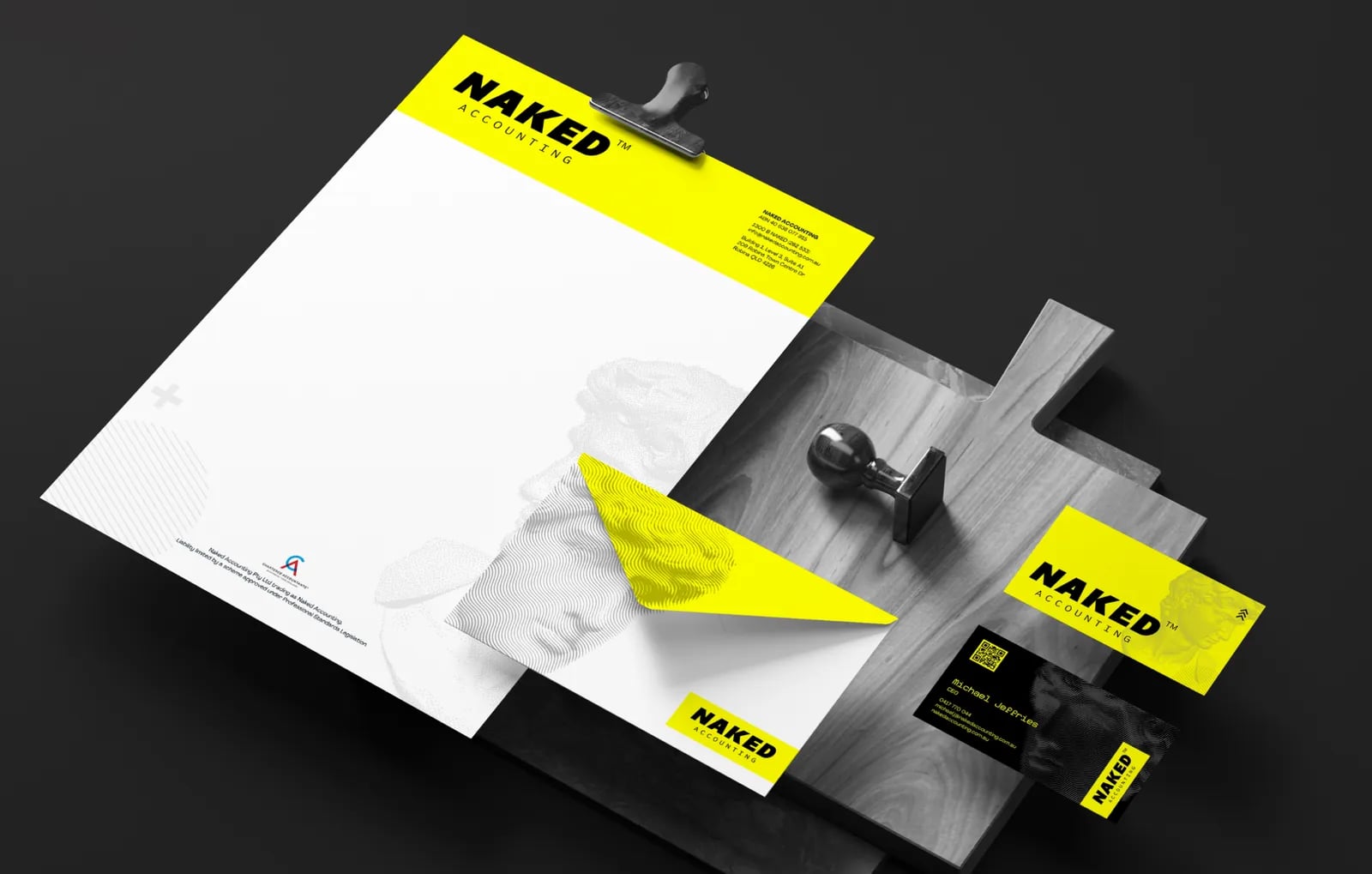
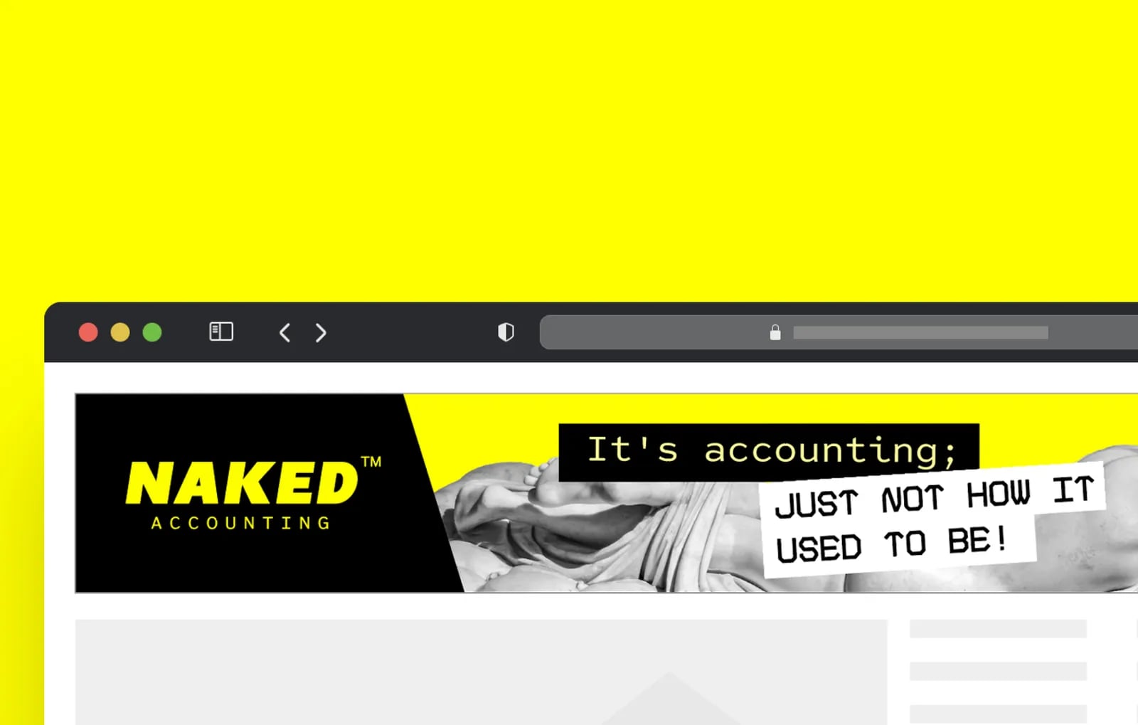
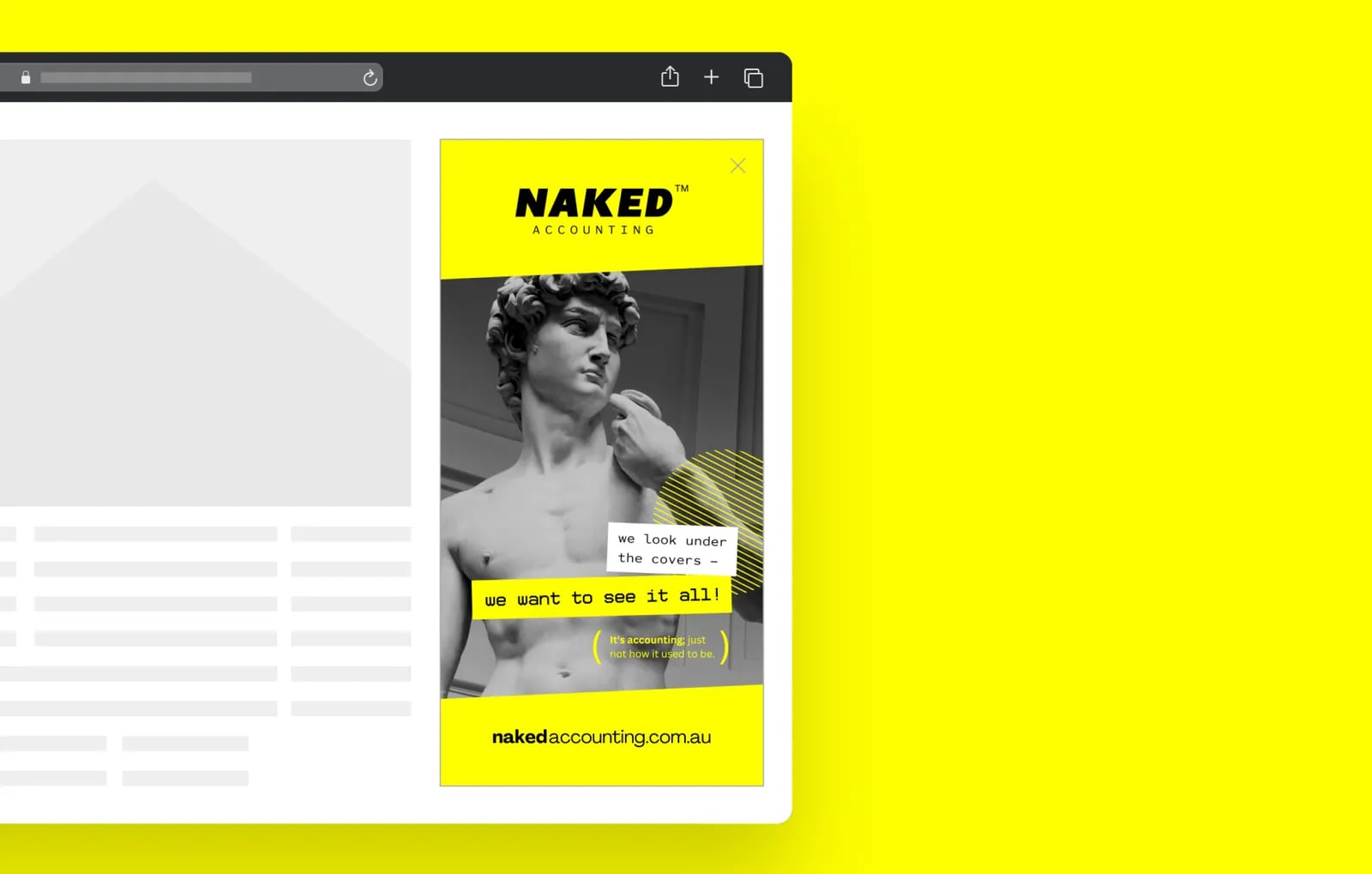
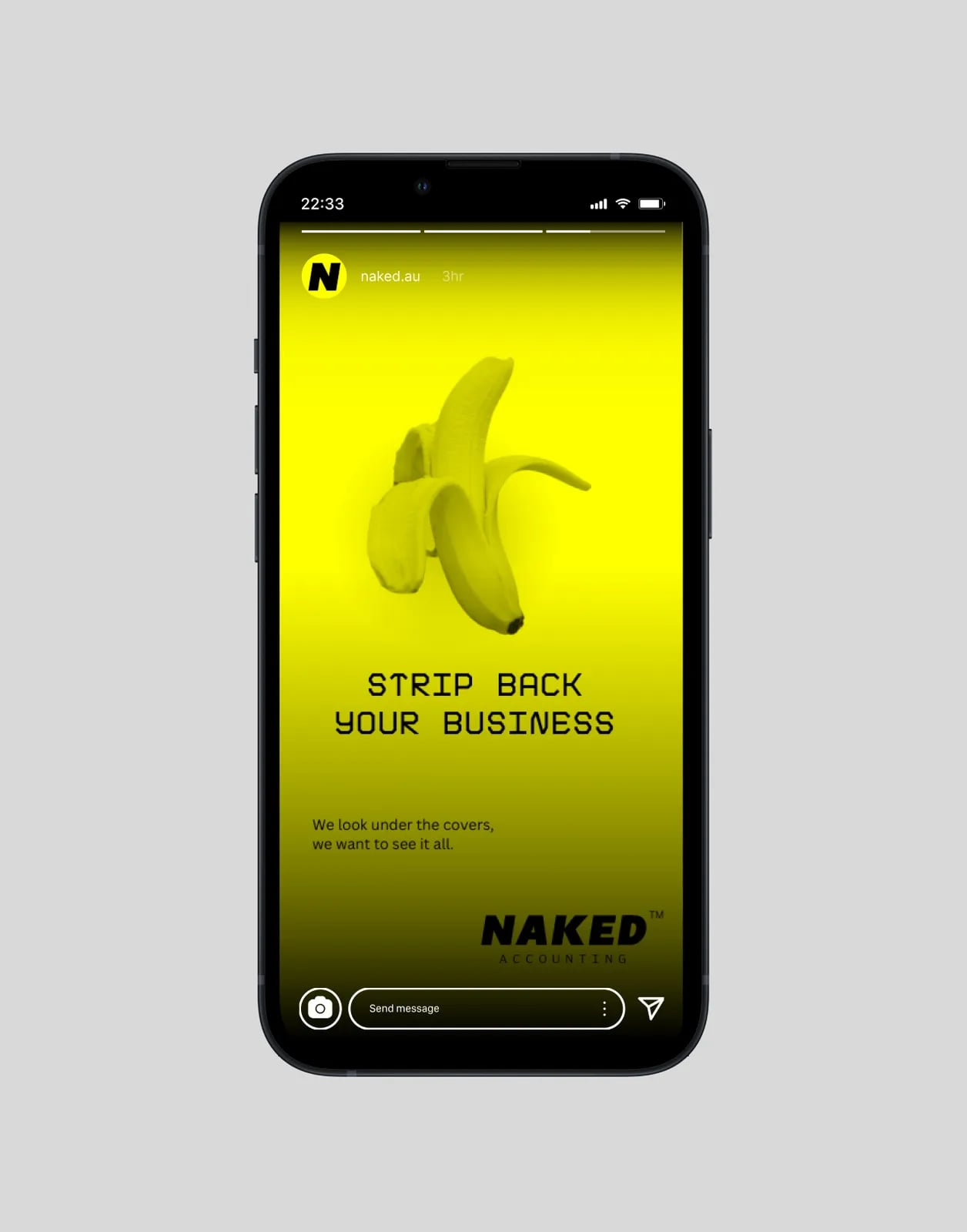
NOIZE built Naked Accounting a brand that shows transparency at every turn. The name was the starting point. We designed a clean wordmark that hints at revealing without being literal, set it on a bold yellow, and carried it into the website and photography.
The brief
Traditional accounting brands look conservative and distant. Naked Accounting saw a gap for a firm that put clarity, honesty and approachability first. Its brand had to make that difference obvious straight away.
The approach
01Start with the name
"Naked" signals nothing to hide. The strategy made transparency the core message.
02Clear, not cheeky
The identity suggests openness without leaning on a literal joke.
03Speak plainly
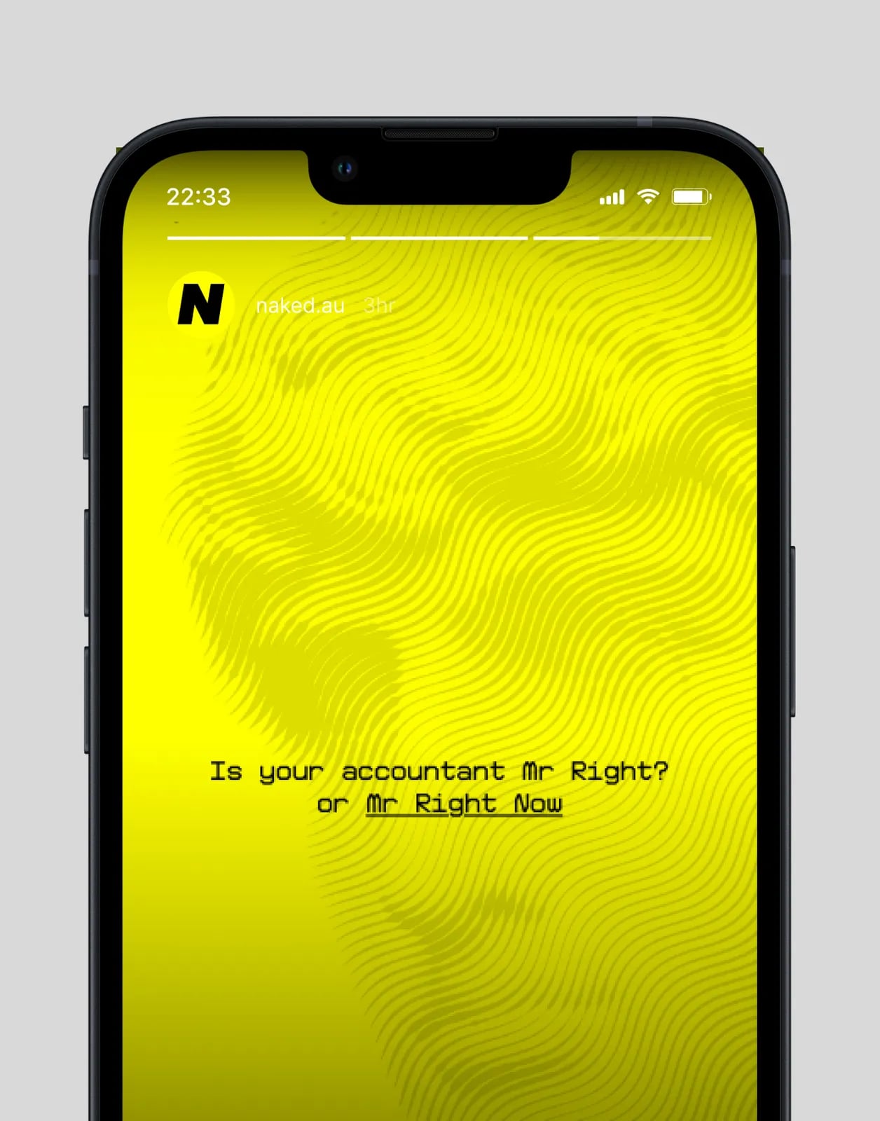
The brand voice explains finance in everyday words.



What we built
01A new identity
A clean, minimal wordmark on a bold yellow, with brand guidelines.
02Website design
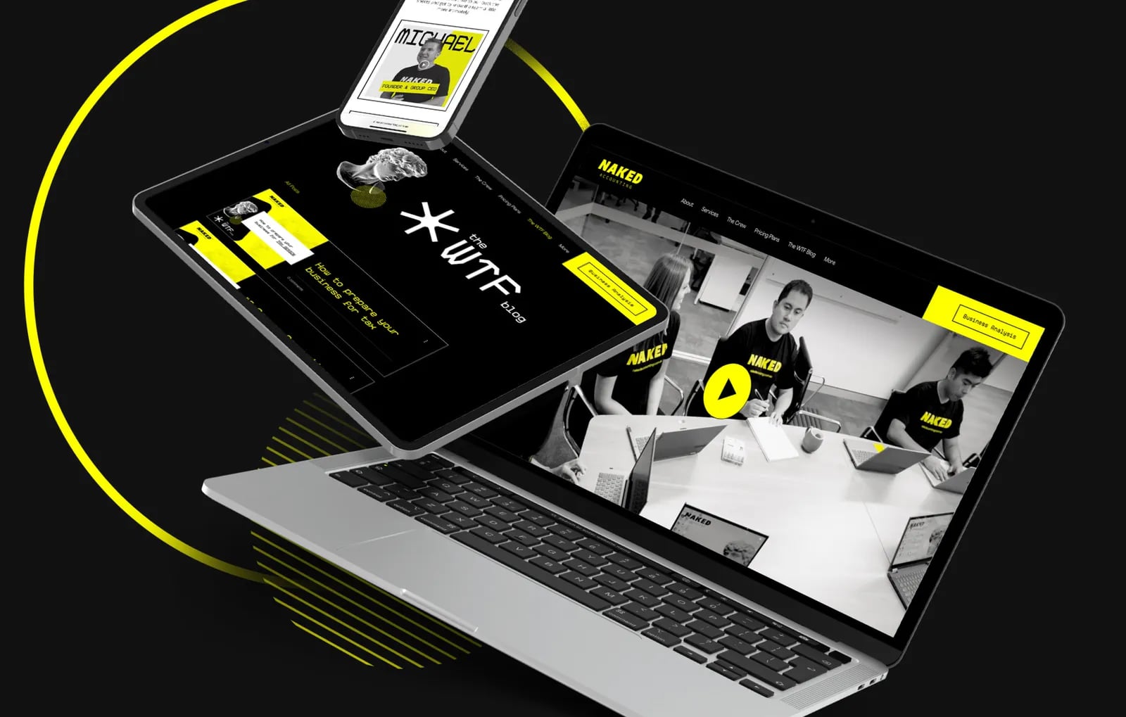
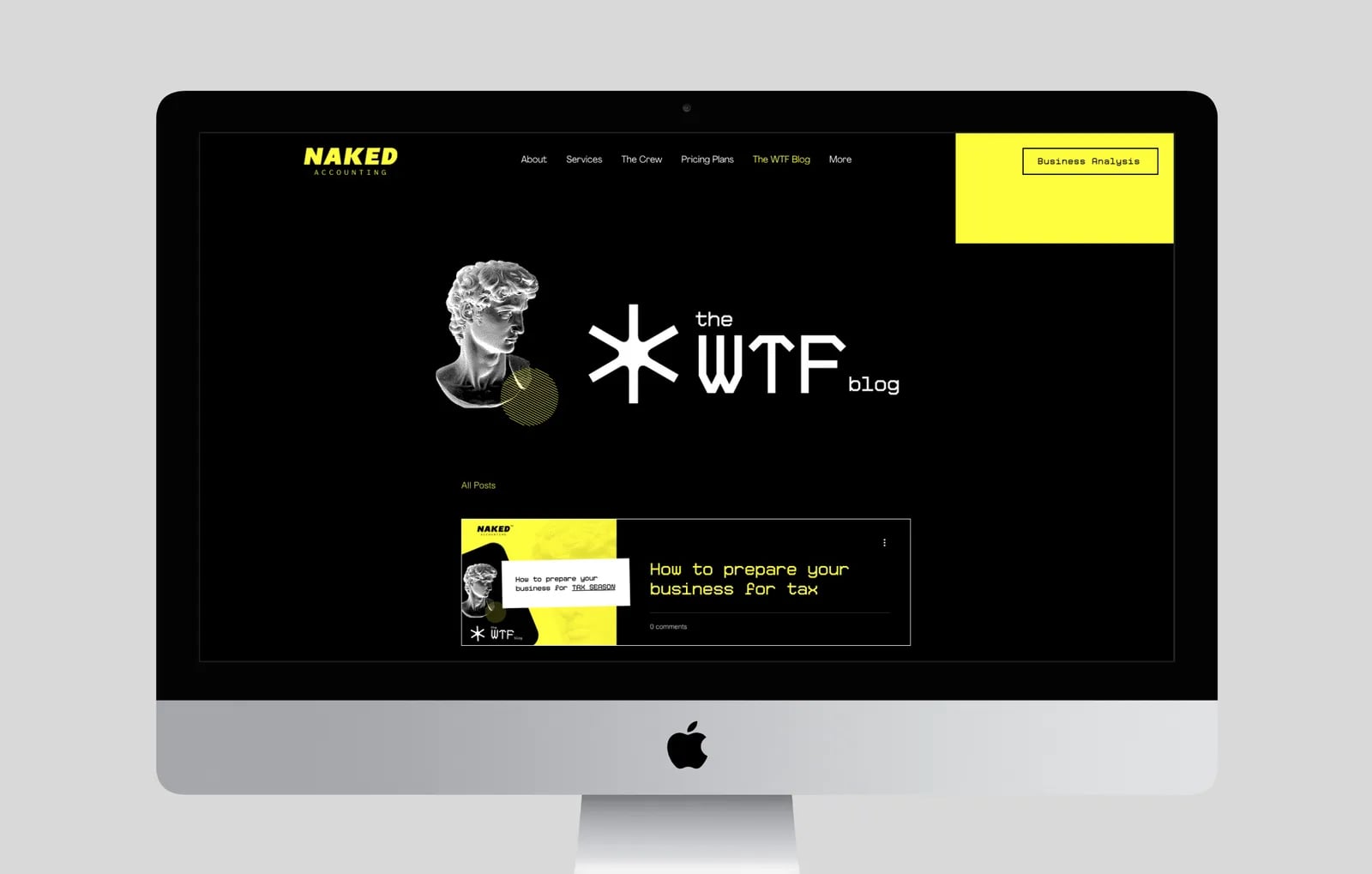
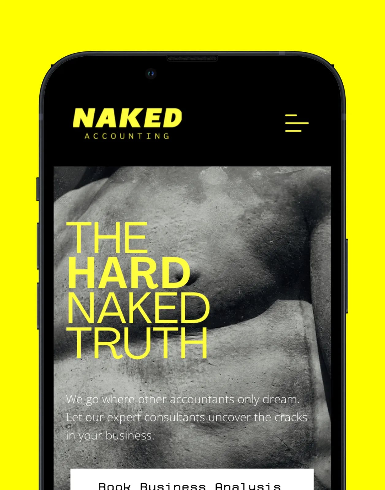
A website that explains services simply and makes it easy to get in touch.
03Photography
Brand photography that shows real people, not stock images.







Common questions
What did NOIZE do for Naked Accounting?
Brand strategy, a visual identity, website design and photography.
Why is the brand yellow?
A bold colour sets the firm apart from the conservative blues and greys most accountants use.
How can an accounting firm stand out?
By being clear about what makes it different and saying it in plain language.
Your first strategy conversation is on us.
Have a chatThe brand for business.