Social Realty: big-agency experience, made independent
- Client
- Social Realty
- Industry
- Property & Real Estate
- What we did
- Brand strategy, Visual identity, Shopfront and office signage, Print
Social Realty's founder spent years at one of Australia's big four real estate agencies, then left to start an independent agency.
The new business offered something different: big-agency experience with a more direct, personal relationship with clients. The brand had to make that clear from the first look.
The short version
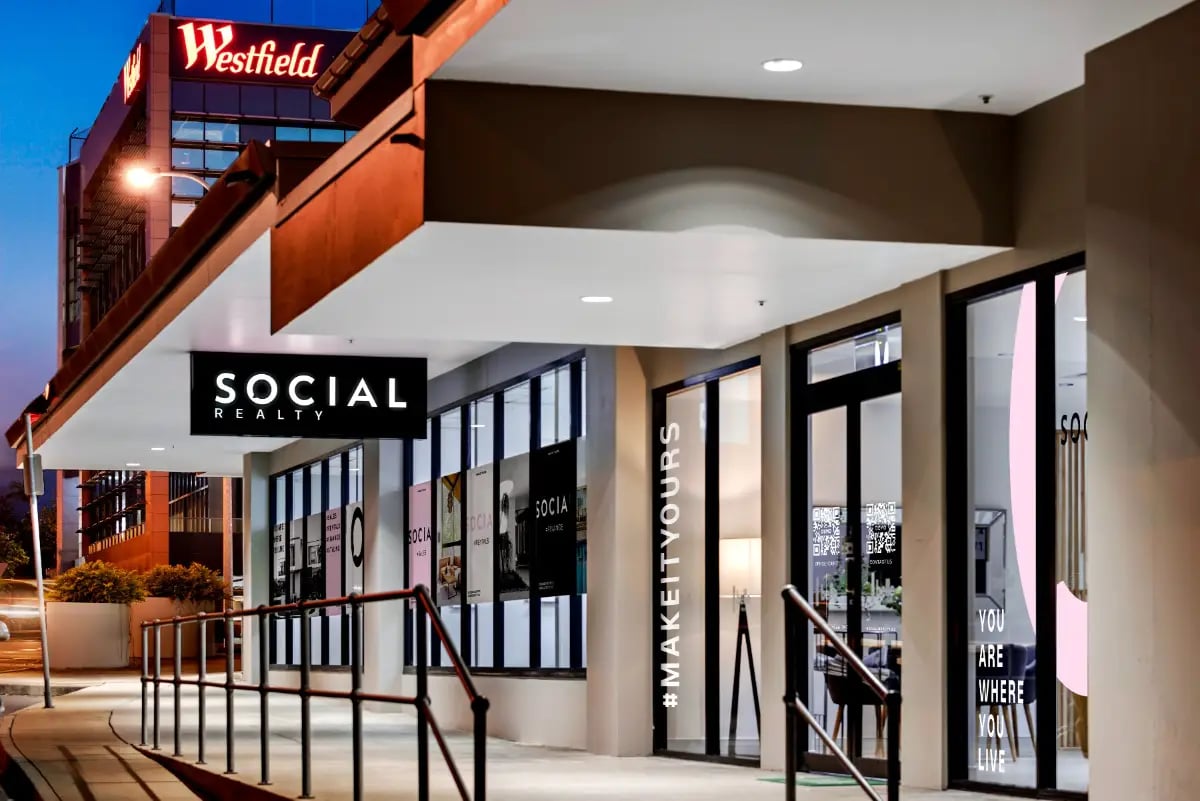
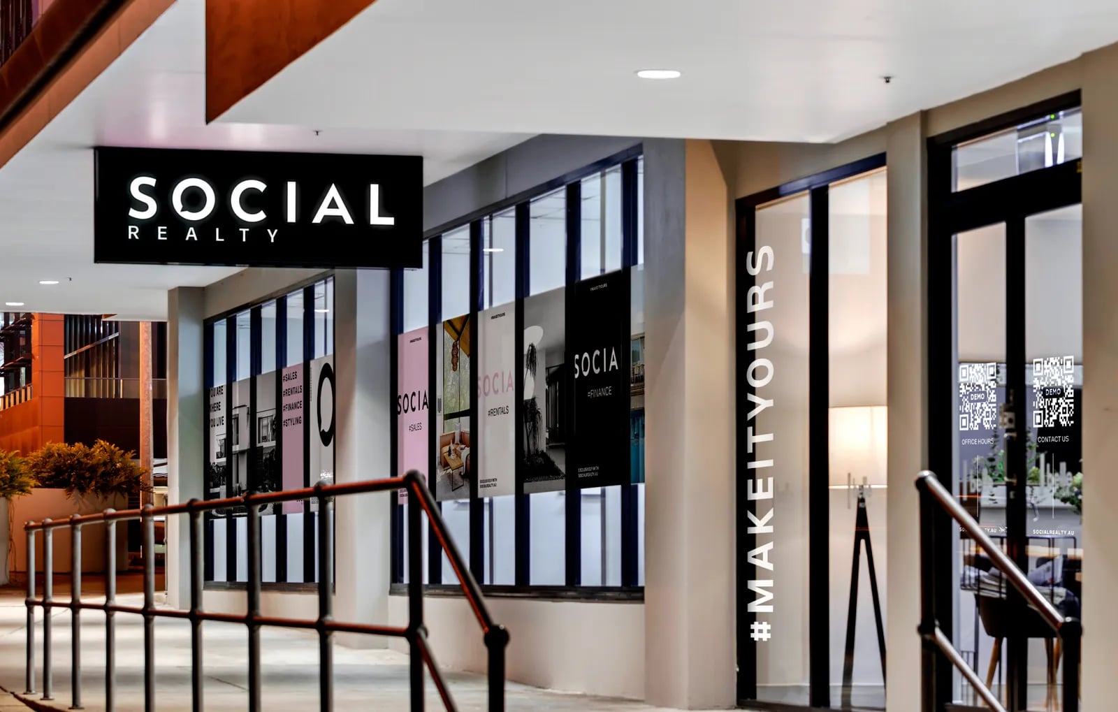
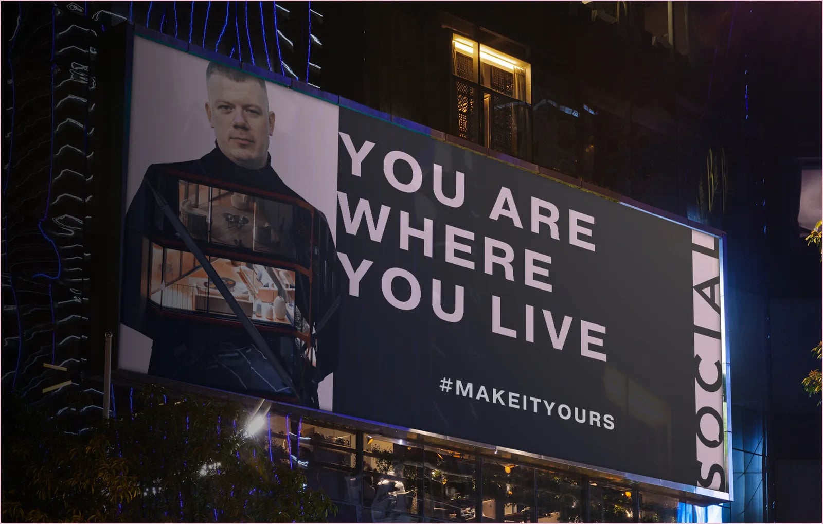
NOIZE built Social Realty a brand that shows big-agency experience in an independent, founder-led business. We skipped the safe primary colours most agencies use and went pink. Then we carried the brand from a shopfront inside Westfield to the office walls and the printed material clients take home.
The brief
Independent agencies often struggle to look as credible as the big names. Social Realty needed to look established from day one, while making it obvious that this was not another big-four office.
The value was personal: clients would deal directly with an experienced agent who was accountable for the result.
The approach
01Experience, made independent
The strategy turned the founder's major-agency background into the reason to trust a new agency. You get the same experience, without the layers in between.
02Stand apart on colour
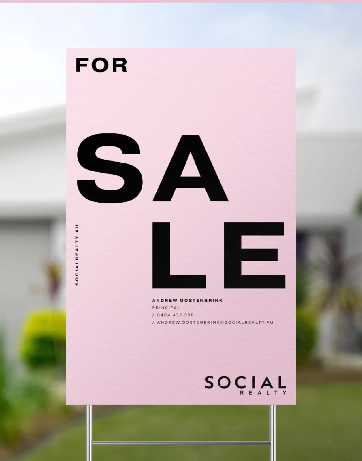
Real estate is full of blue, red and navy. Social Realty went pink, so it is remembered after one visit.
03Carry it into the space
Real estate is a face-to-face business. The brand had to carry through the shopfront and the office, not just the logo.

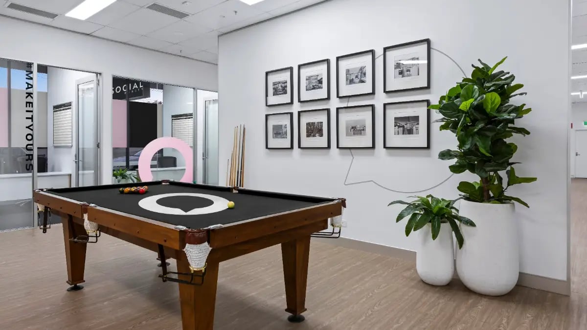
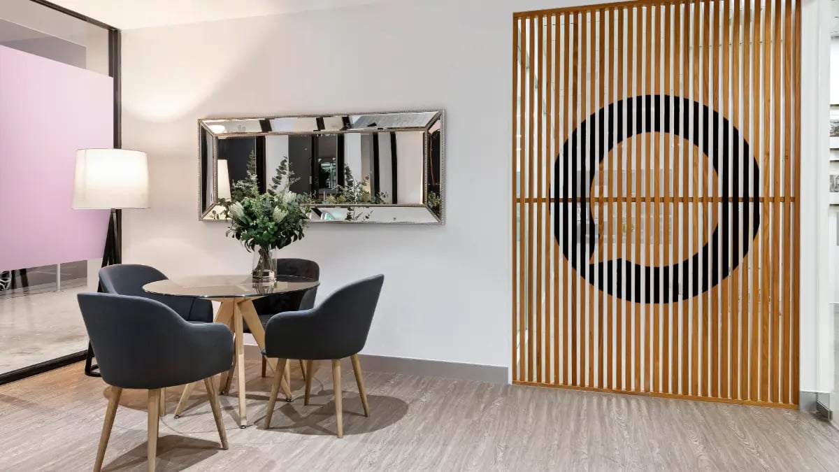
What we built
01A new identity
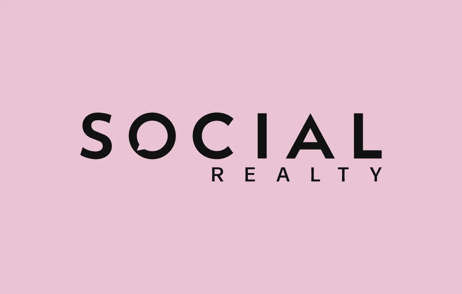
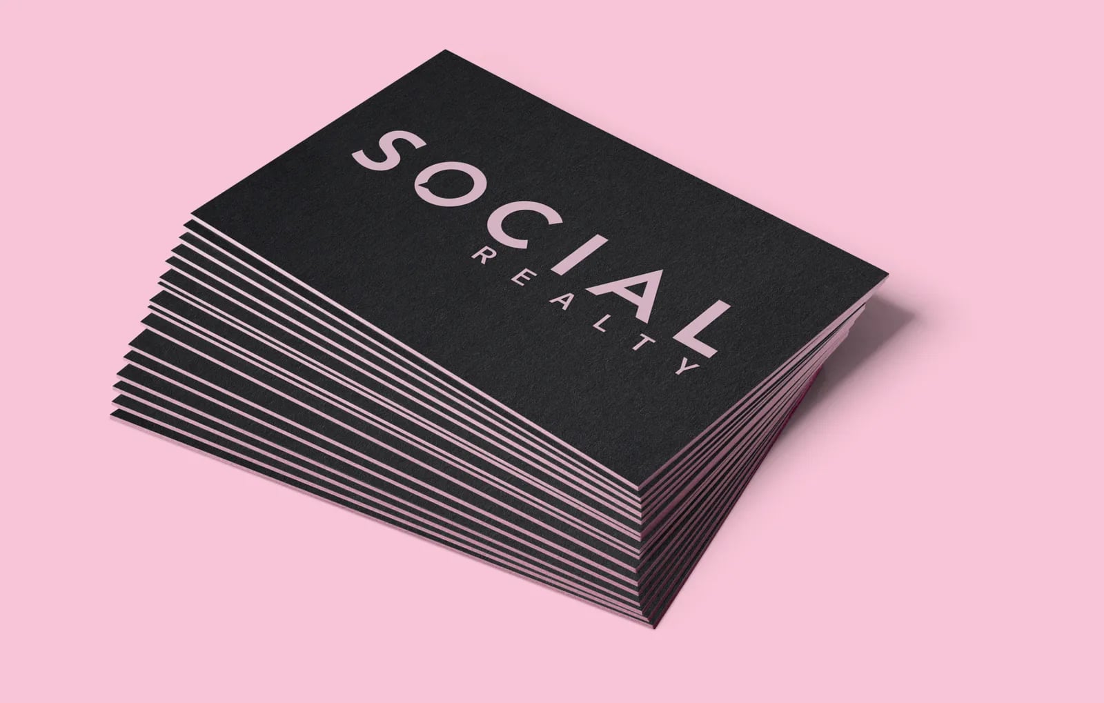
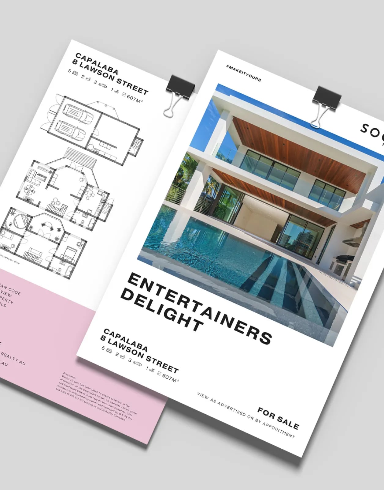
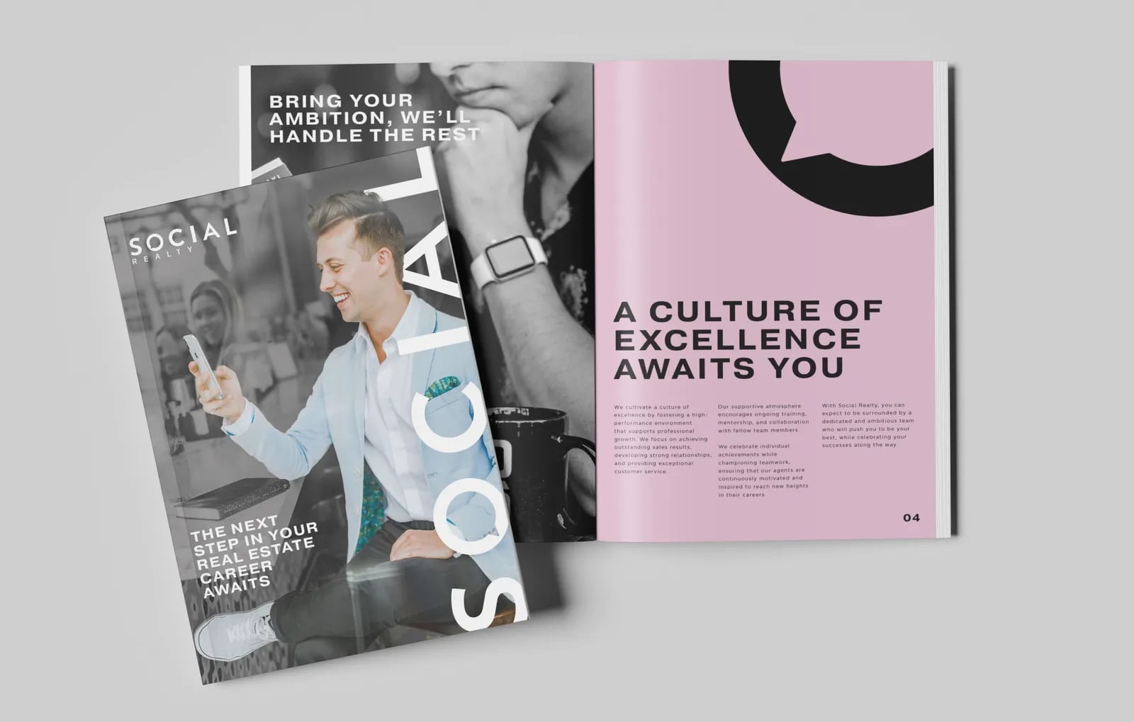
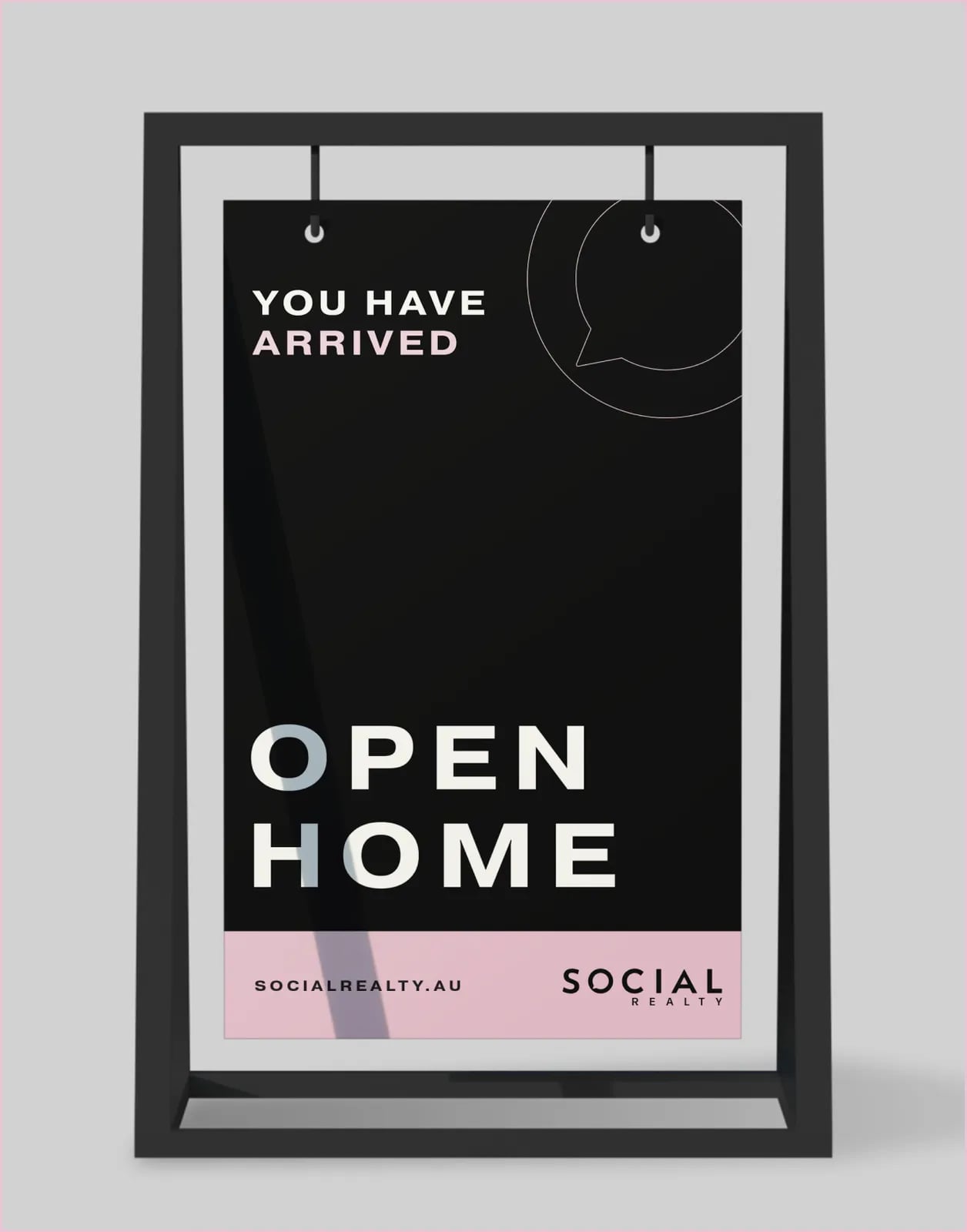
A clean black and white wordmark with a pink accent, and a brand system for listings, print and digital.
02Shopfront and office
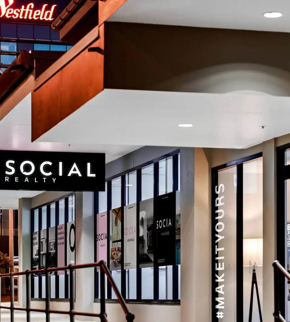
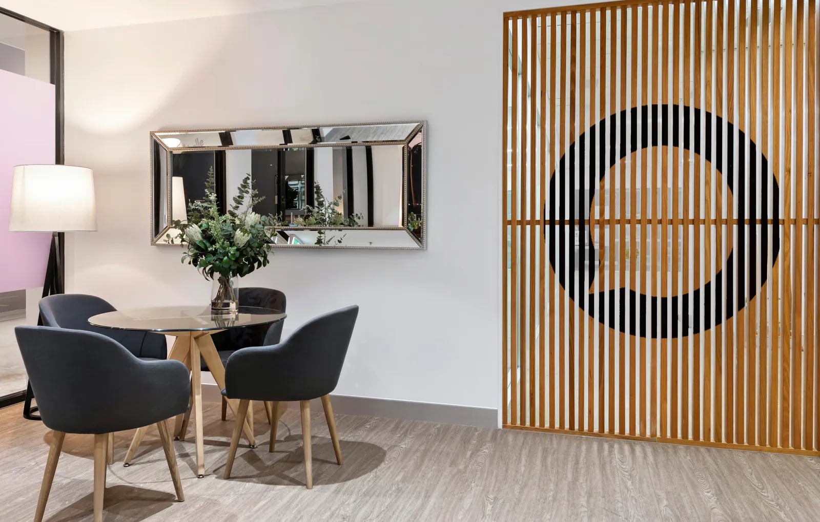
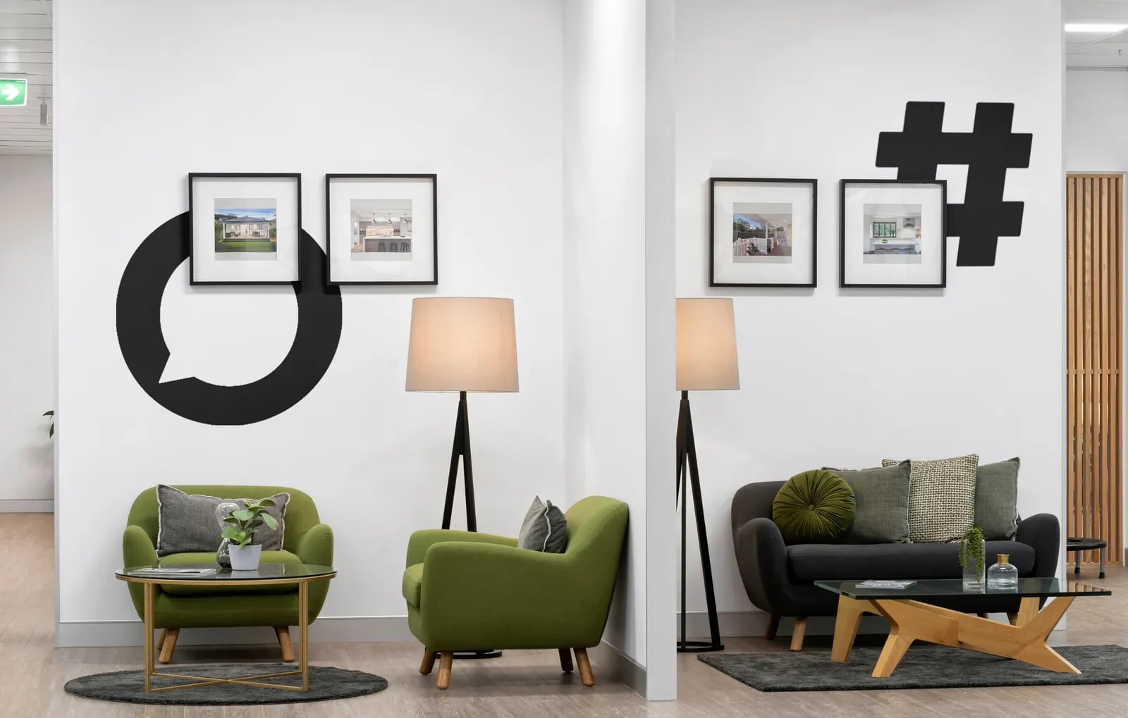
A shopfront inside a Westfield centre, and brand applications through the office, from the meeting room to the walls.
03Print
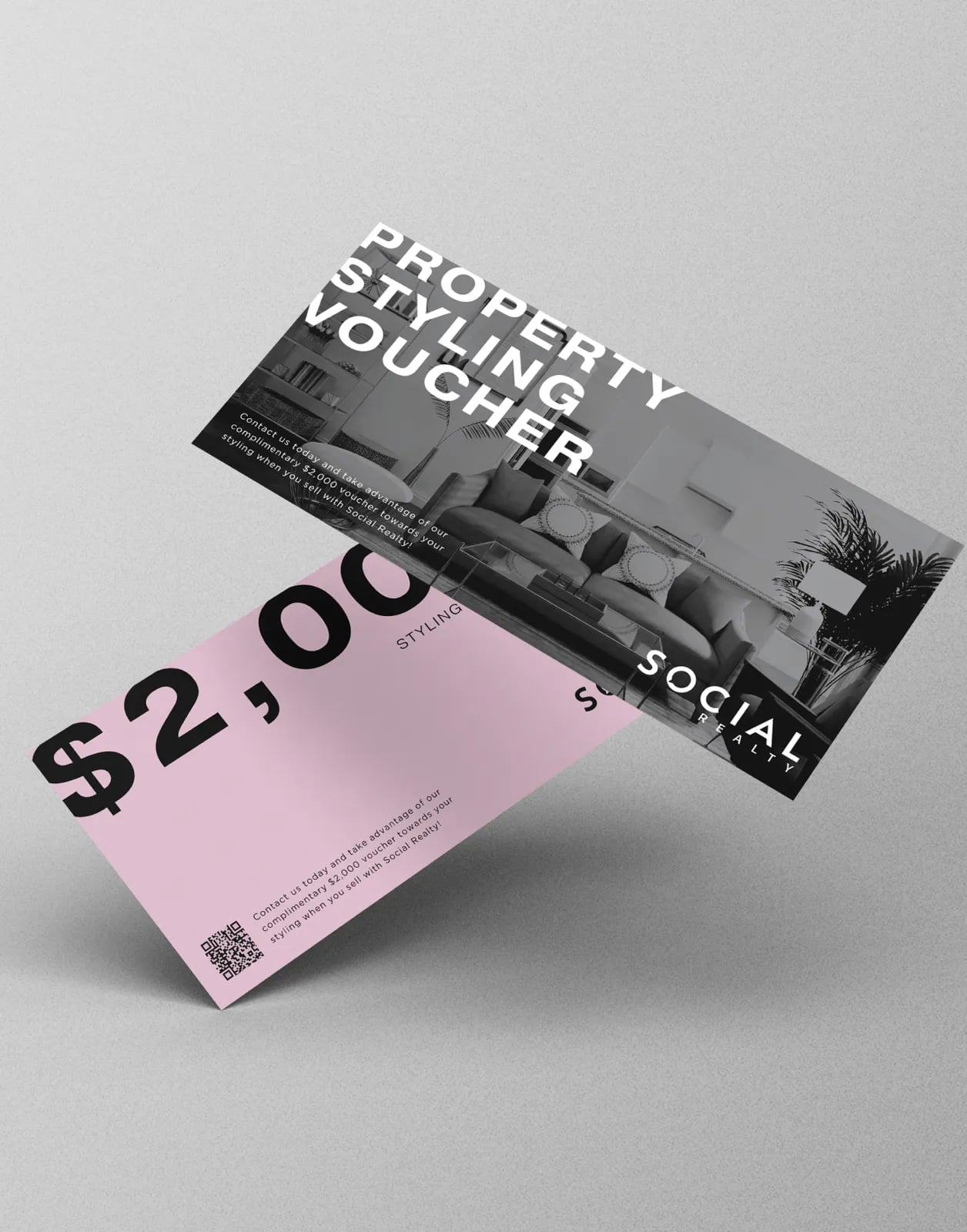
Printed material including property styling vouchers, produced by NOIZE Print.








“The branding and concept designs were fantastic.”
Common questions
What did NOIZE do for Social Realty?
Brand strategy, a new visual identity, shopfront and office brand applications, and printed material.
Why pink for a real estate agency?
Most agencies use safe primary colours, so they blend together. Pink makes Social Realty easy to remember and easy to spot.
How can an independent agency compete with big brands?
By being clear about what makes it different, and by looking just as professional everywhere clients see it.
Your first strategy conversation is on us.
Have a chatThe brand for business.