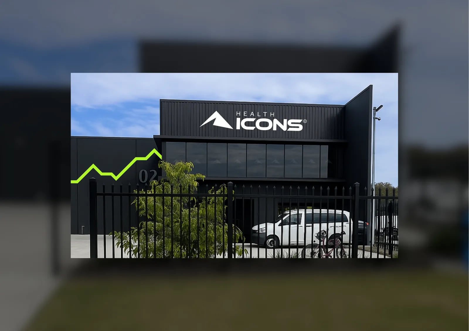
Health Icons: rebuilt from the name up
- Client
- Health Icons
- Industry
- Health, Wellness & Pet Care
- What we did
- Brand strategy, Naming, Visual identity, Brand assets
Health Icons serves healthcare professionals and the public.
It came to NOIZE asking for a refresh.
The short version
Health Icons asked for a refresh, and we rebuilt the brand from the name up. The new brand is authoritative for professionals and easy to use for everyone else, with a clear identity and assets built to rise.
The brief
Health information has to be trusted and easy to understand. The old brand didn't do both.
The approach
01Two audiences
Authority for professionals, simplicity for the public.
02Start with the name
The whole brand was rebuilt, not just restyled.
03Built to rise
A brand designed to grow with the business.

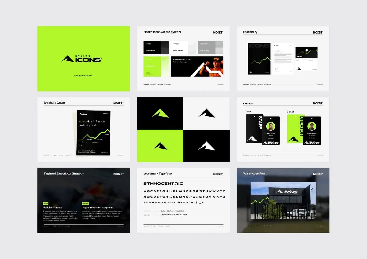
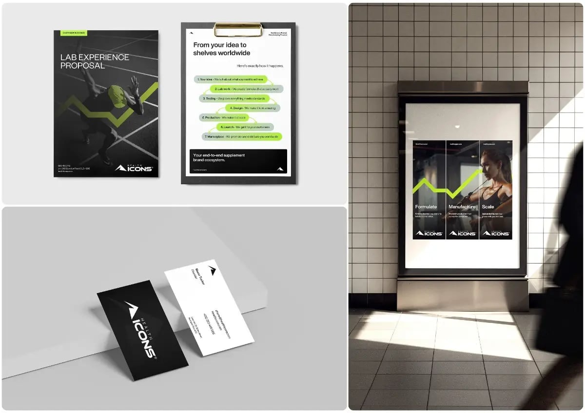
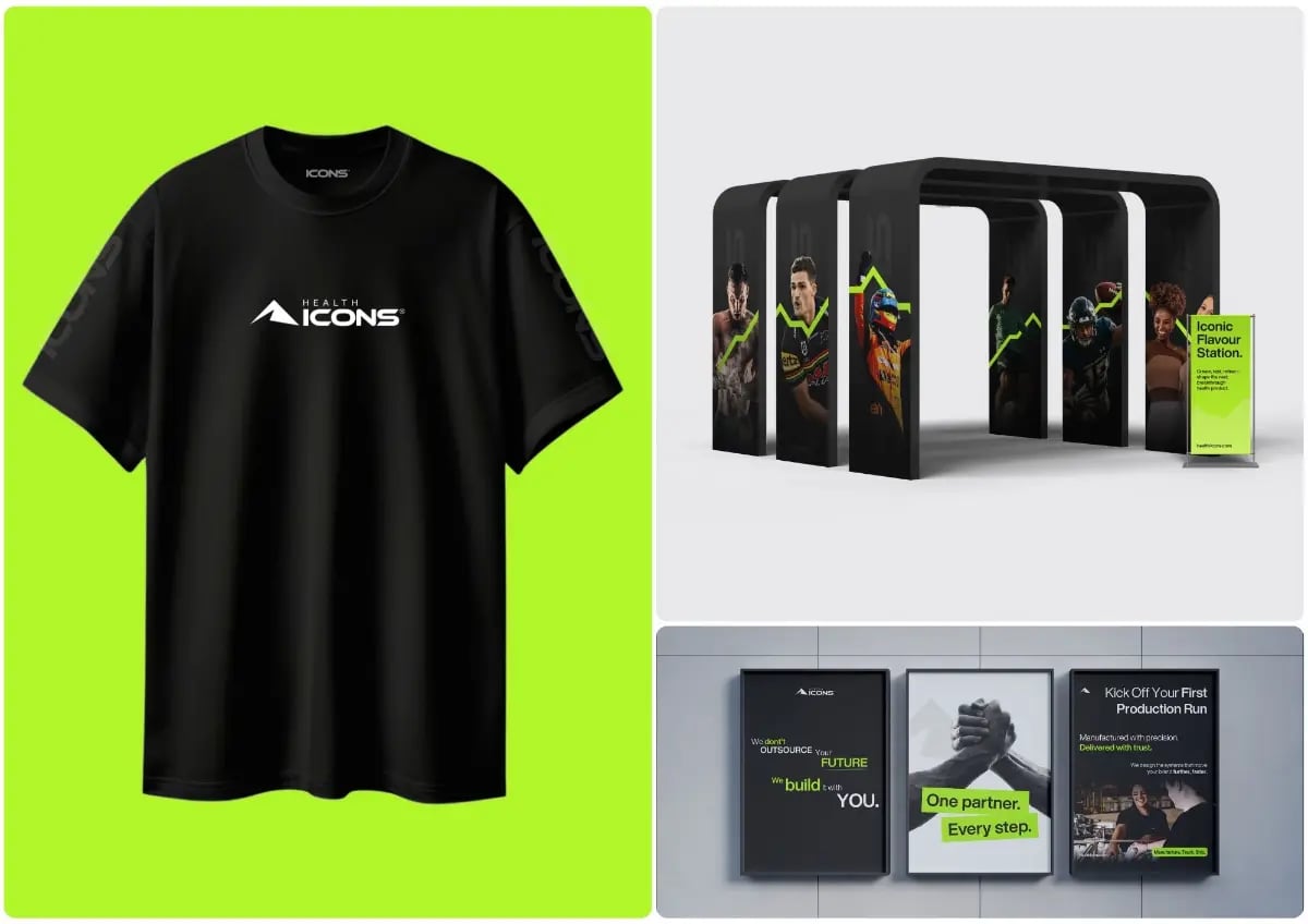

What we built
01A new identity
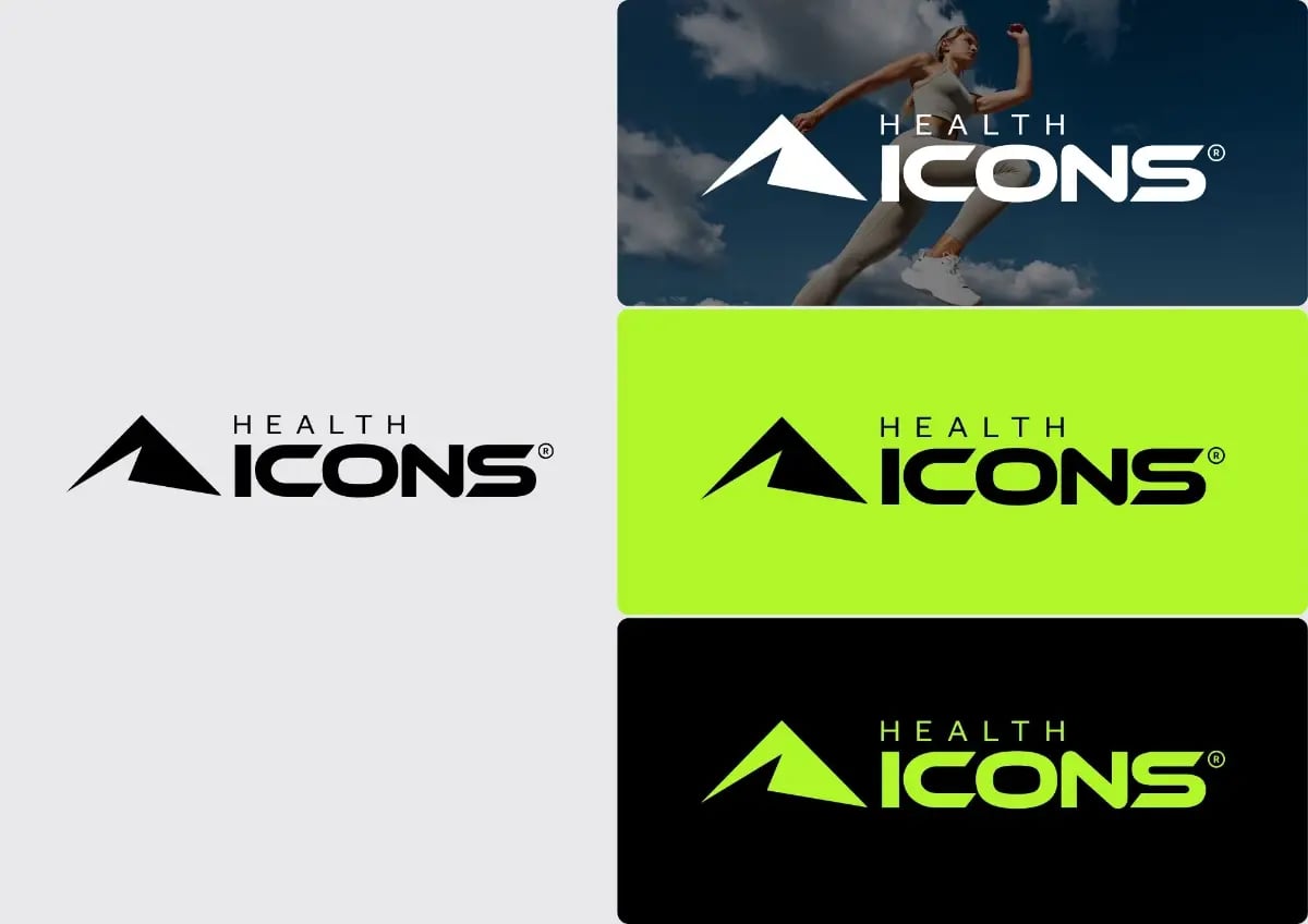
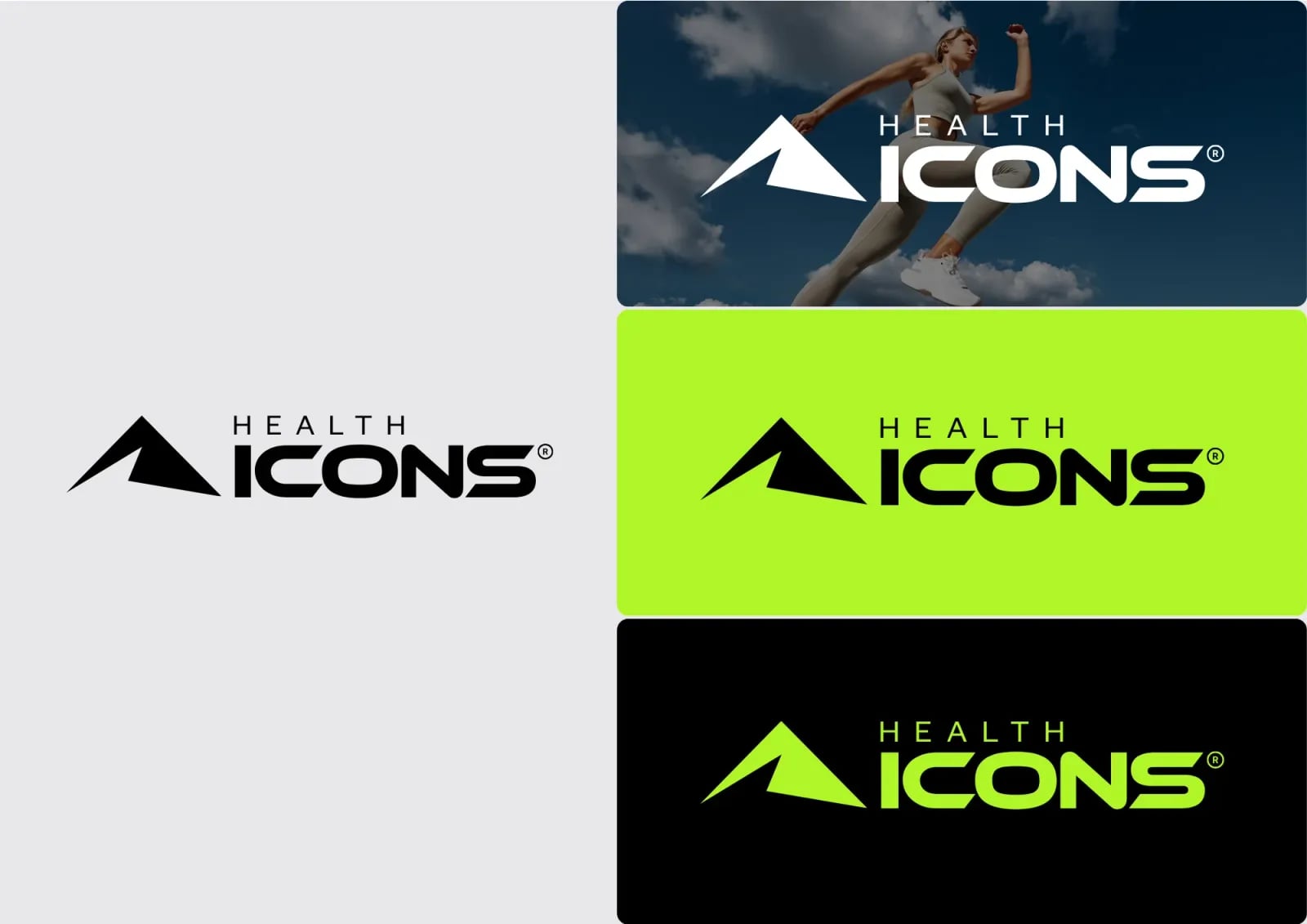
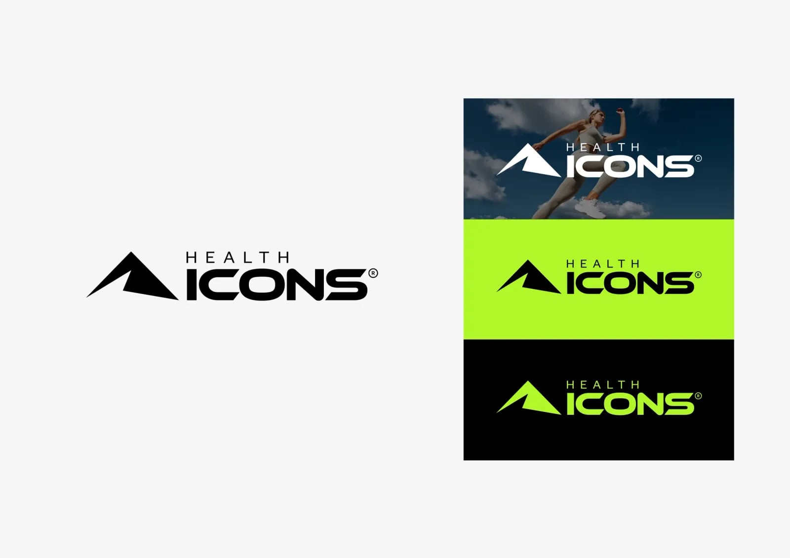
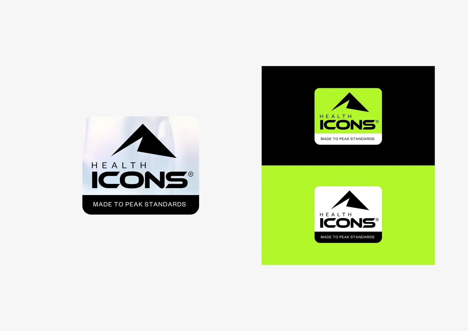
A clear, confident logo and palette.
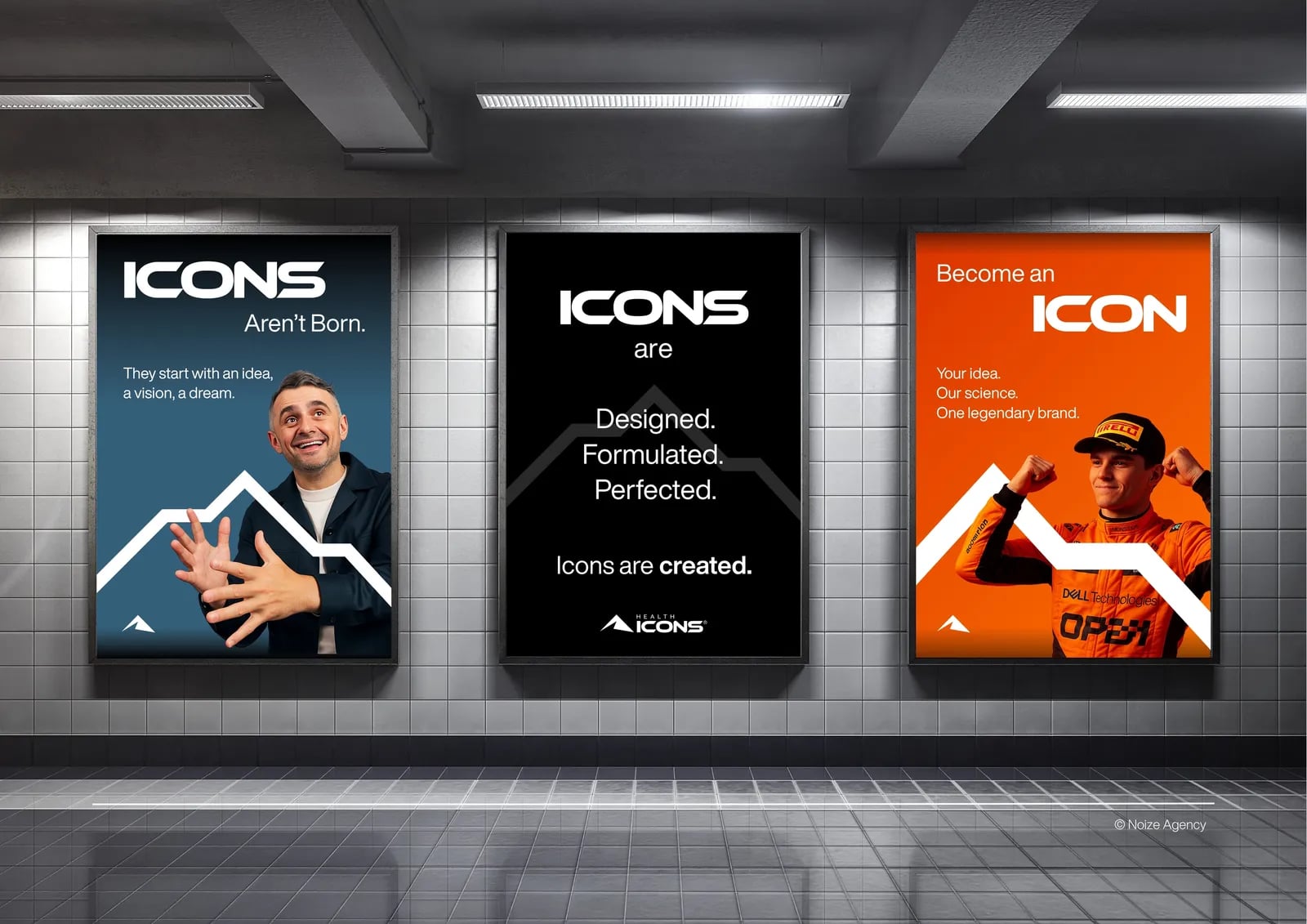
02Brand assets
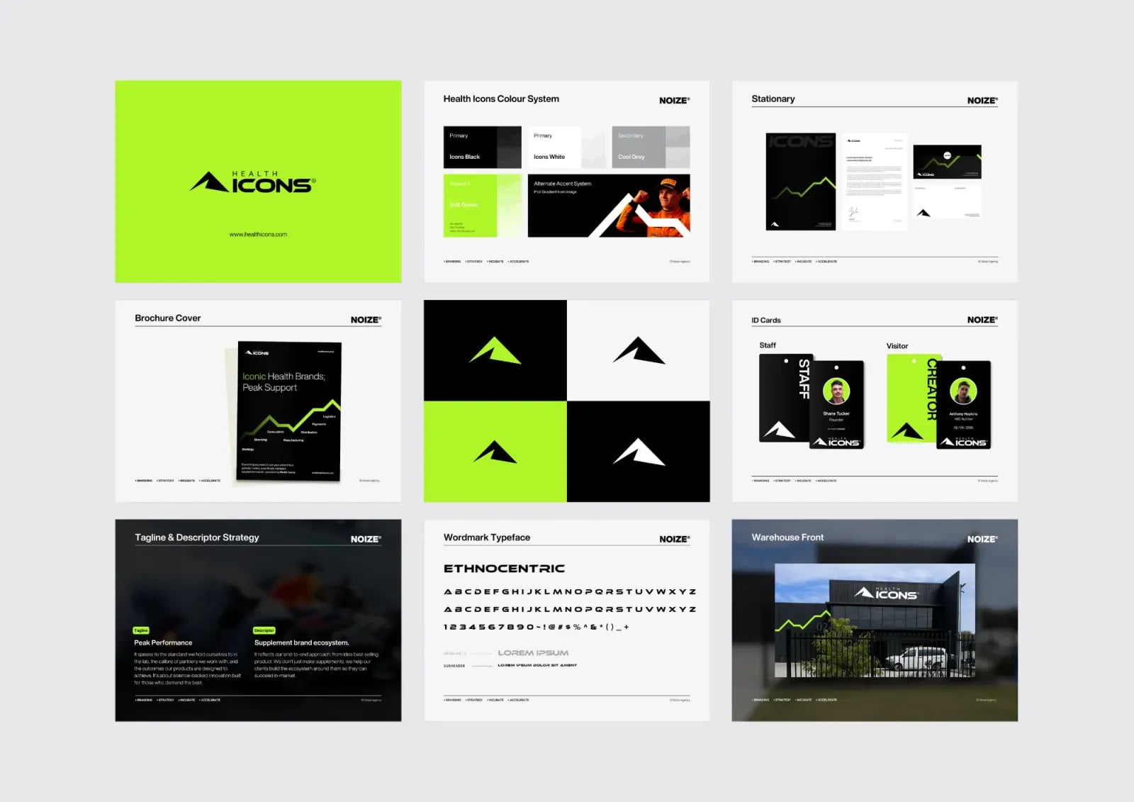
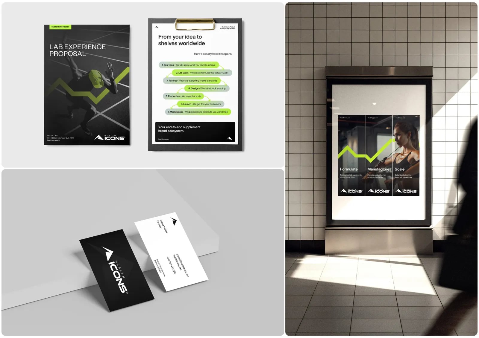
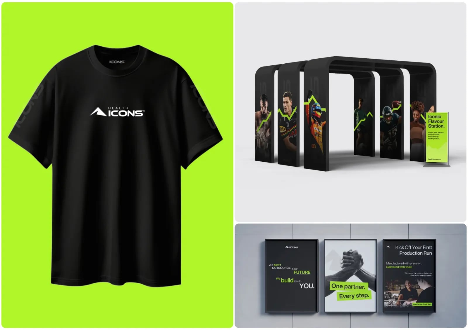
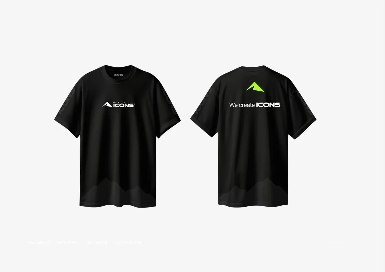
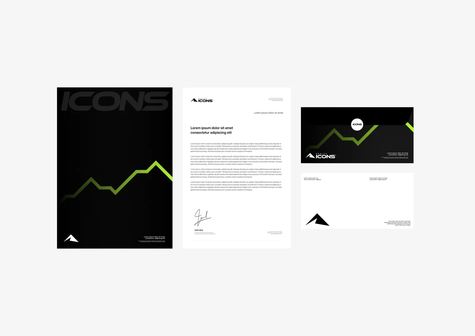
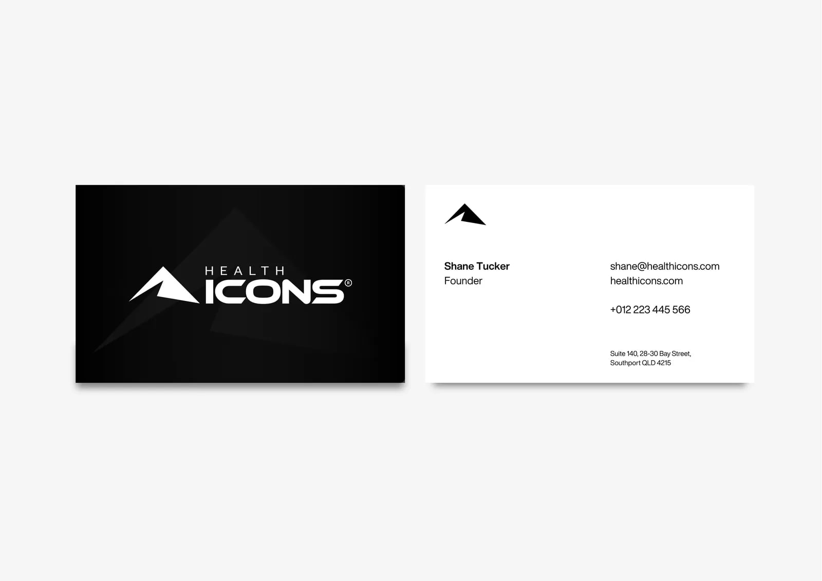
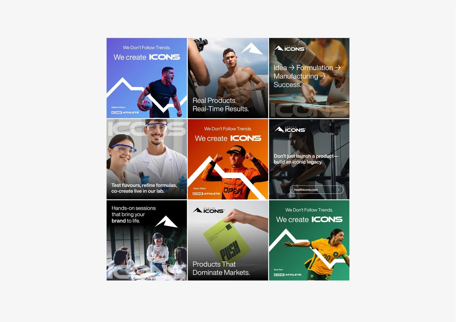
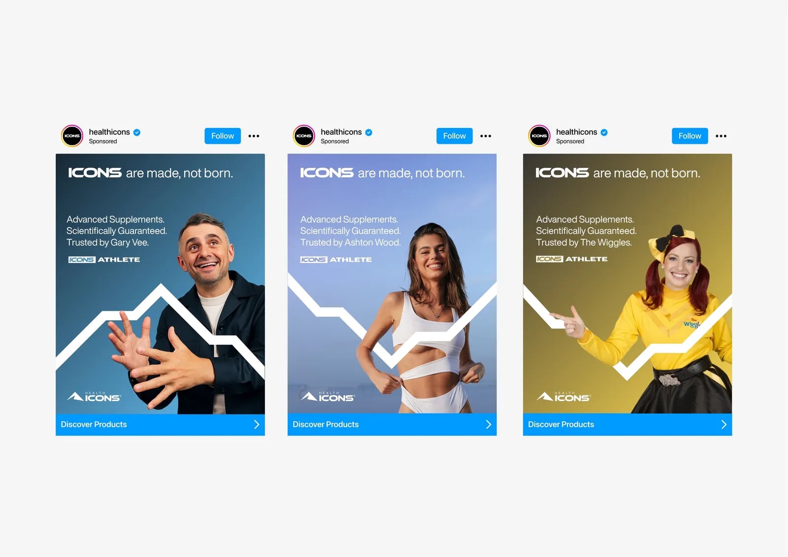
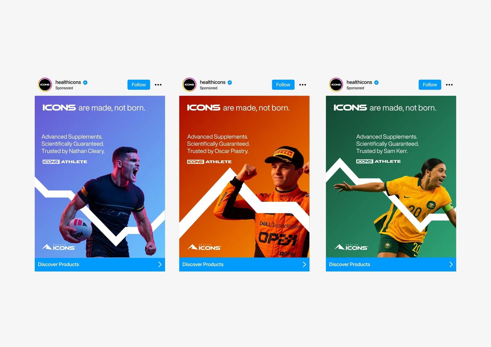
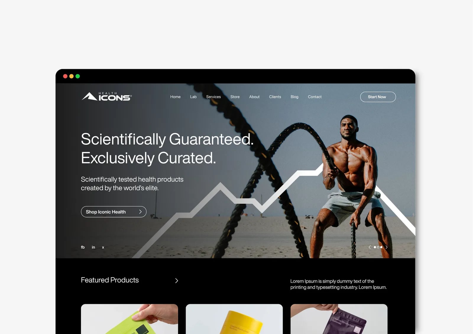
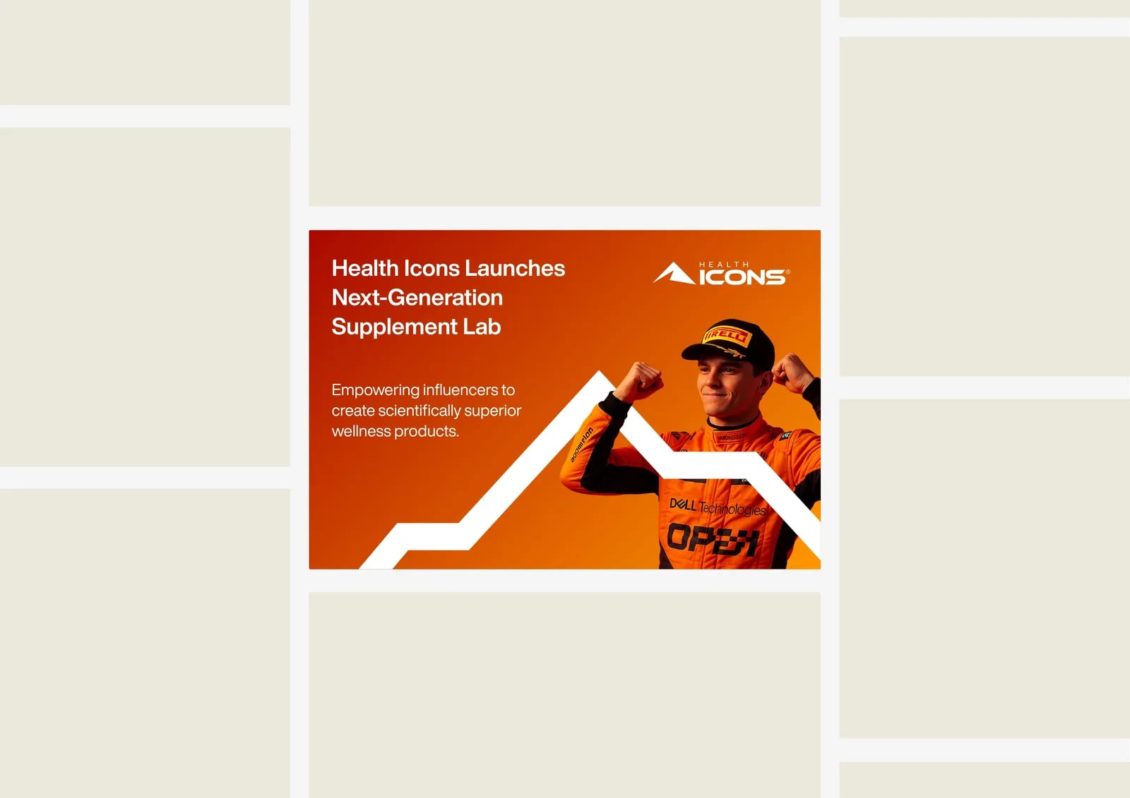
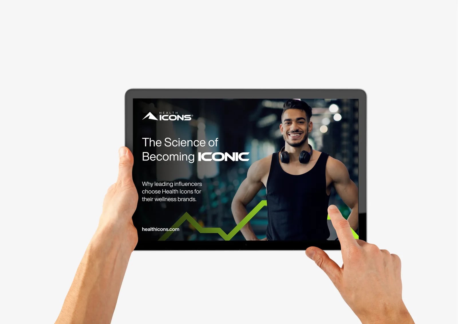
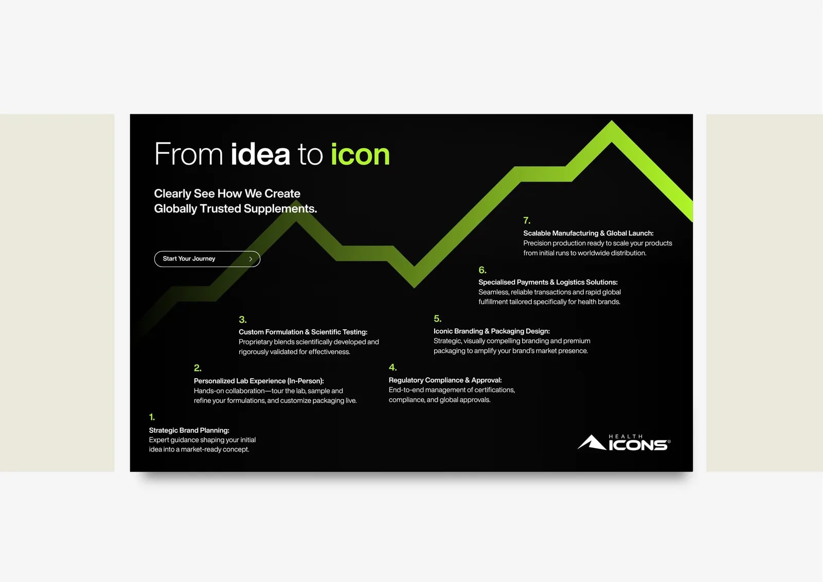
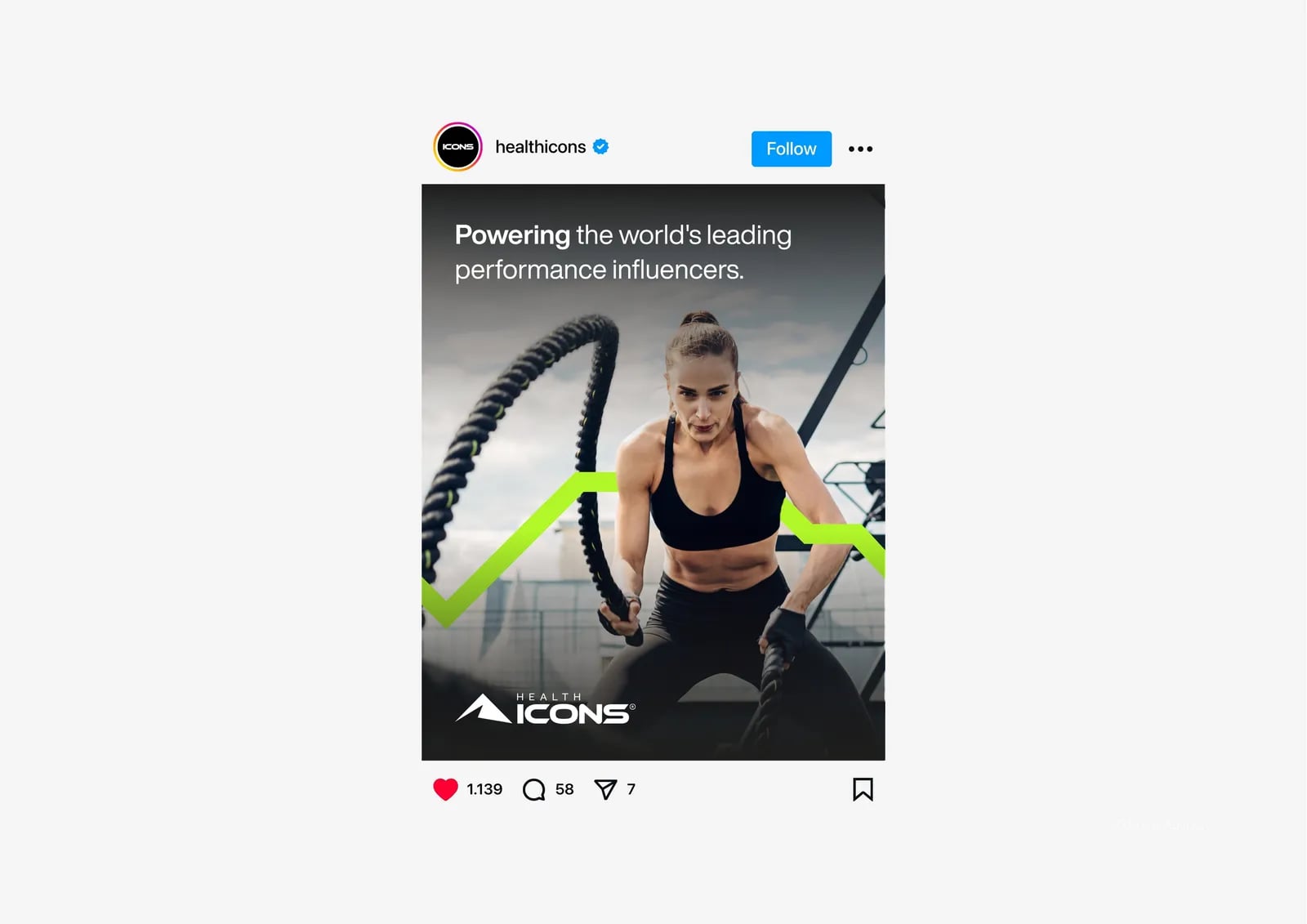
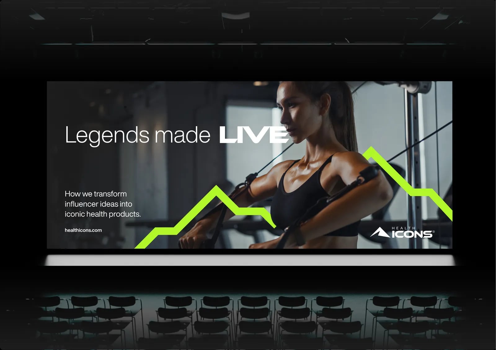
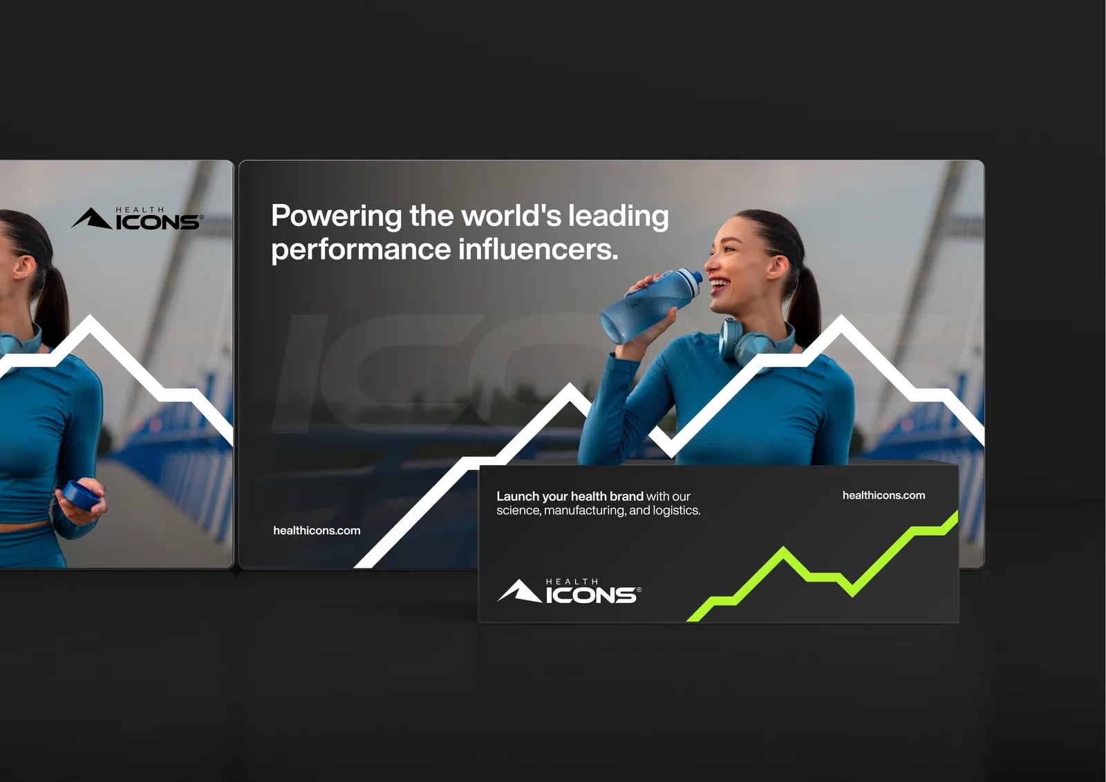
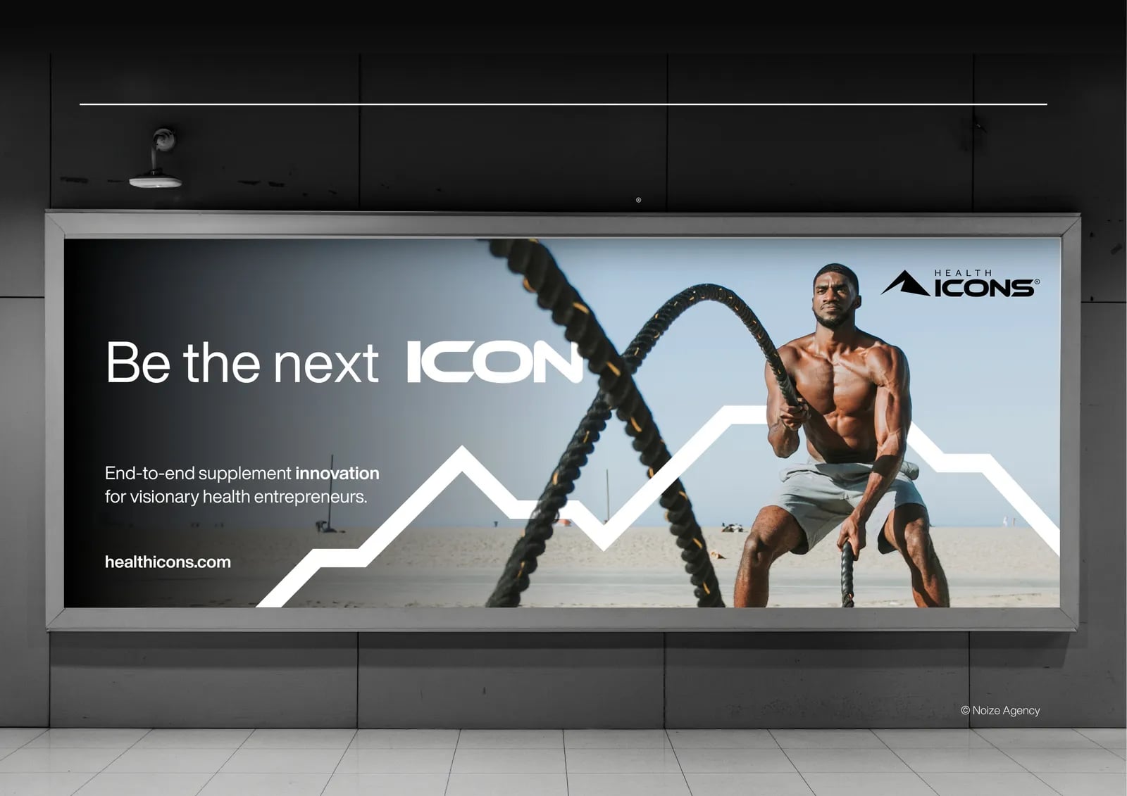
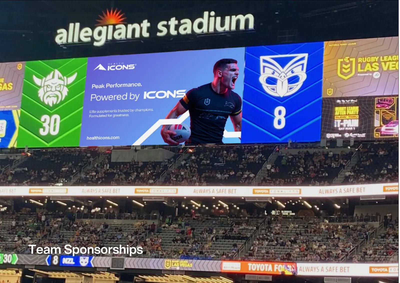
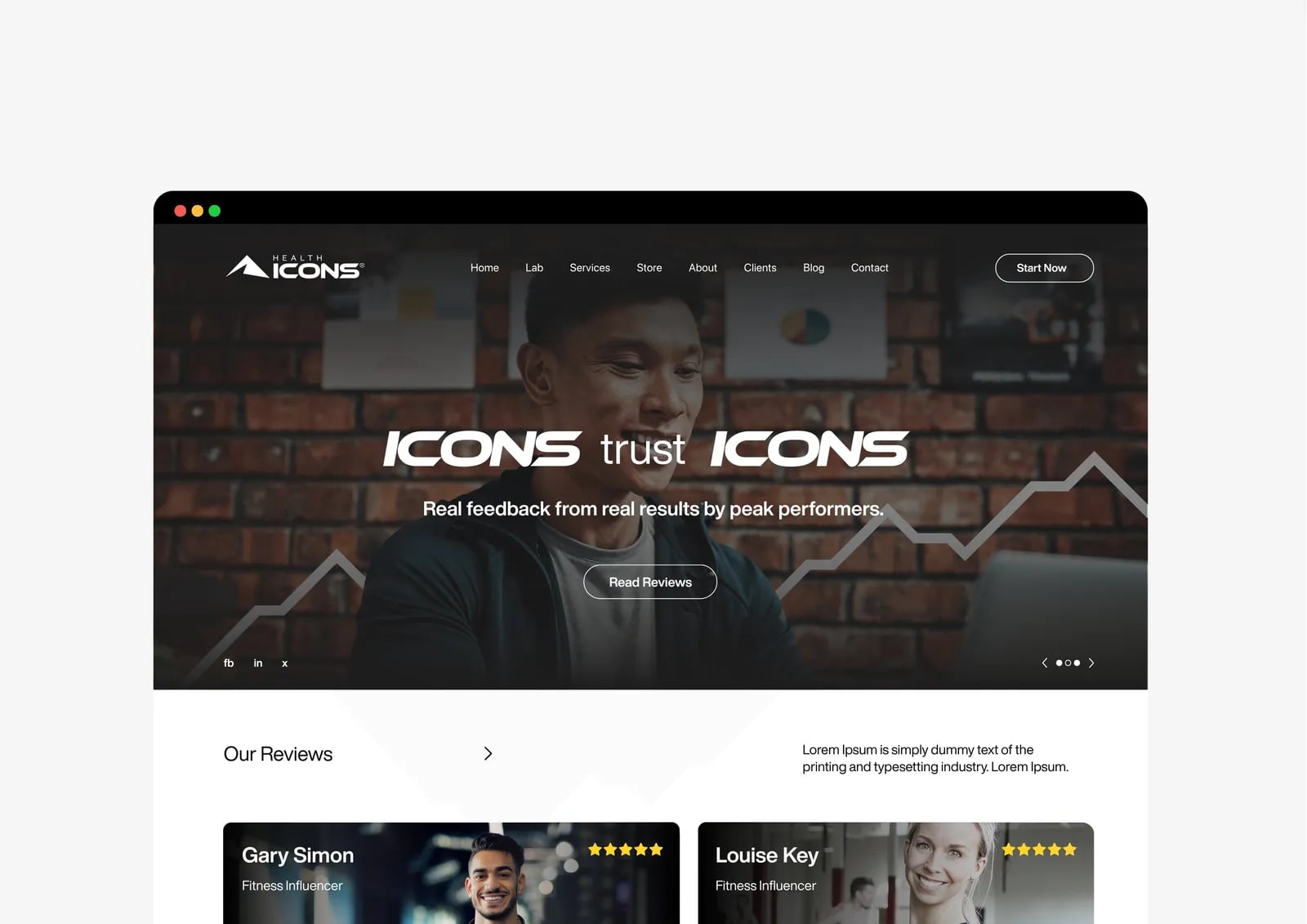
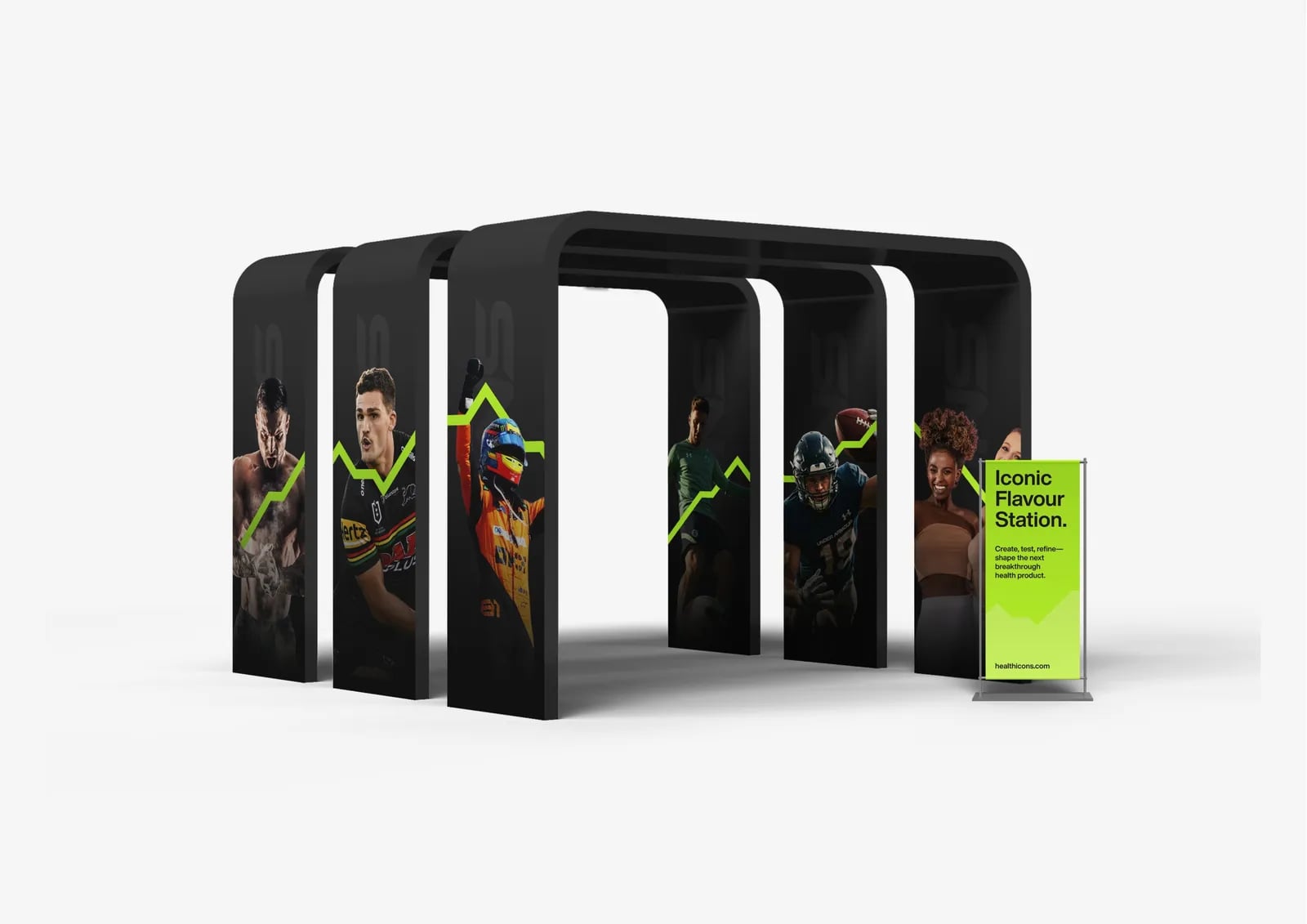
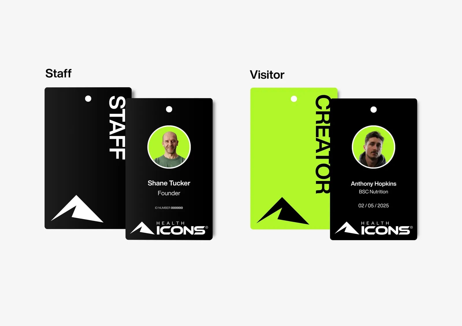
Brand wall, print and digital materials.
03Brand guidelines
Rules that keep the brand consistent everywhere.



Common questions
What did NOIZE do for Health Icons?
Brand strategy, naming, visual identity and brand assets.
When is a refresh not enough?
When the name, position or audience has changed, a full rebuild often works better.
Your first strategy conversation is on us.
Have a chatThe brand for business.