Benzie: a property brand built on trust and guidance
- Client
- Benzie
- Industry
- Arts, Education & Community
- What we did
- Brand strategy, Visual identity, Brand assets
Benzie works in real estate and property.
It wanted to stand apart from agencies that feel transactional and impersonal.
The short version
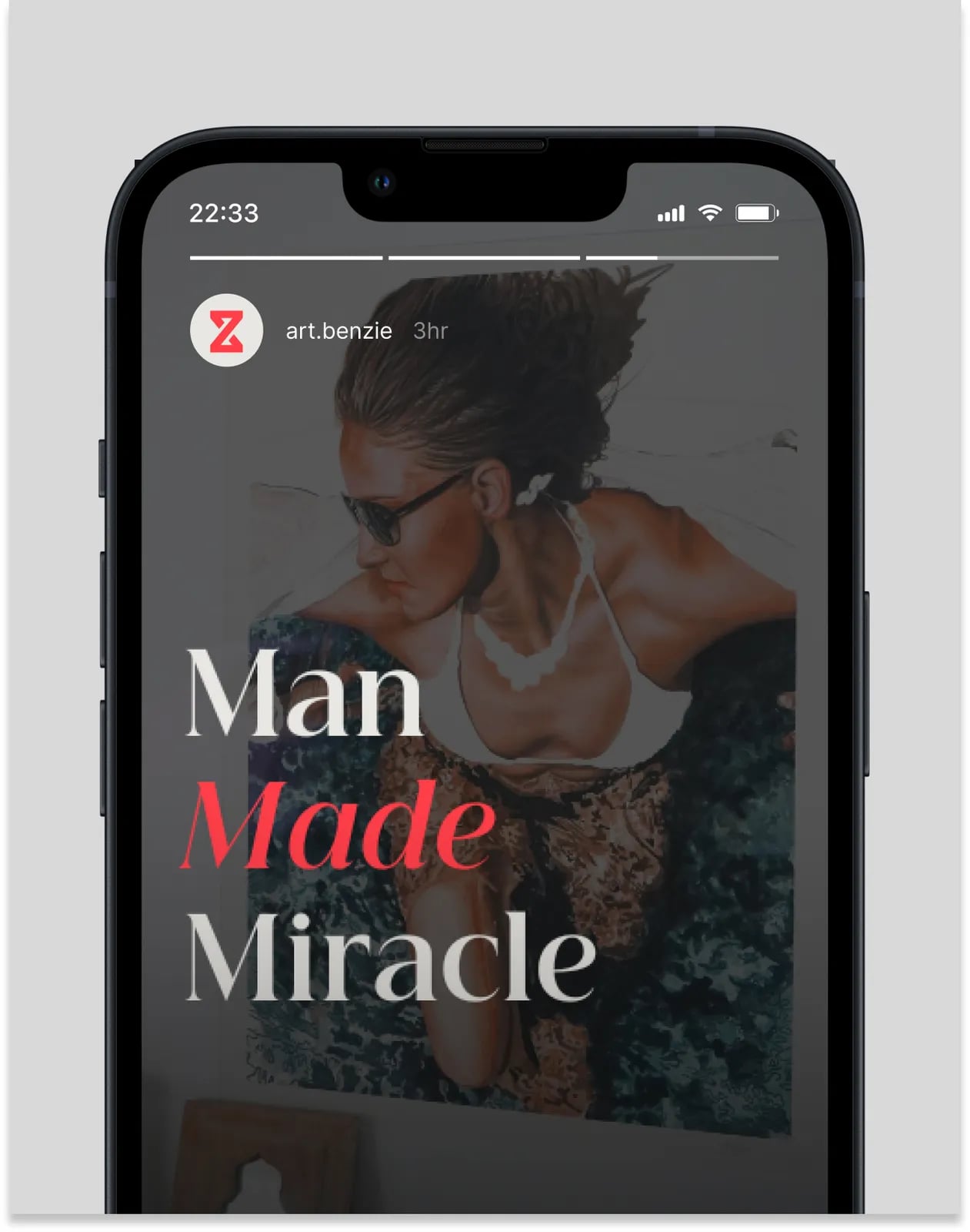
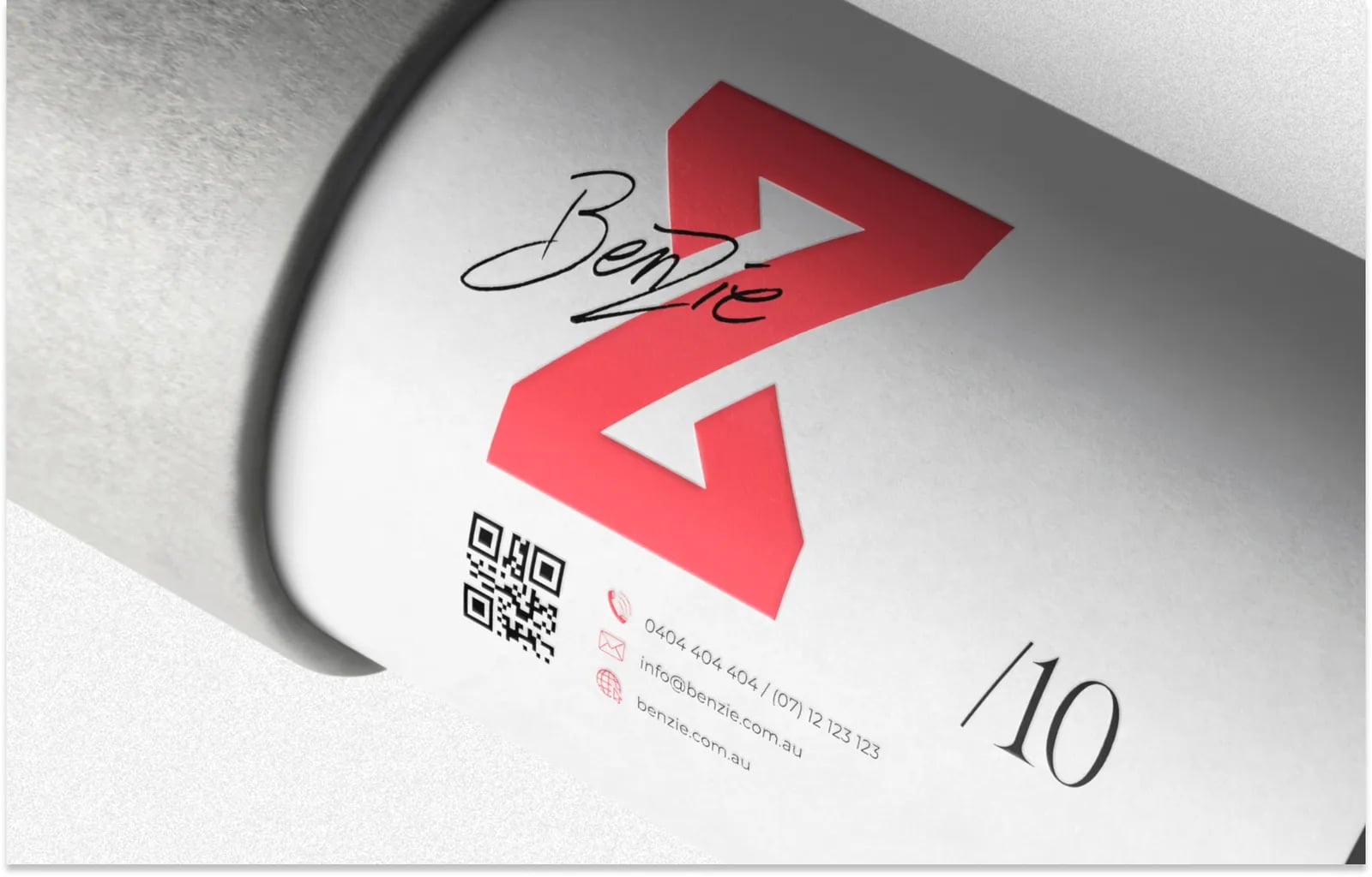
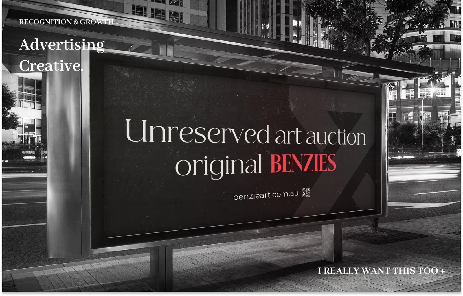
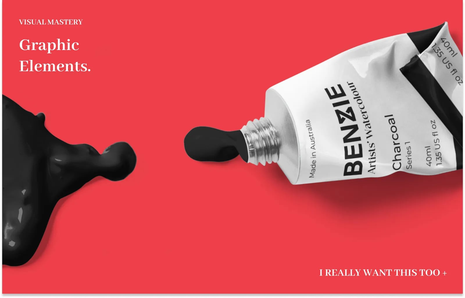
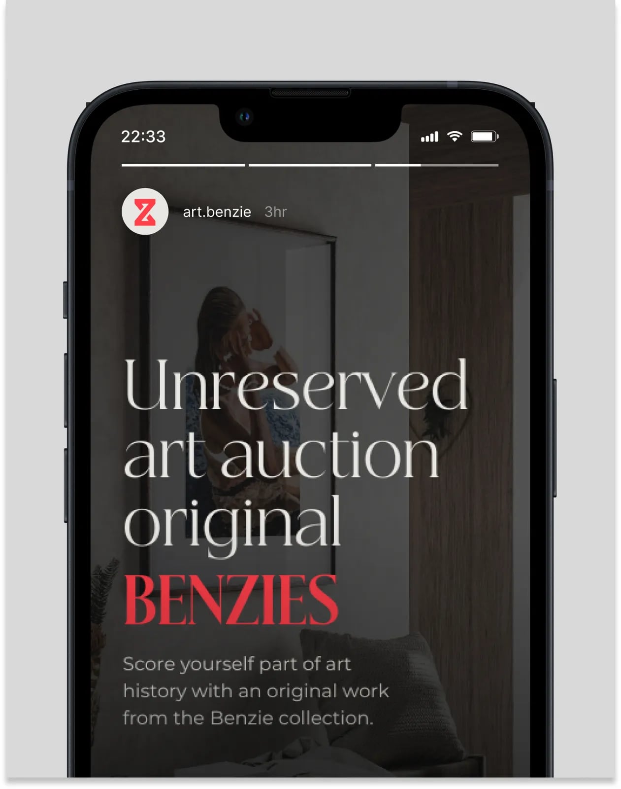
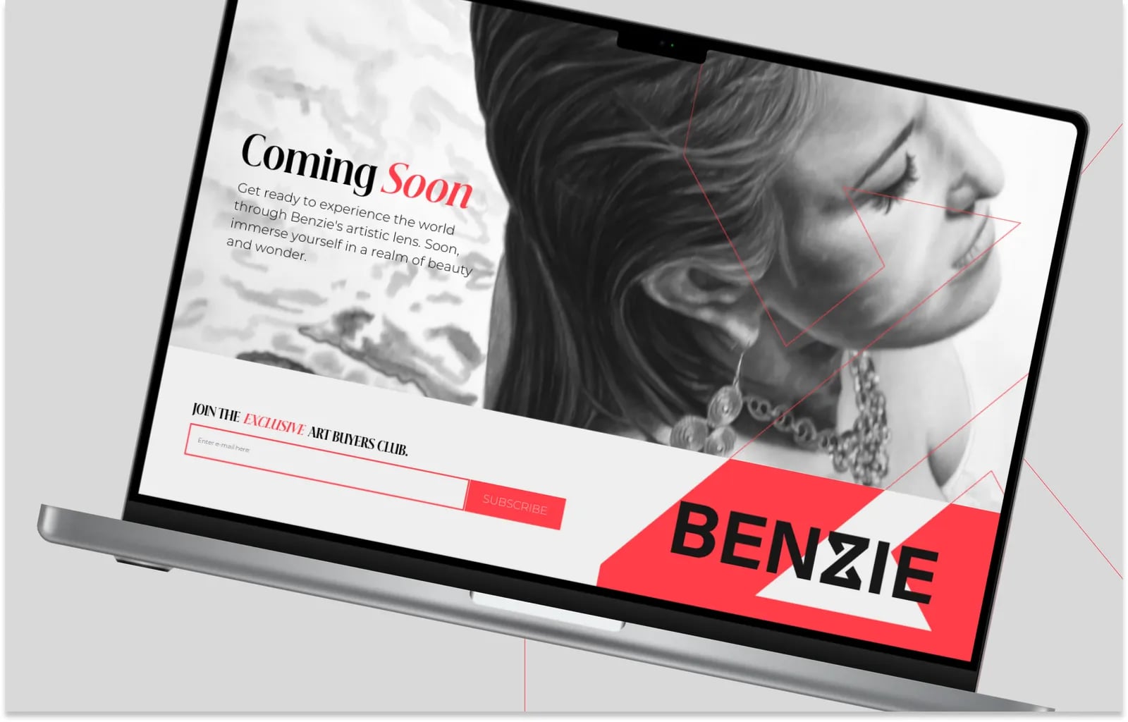
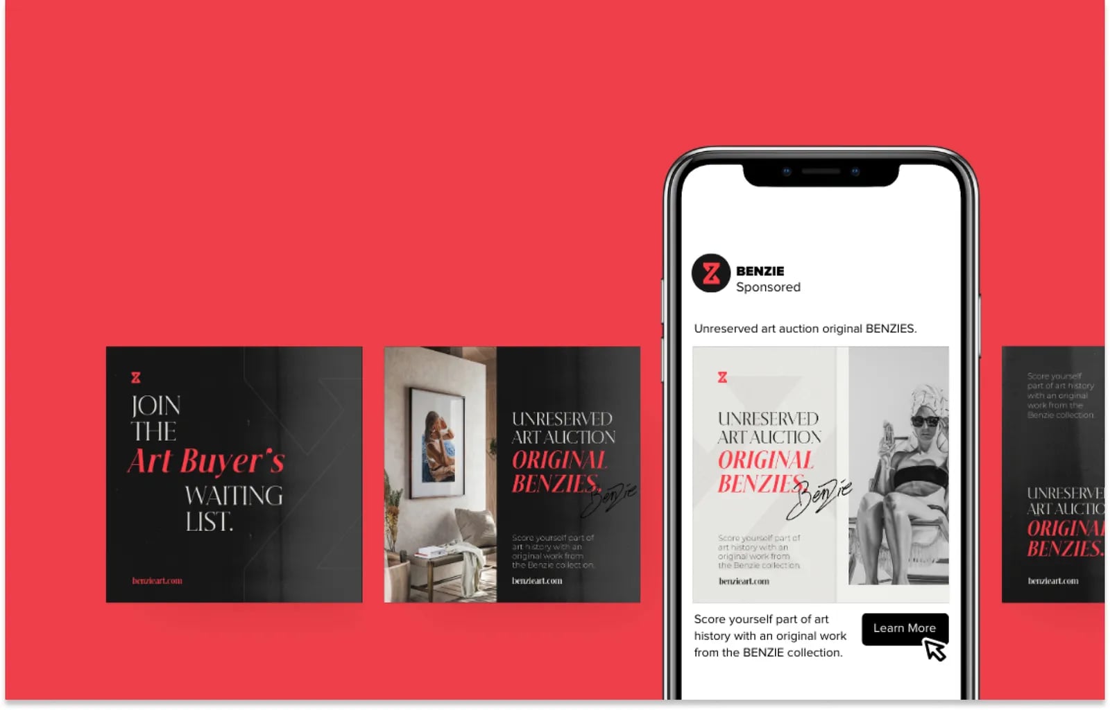
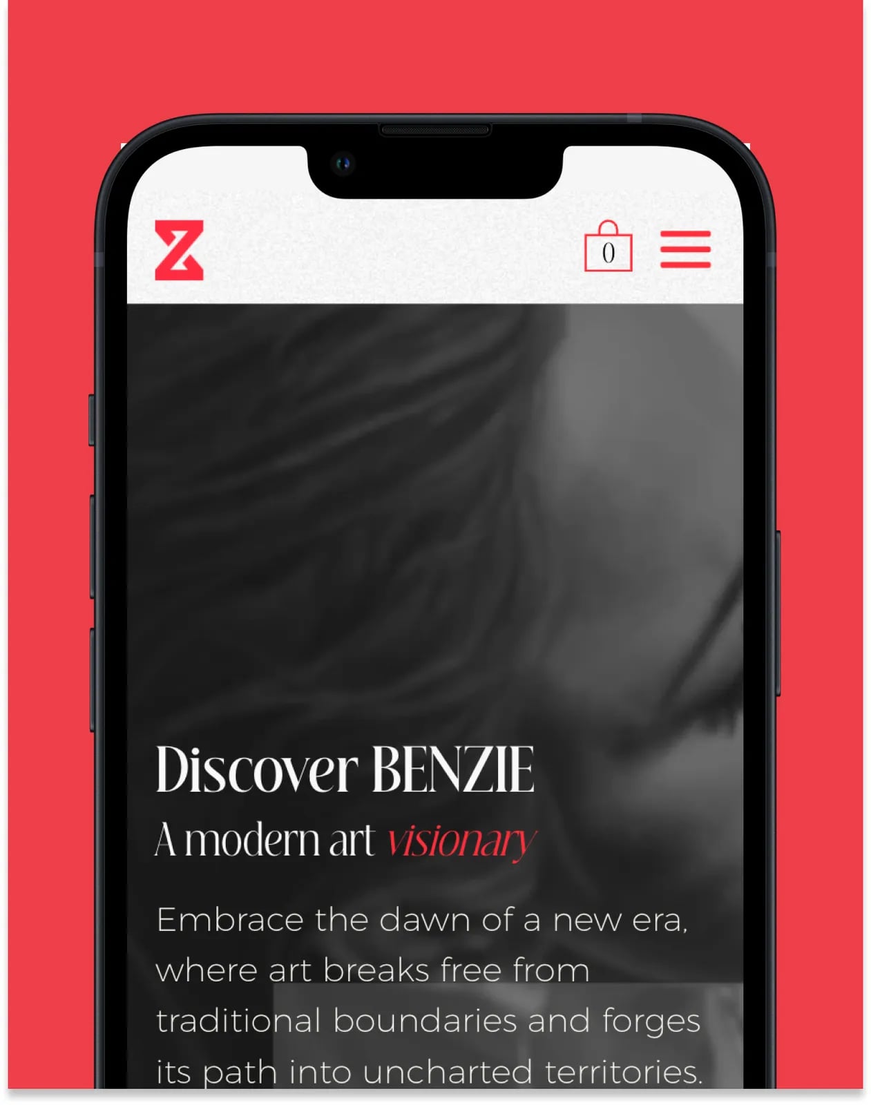
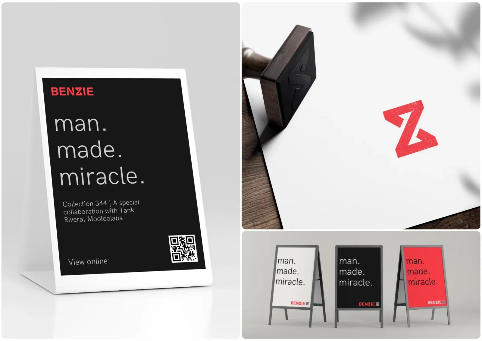
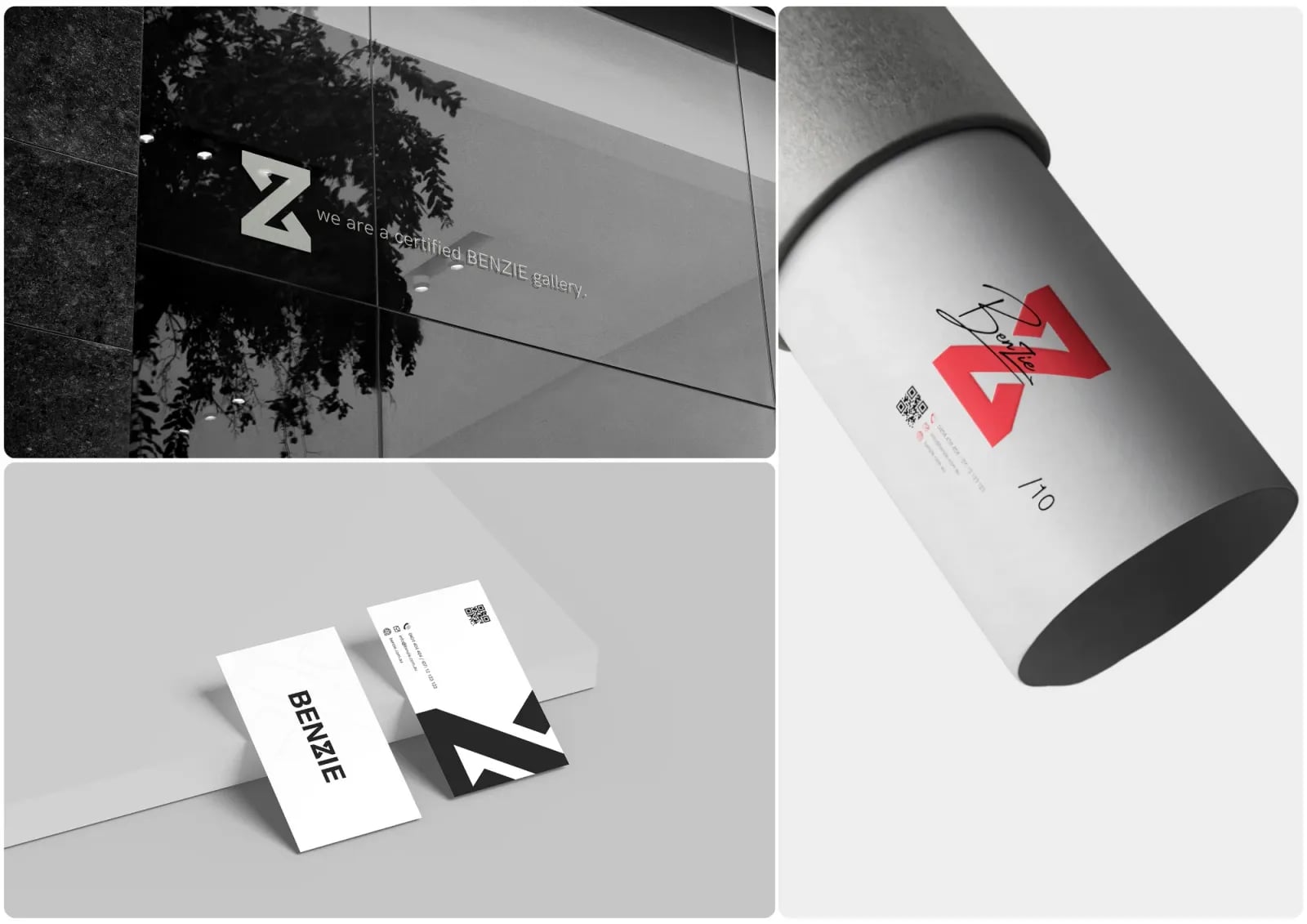
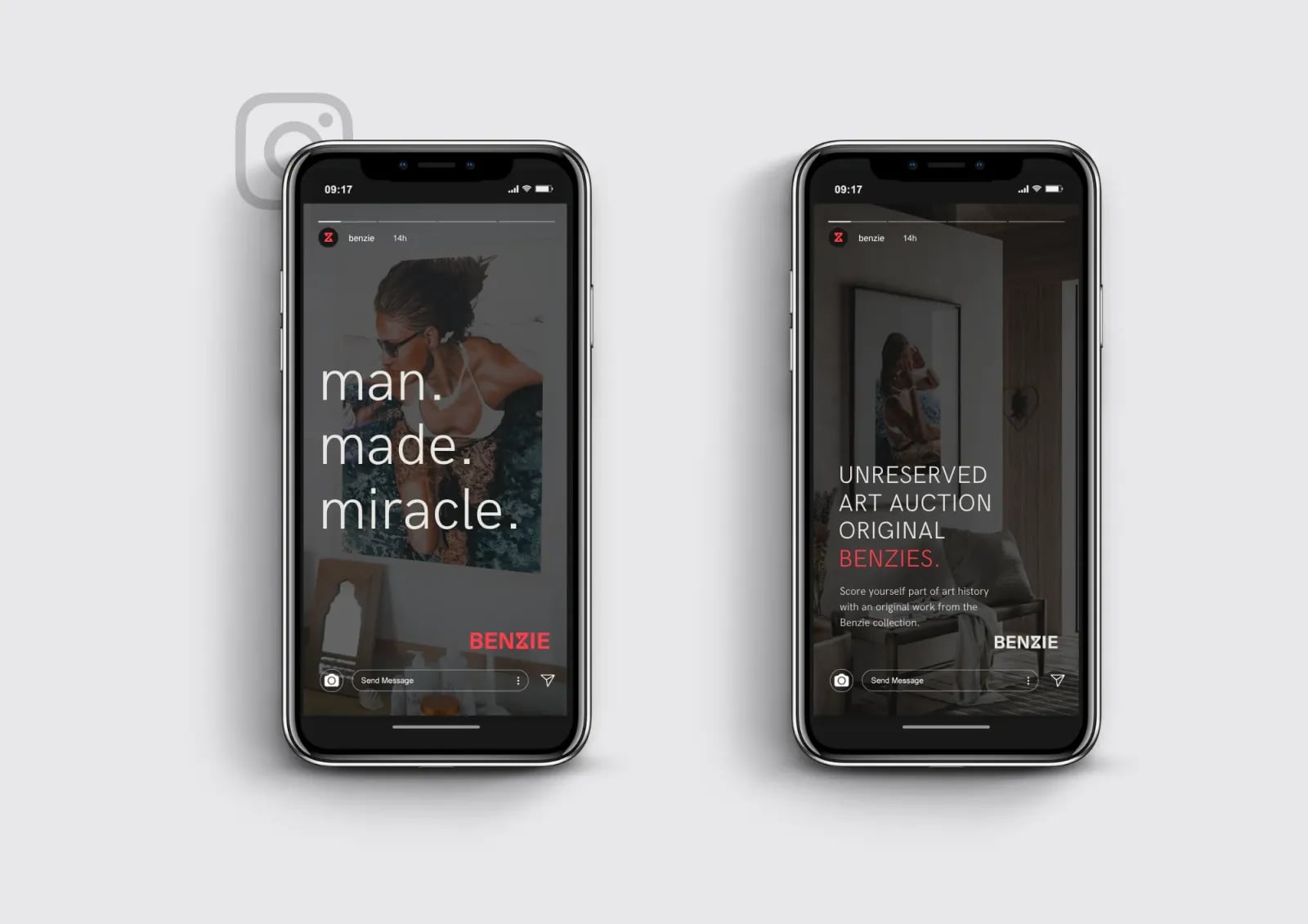
NOIZE positioned Benzie as a trusted adviser rather than just a service provider. The identity uses deep charcoal and muted gold instead of the usual property blues and greens. A full set of brand assets carries it across listings, print and digital.
The brief
Real estate is crowded and often feels like a numbers game. Benzie wanted a brand that showed partnership, clear advice and a smoother experience.
The approach
01Guide, don't sell
The strategy positions Benzie as a partner in big life decisions.
02Calm expertise
A voice that is confident and approachable.
03Avoid the clichés
Charcoal and muted gold instead of the usual property colours.
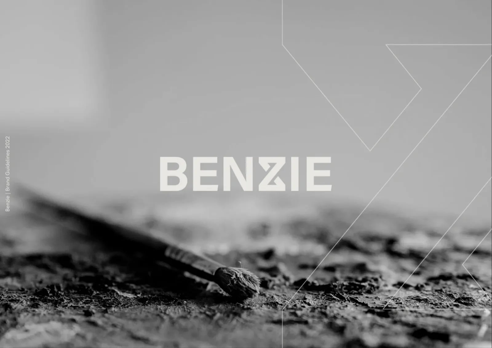
What we built
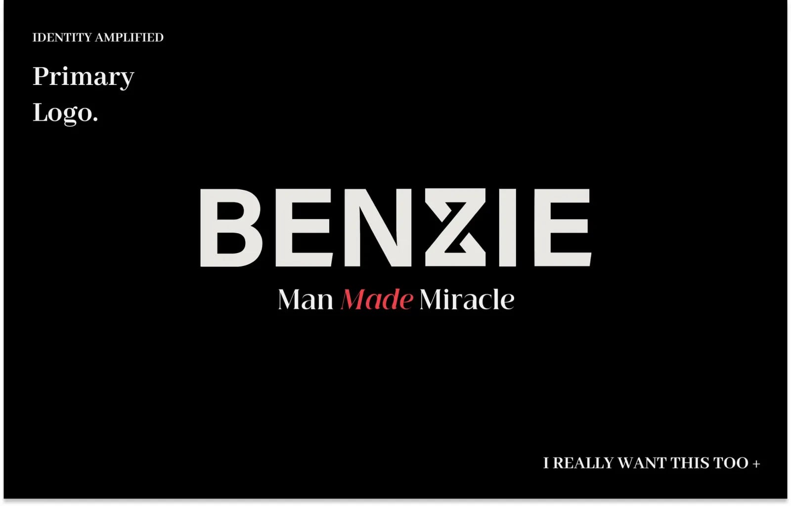
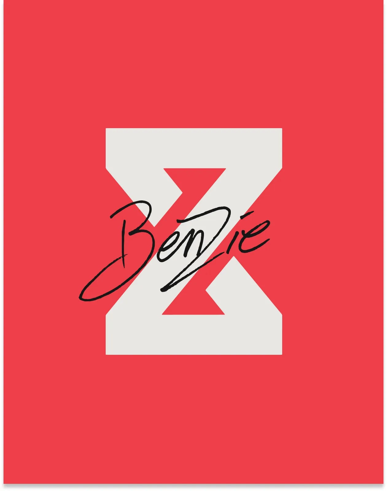
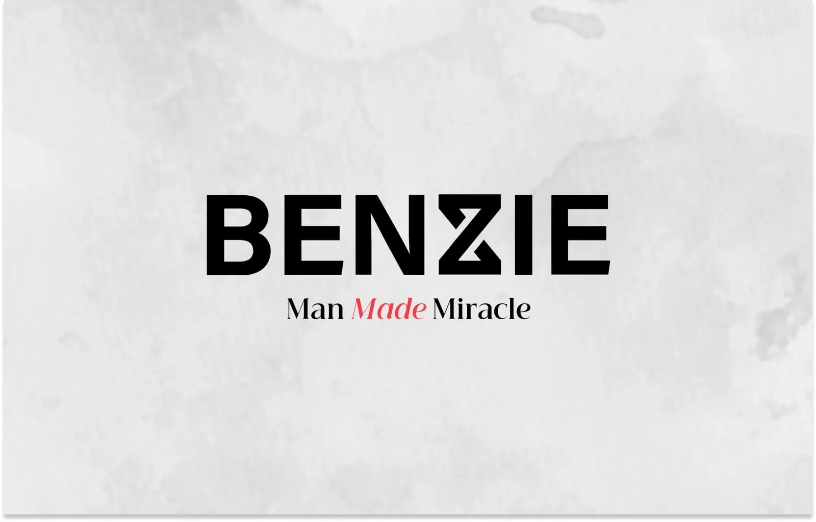
01A new identity
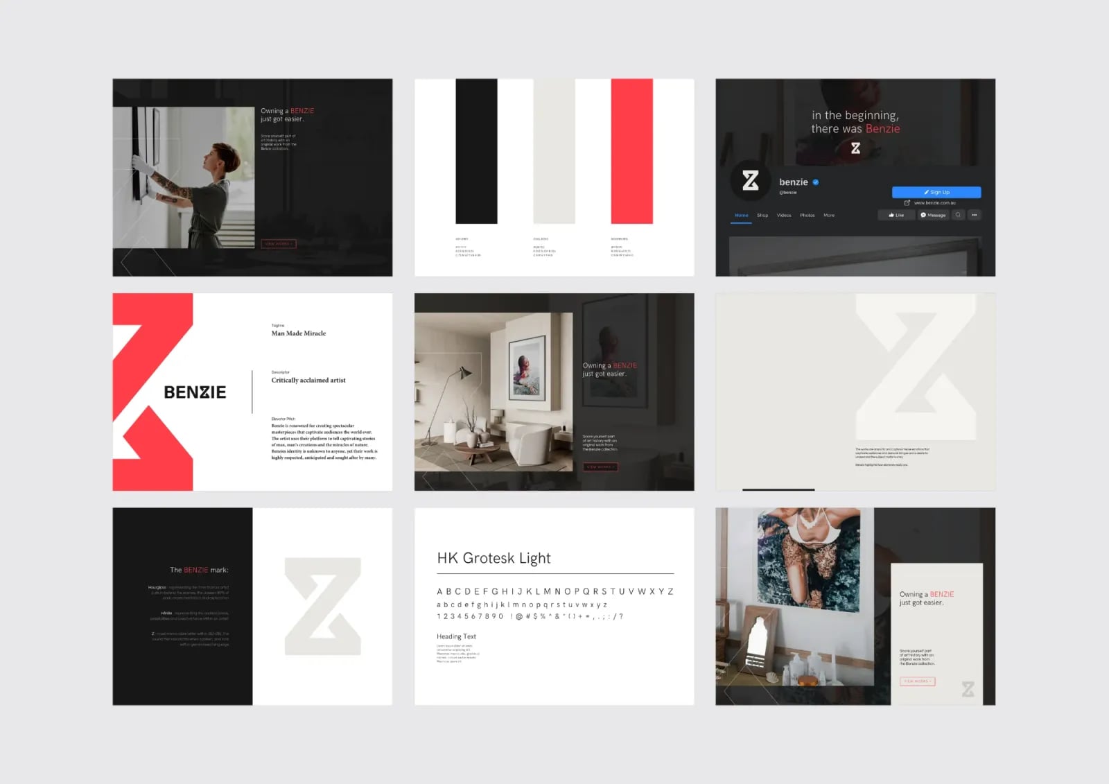
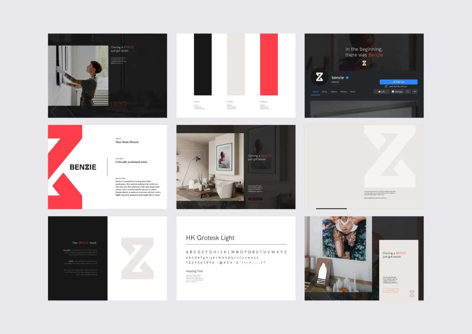
A refined logo with a charcoal and gold palette.
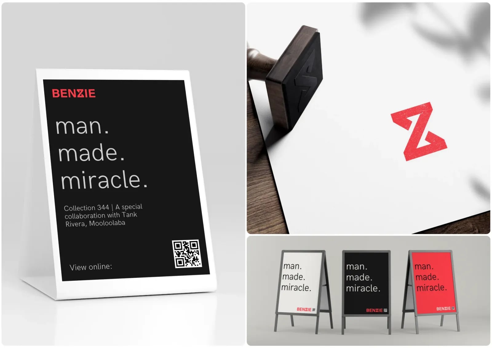
02Brand assets
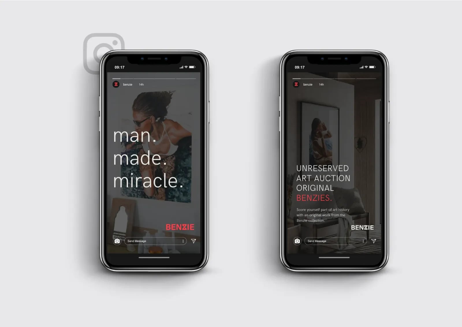
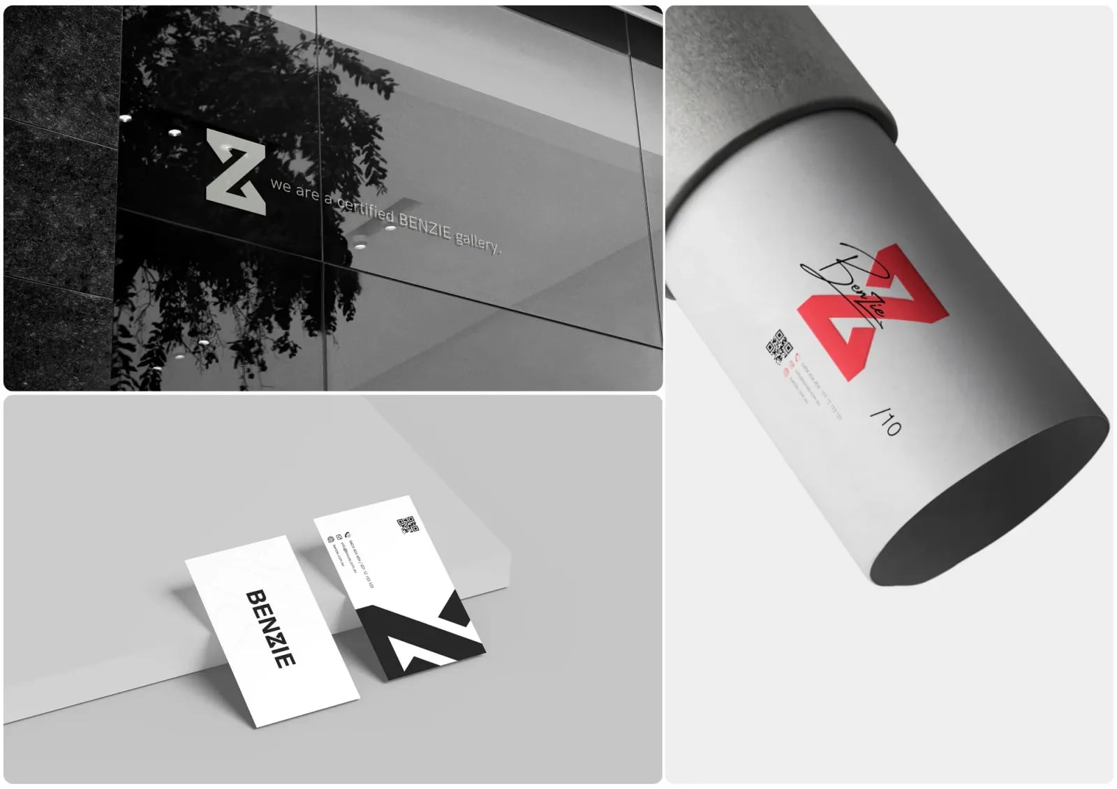
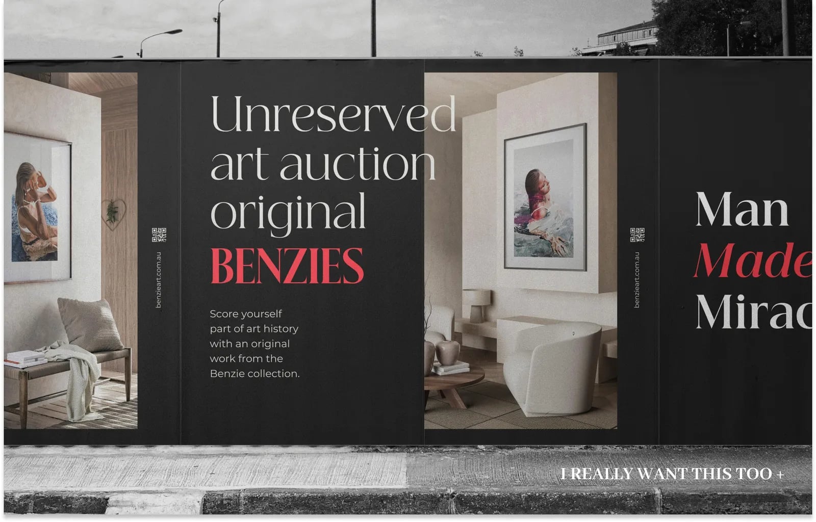
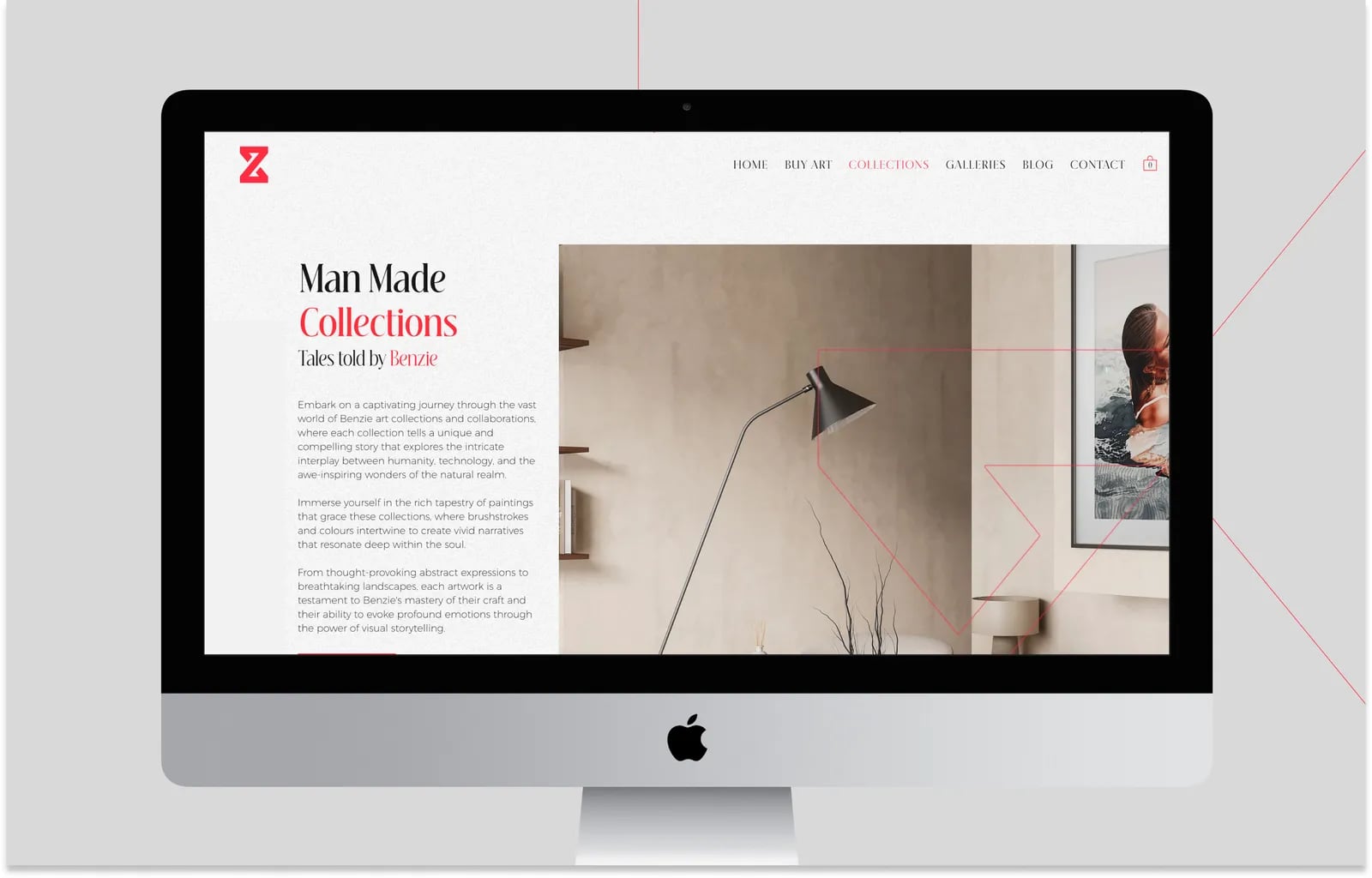
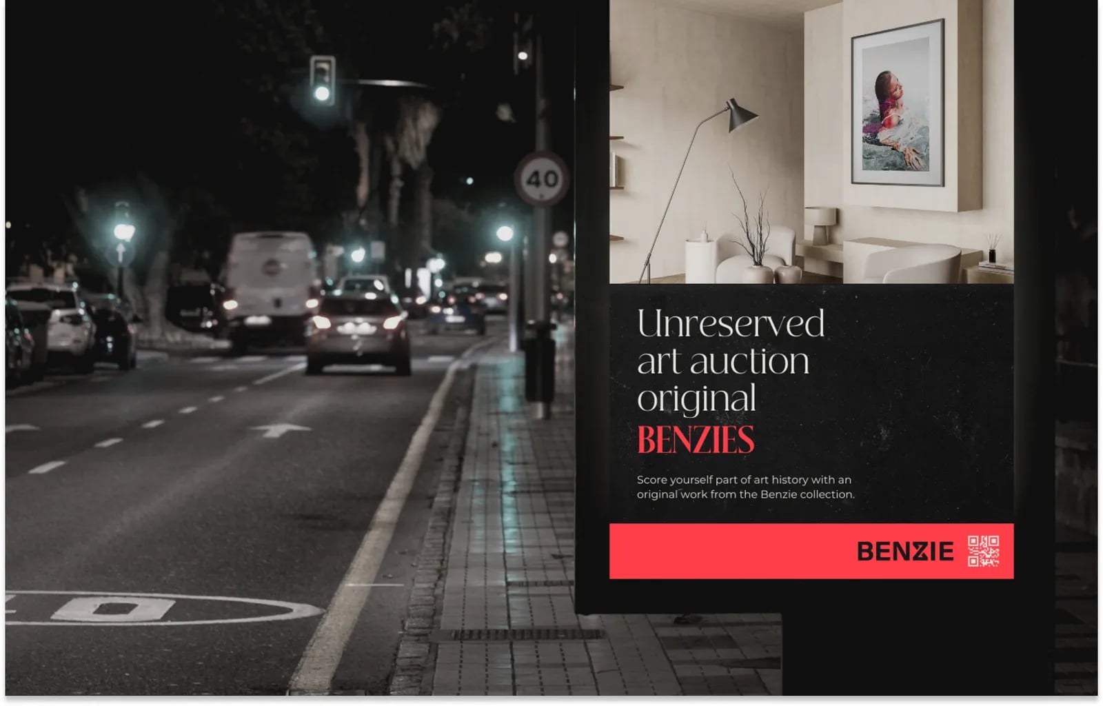
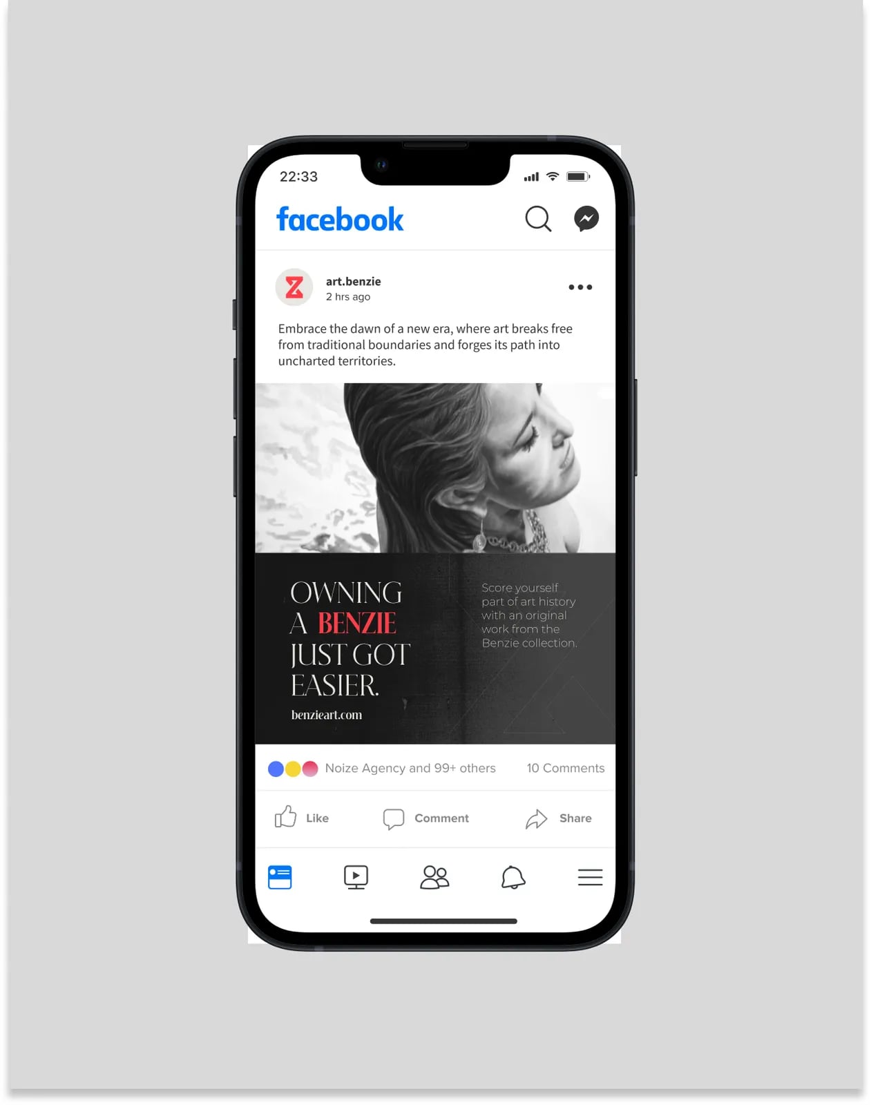
Listing templates, stationery and digital assets.
03Brand guidelines
Rules for consistent use.





Common questions
What did NOIZE do for Benzie?
Brand strategy, a visual identity and brand assets.
Why avoid blue for a property brand?
Most agencies use it. A different palette helps Benzie stand out.
What makes a real estate brand trusted?
Consistency, clear advice and a brand that feels like a partner, not a salesperson.
Your first strategy conversation is on us.
Have a chatThe brand for business.