How a Simple Bottle Made This Vodka Absolut-ely Iconic
The Crowded Market Problem
In 1980, Absolut vodka found itself competing against established big-name brands with no real differentiation. The vodka itself was good, but so was everyone else's.
Instead of focusing on the liquid, they focused on the container.
The Strategy
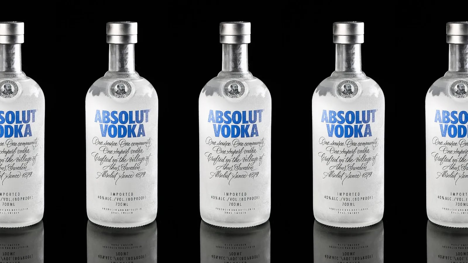
Absolut's bottle was sleek, clear, and minimalist, inspired by 18th-century Swedish medicine bottles. Their ad campaign didn't try to convince you the vodka was better. It showed the bottle in various creative, artistic contexts, making it the star.
The ads were clever, consistent, and visually striking. The bottle appeared in every situation imaginable, from high fashion to pop art to holiday themes, always unmistakably Absolut.
By turning the bottle into a symbol, Absolut didn't just stand out, they became synonymous with premium vodka.
The Results
Absolut went from an unknown Swedish brand to a global phenomenon. People began recognising Absolut by the bottle alone, a symbol of style and quality that required no explanation.
The campaign ran for 25 years and produced over 1,500 different executions. All featuring the same bottle.
The Lesson
Sometimes, the way your product looks is as important as the product itself.
- Is your product's packaging distinctive enough to stand out on its own?
- How can you use design to create a visual identity that customers instantly recognise?
- What packaging element could you turn into your brand's most powerful marketing tool?
Thoughtful, distinctive packaging can be the key to standing out in a crowded market, turning a simple item into an instantly recognisable brand.
Your first strategy conversation is on us.
Have a chatThe brand for business.