How a Hidden Arrow in the FedEx Logo Changed Everything
The Detail Most People Miss
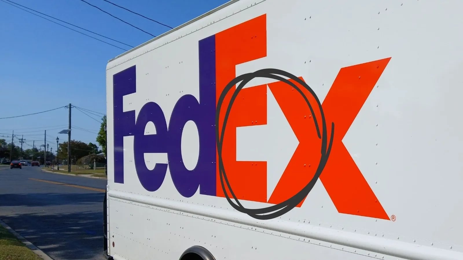
Ever spotted the hidden arrow in the FedEx logo? It sits in the negative space between the "E" and the "x." Subtle, right?
But this little arrow isn't just a clever trick. It's a perfect reflection of FedEx's core brand values: speed and precision.
The Story Behind It
Back in 1994, FedEx was ready to evolve. They wanted a fresh logo that didn't just look good, it had to communicate exactly what they stood for. Designer Lindon Leader created the now-iconic mark, embedding a forward-pointing arrow that speaks to delivery, momentum, and accuracy.
Without shouting, this tiny detail says everything about their promise: we move fast, and we get it right.
The hidden arrow became a talking point. People who noticed it felt like they were in on a secret, and that kind of brand engagement is priceless.
Why Design Details Matter
The FedEx arrow is a masterclass in purposeful design. Every element of your brand identity, logo, colour, typography, layout, communicates something. The question is whether it's communicating what you intend.
The Lesson
The smallest details can carry the biggest messages.
- What subtle elements in your logo or design could better communicate your brand's promise?
- Are there hidden opportunities in your branding that could strengthen your message?
- What design choice could you make today that would leave a lasting impression?
Thoughtful design isn't just about aesthetics. It's about alignment between what you say and what you show.
Your first strategy conversation is on us.
Have a chatThe brand for business.