Sophor: a clear identity for a technology business
- Client
- Sophor
- Industry
- Technology & Security
- What we did
- Brand strategy, Visual identity, Brand guidelines, Brand assets
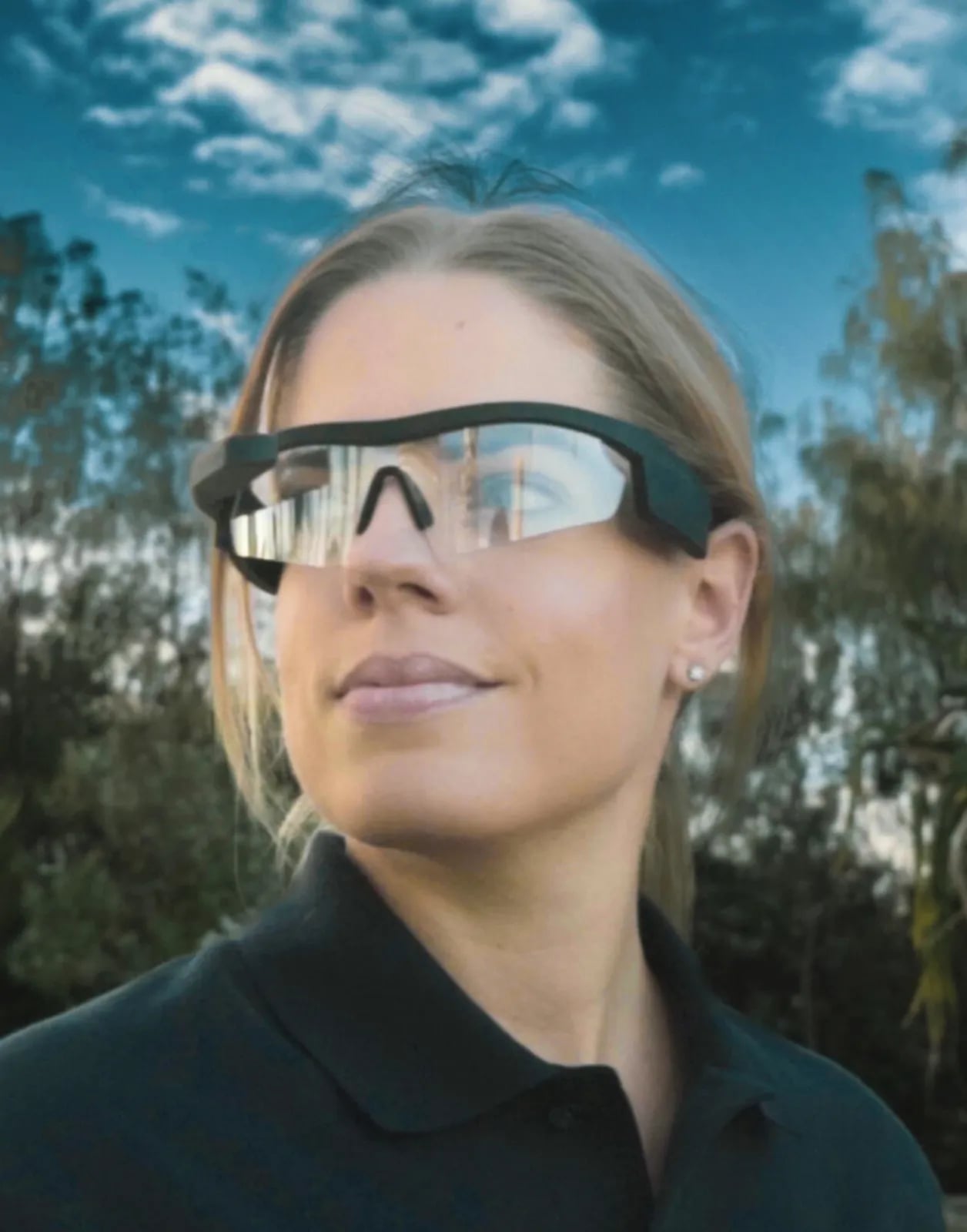
Sophor is a technology and software business. Its products were strong, but its brand didn't show it.
In a crowded industry, it needed an identity that made its thinking easy to see.
The short version
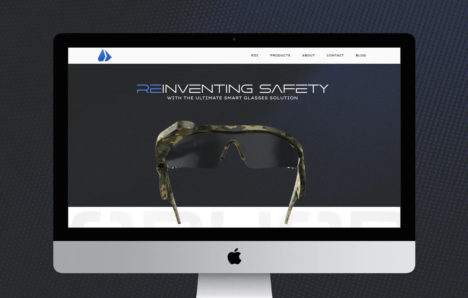
NOIZE built Sophor a modern brand identity based on intelligence, reliability and a focus on the user. We started with research into the market and competitors, then designed the logo and visual system, and finished with brand guidelines and assets so every team member presents Sophor the same way.
The brief
Sophor had no consistent brand. Its look didn't match the quality of its solutions, which made it harder to stand out against competitors with bigger names.
The approach
01Research first
We looked at Sophor's values, capabilities and goals, and studied the market, competitors and audience.
02Smart and human
The positioning balances technical strength with a focus on the people who use the product.
03Built to last
The identity was designed to feel modern without chasing trends.
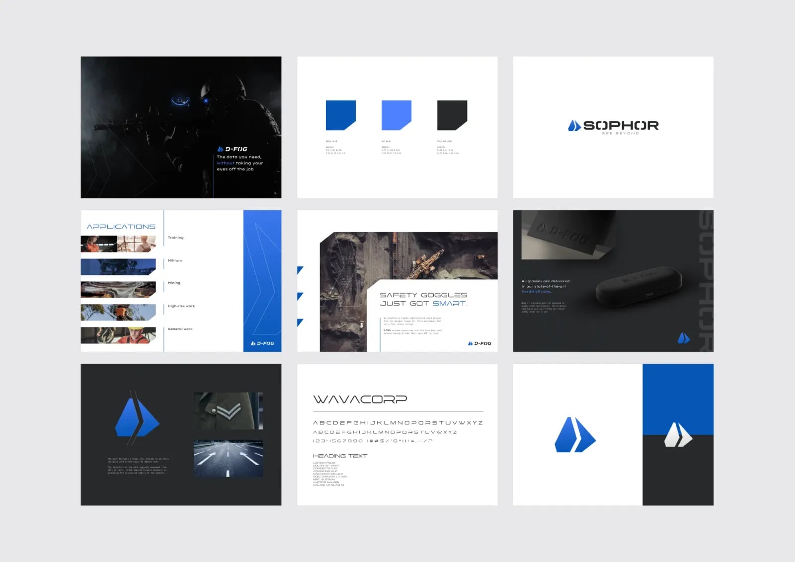
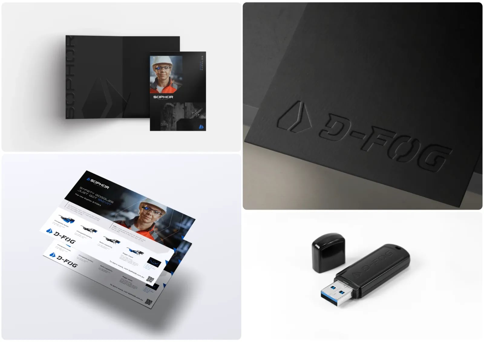
What we built
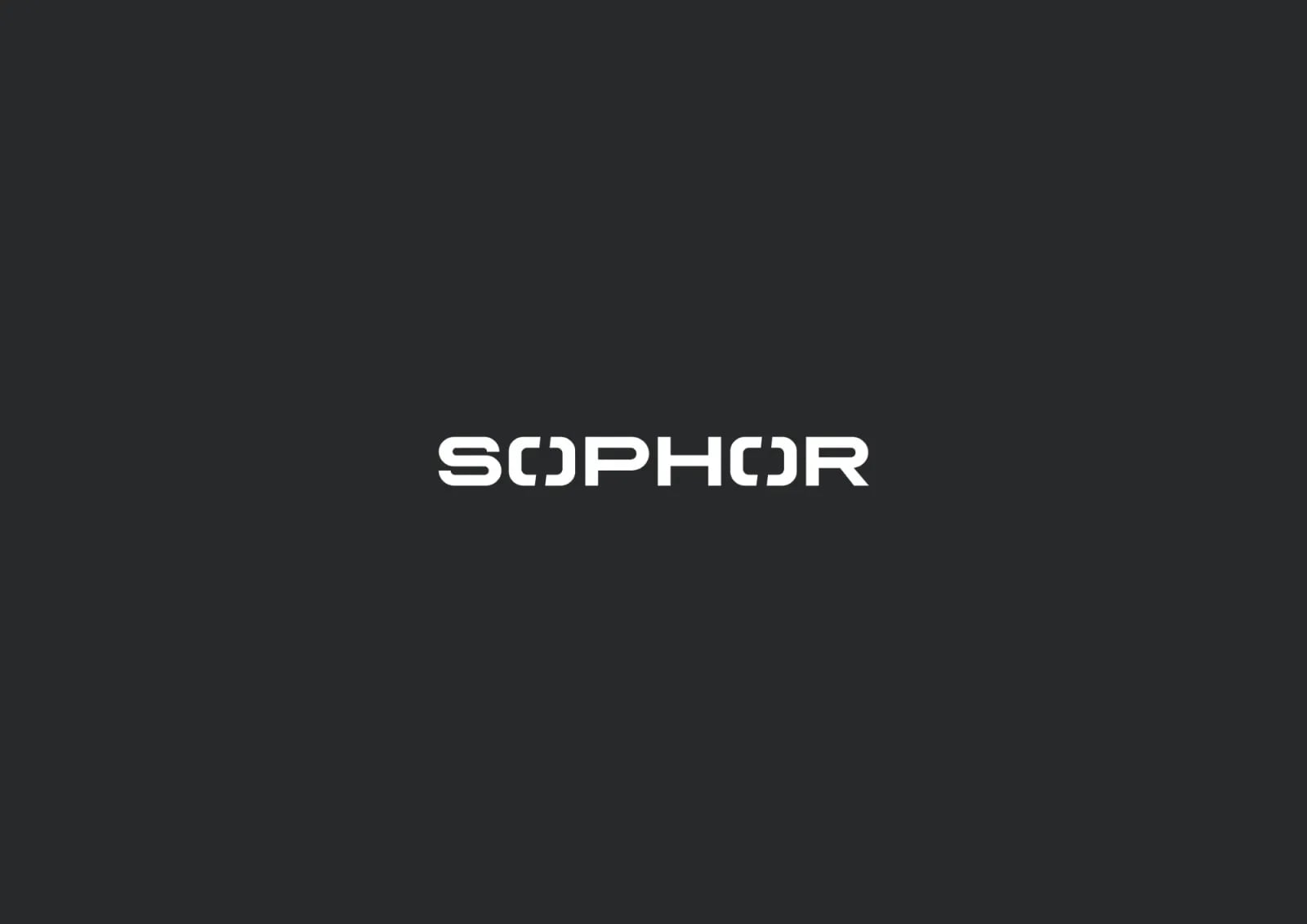
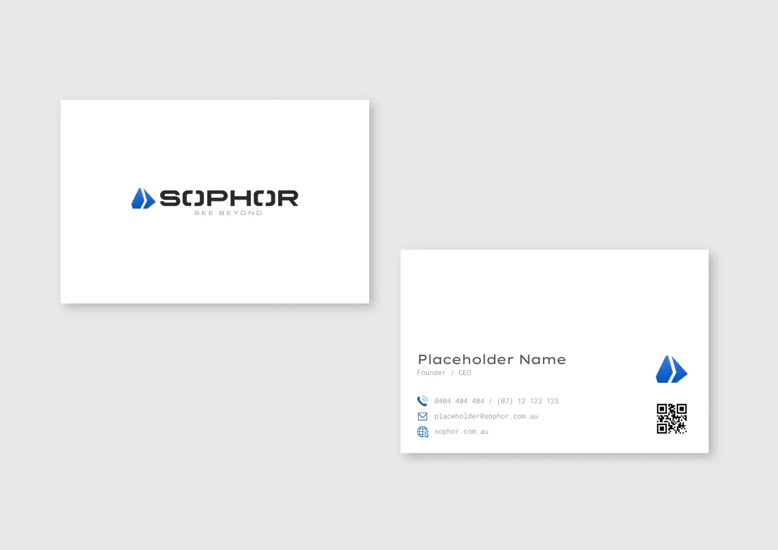
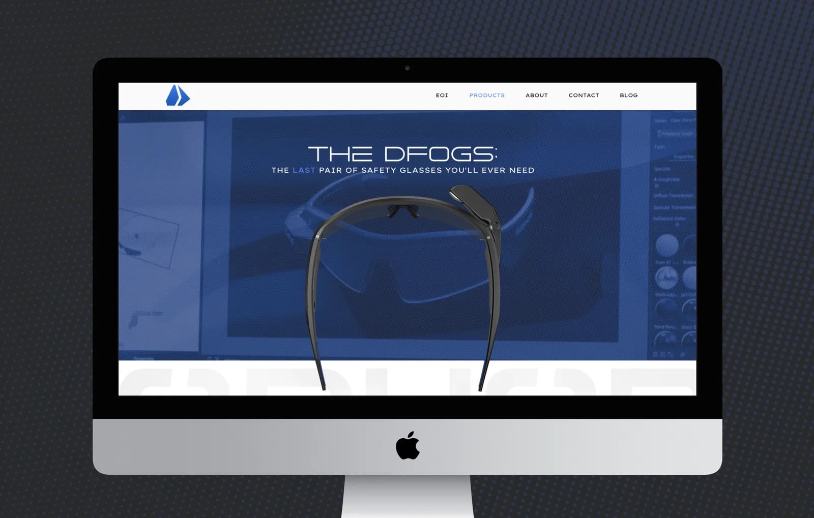
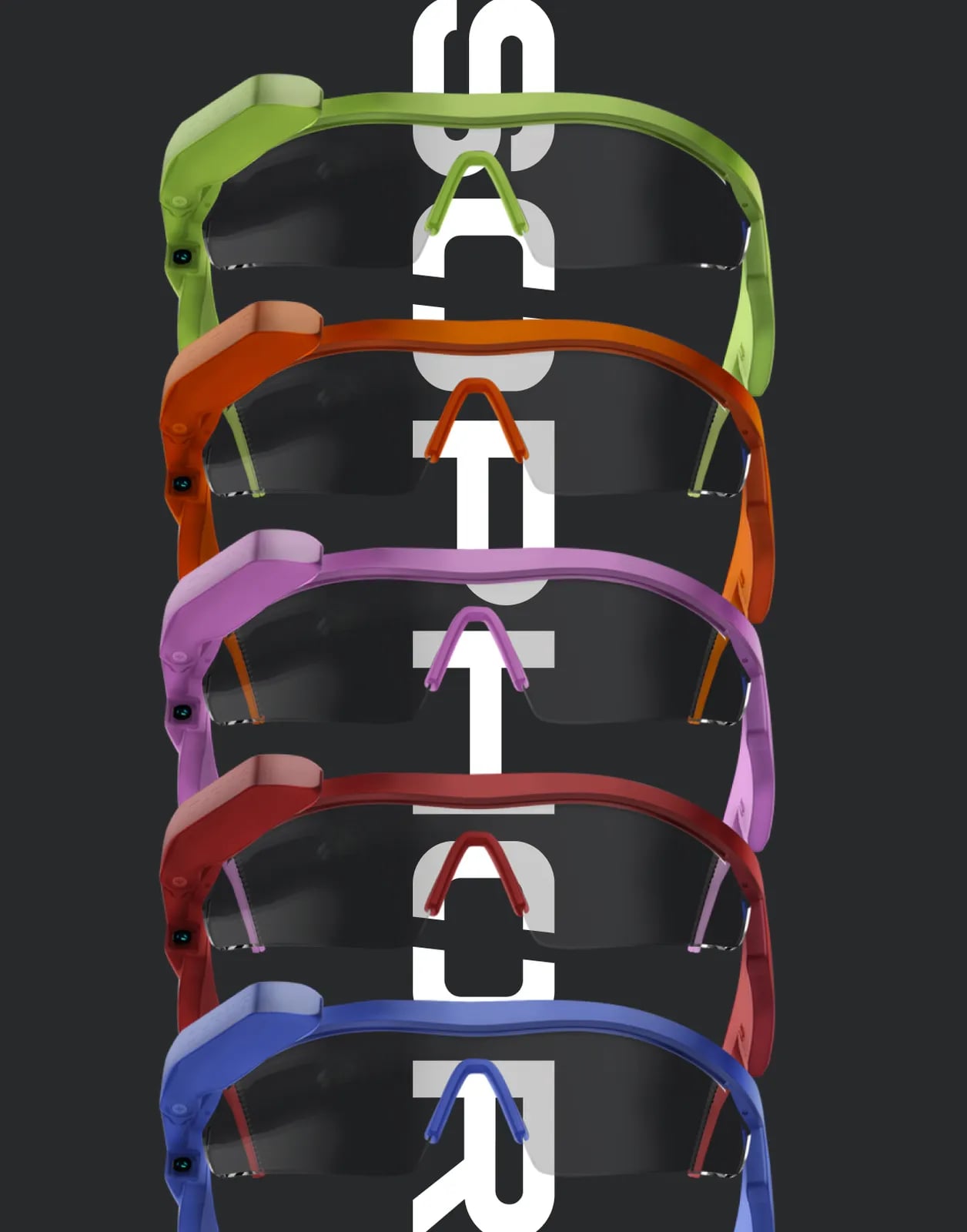
01A new identity
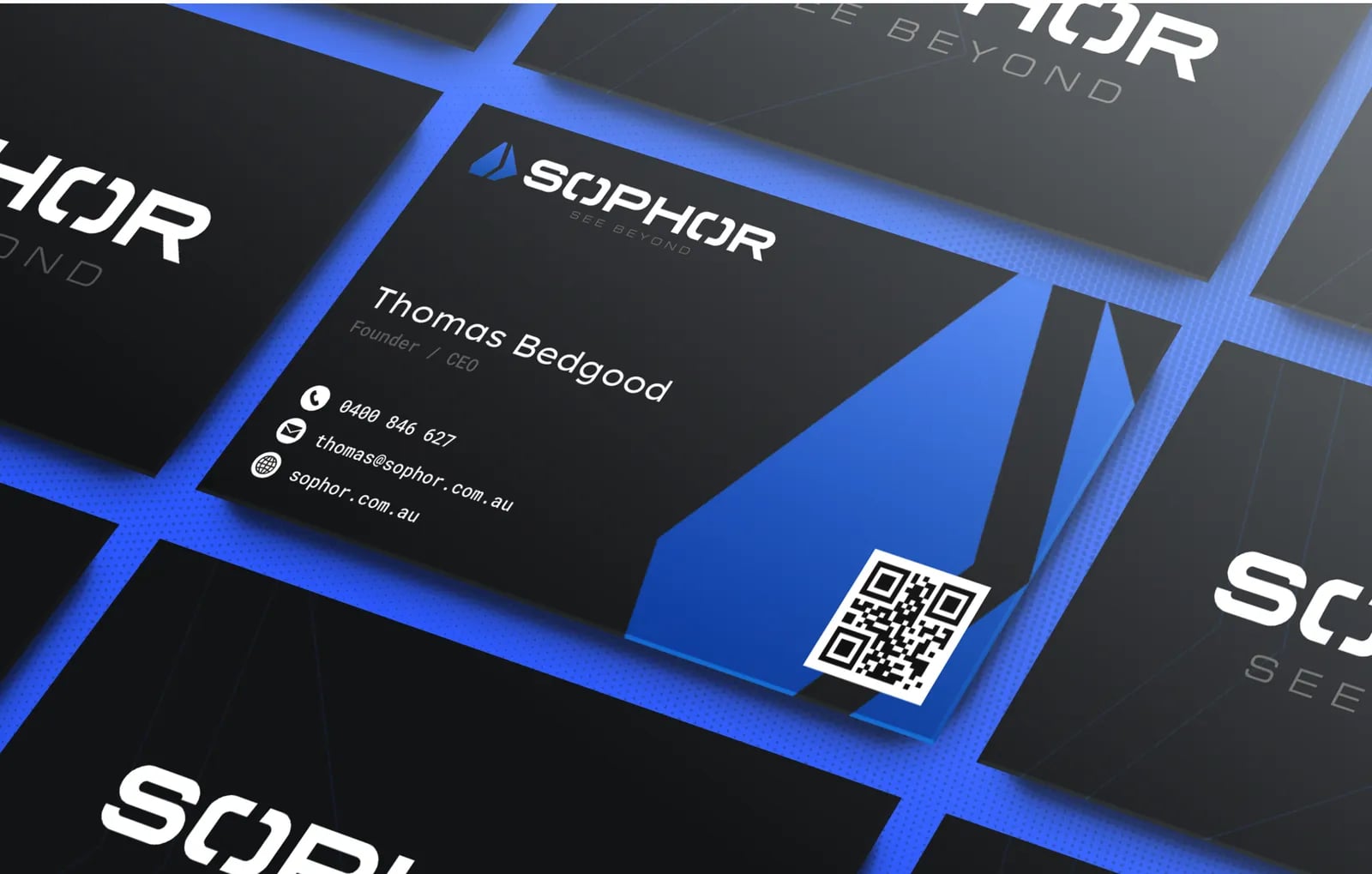
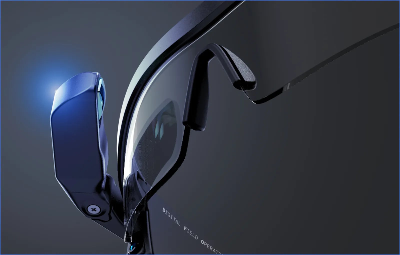
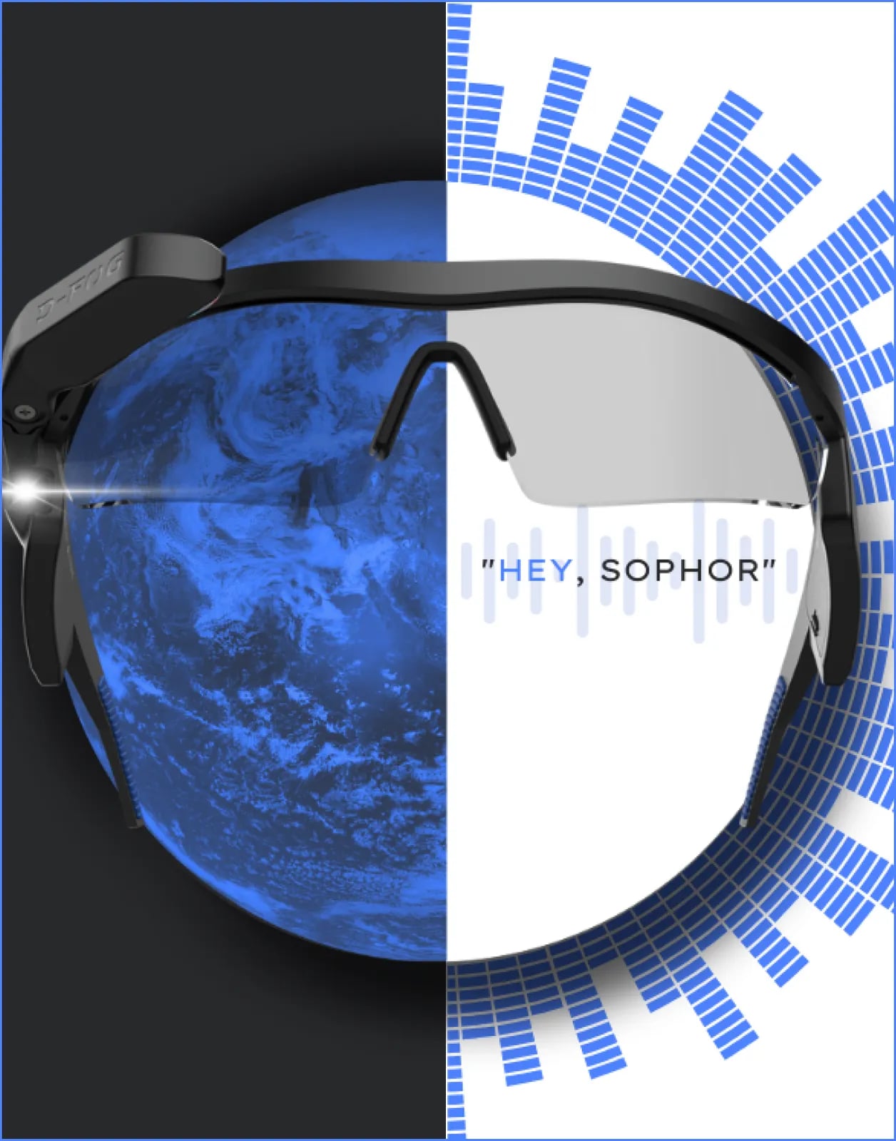
A modern logo, colour palette and type system.
02Brand guidelines
A rulebook for visual and written communication.
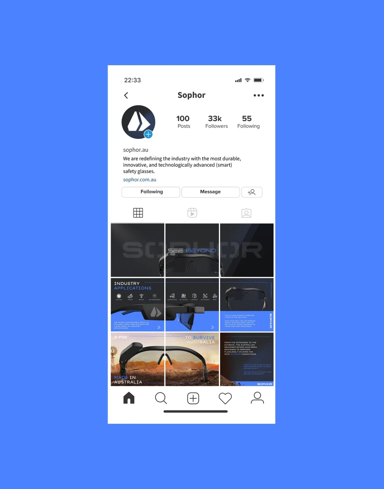
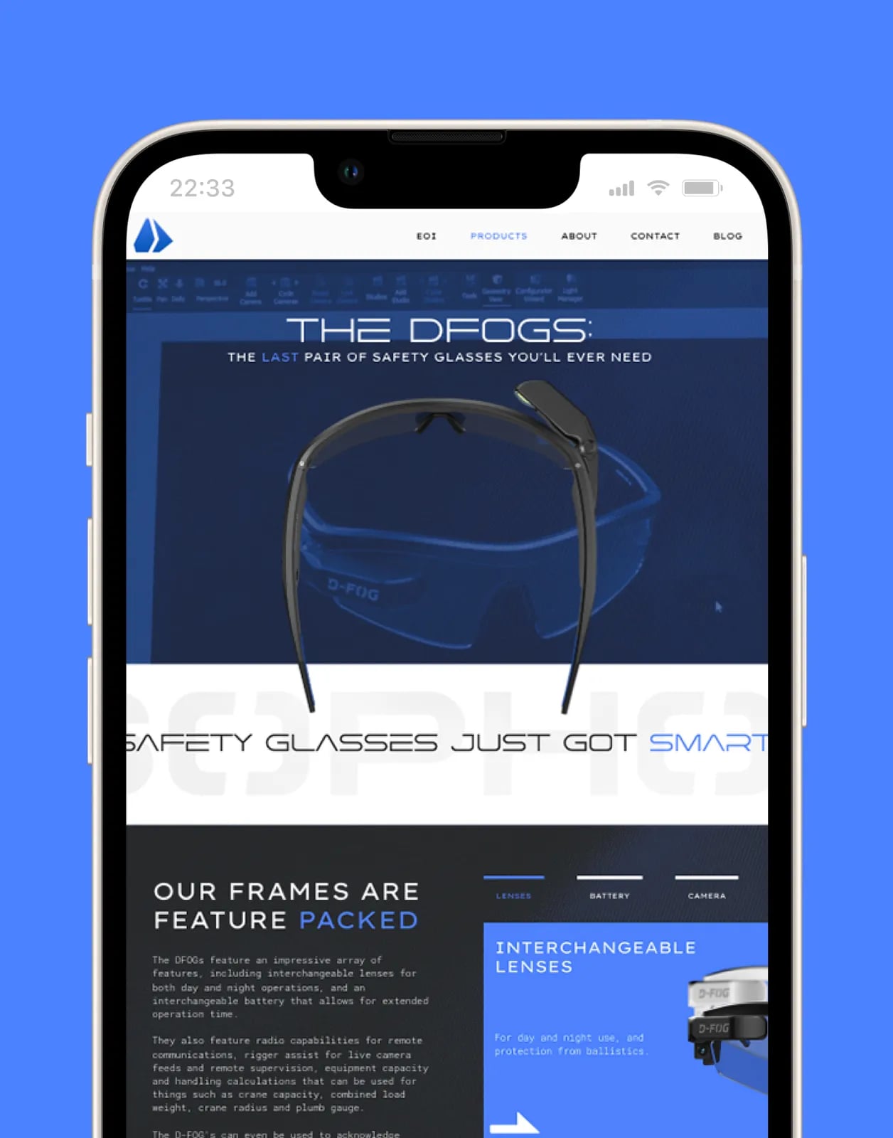
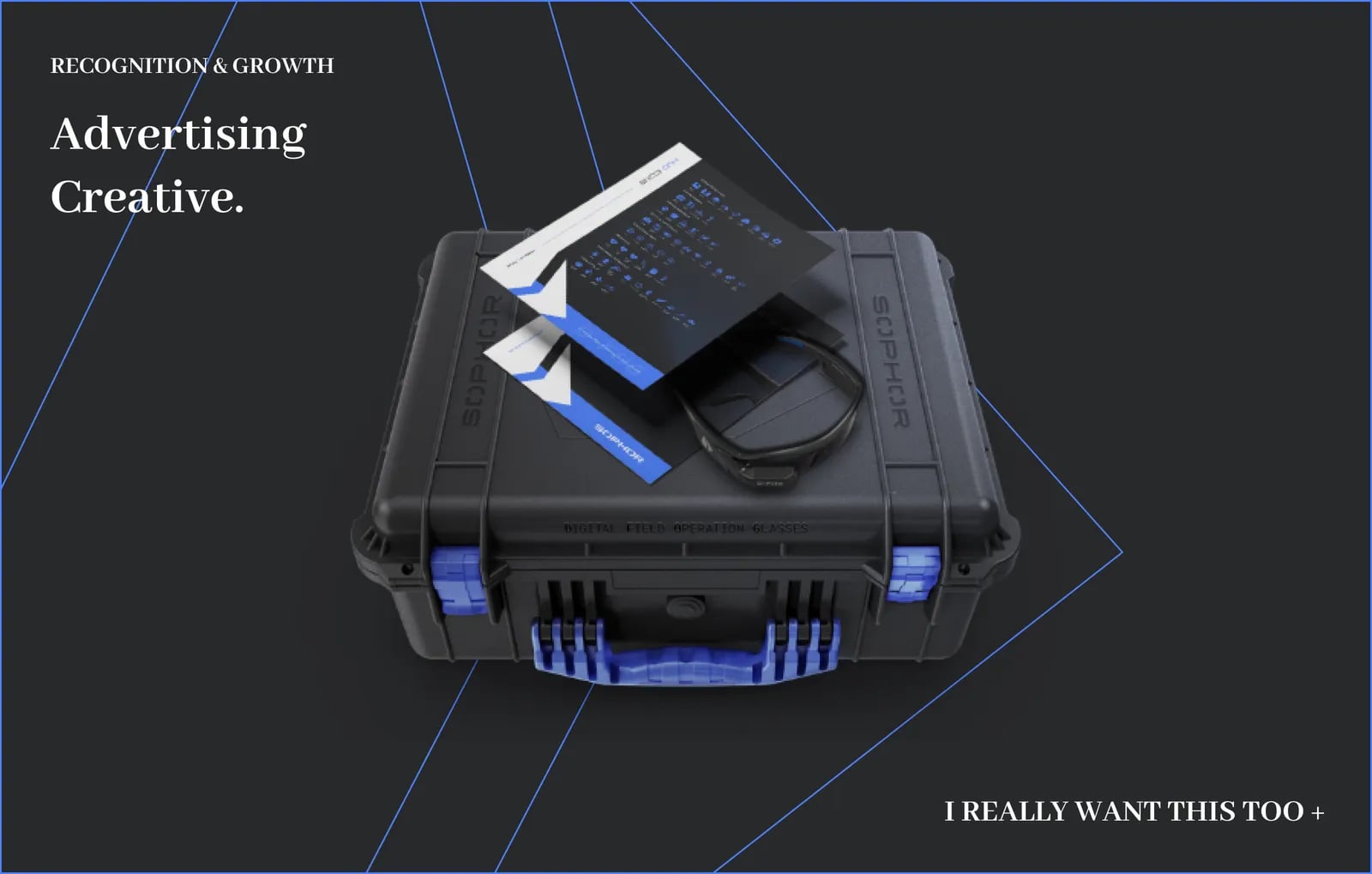
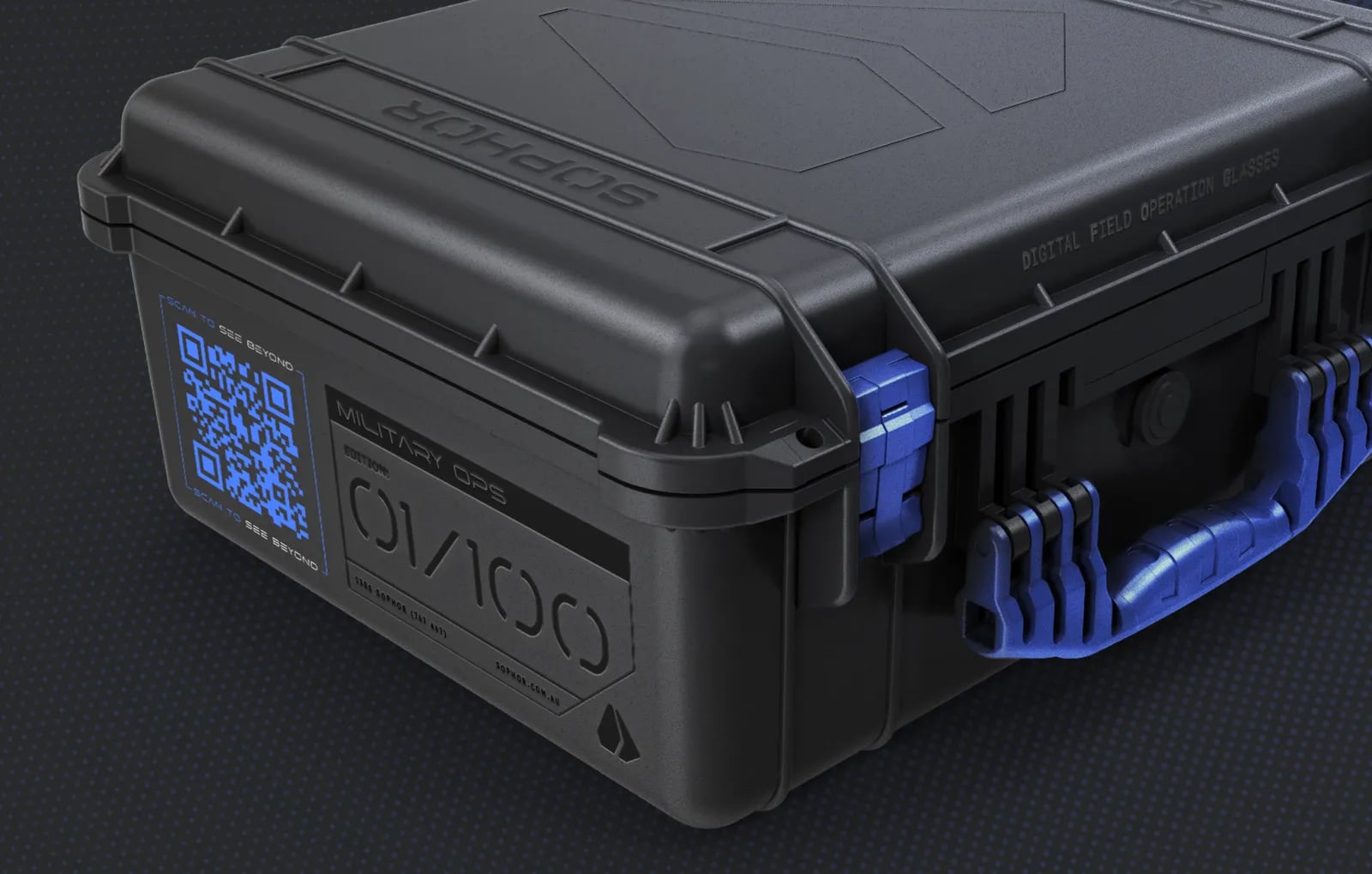
03Brand assets
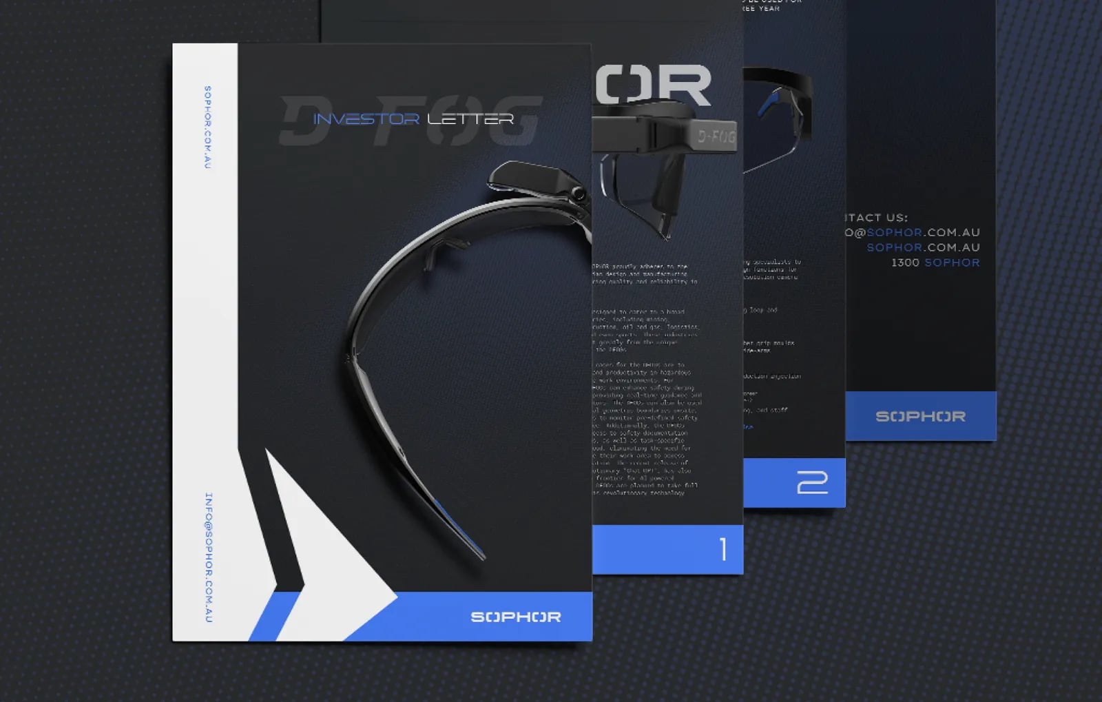
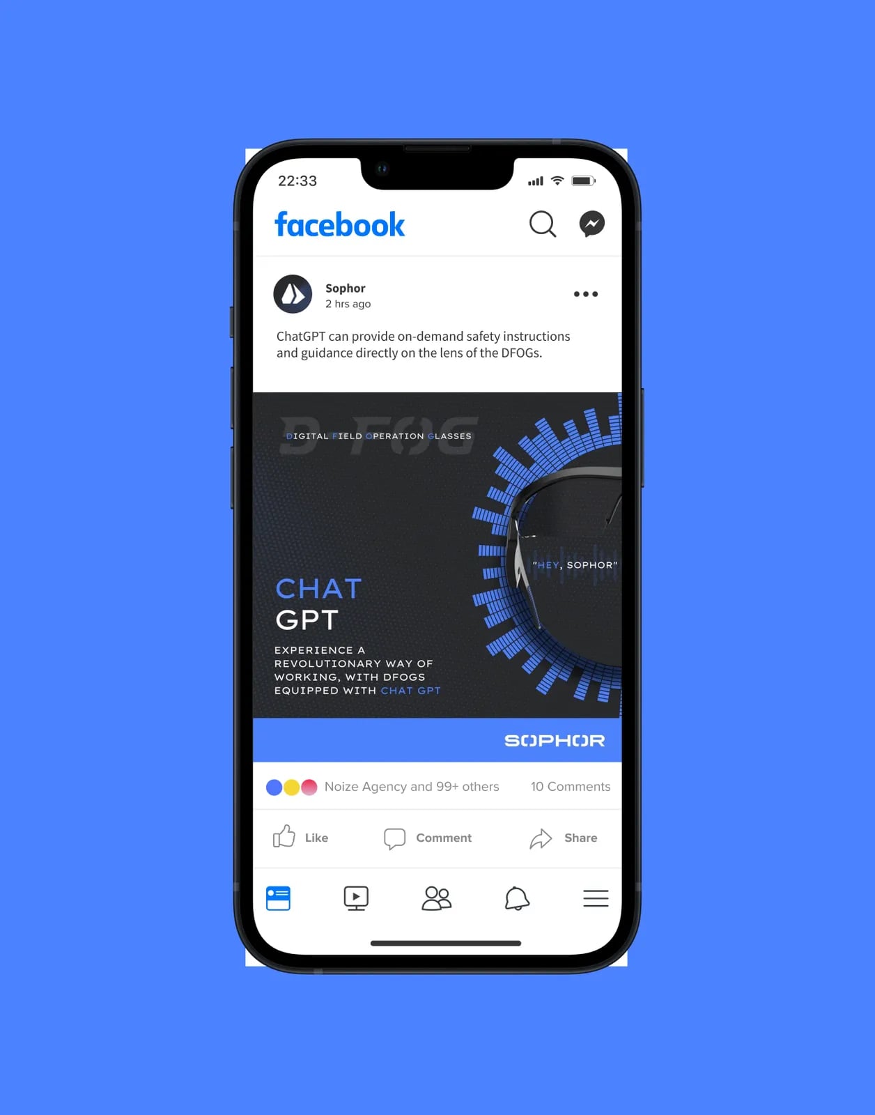
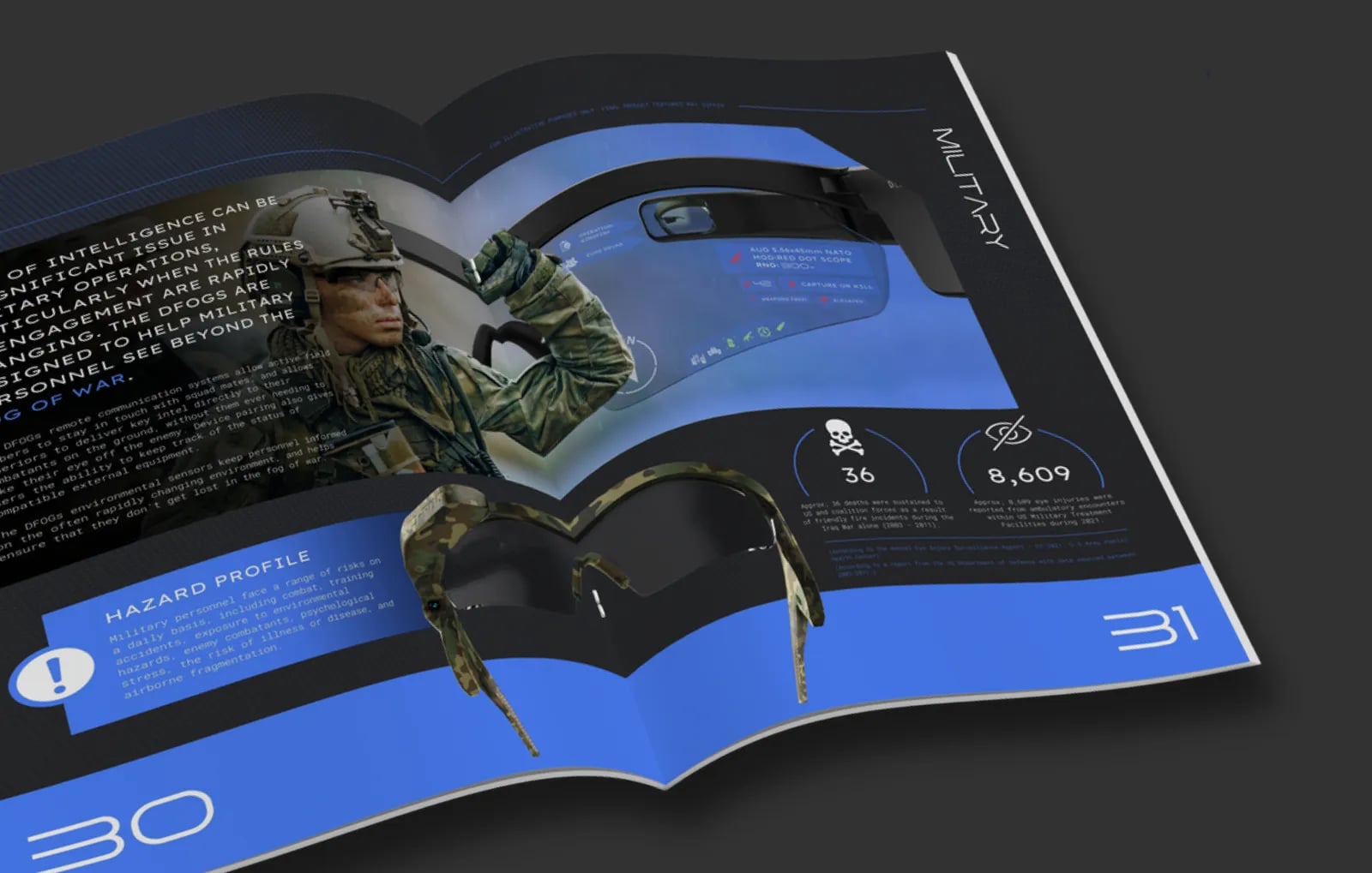
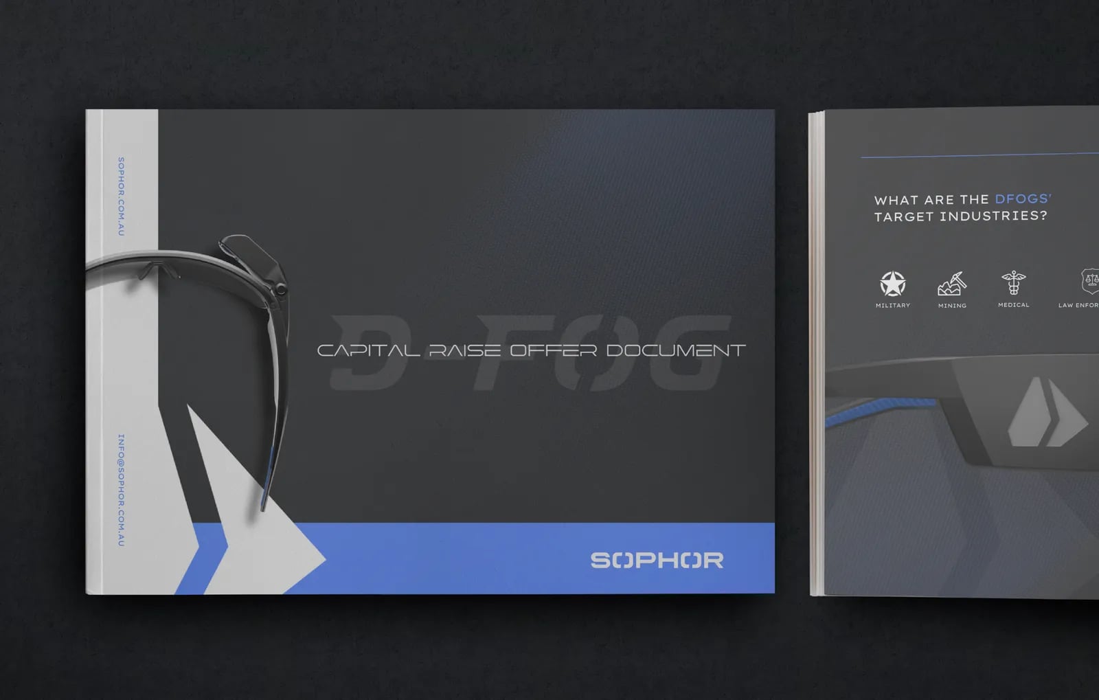
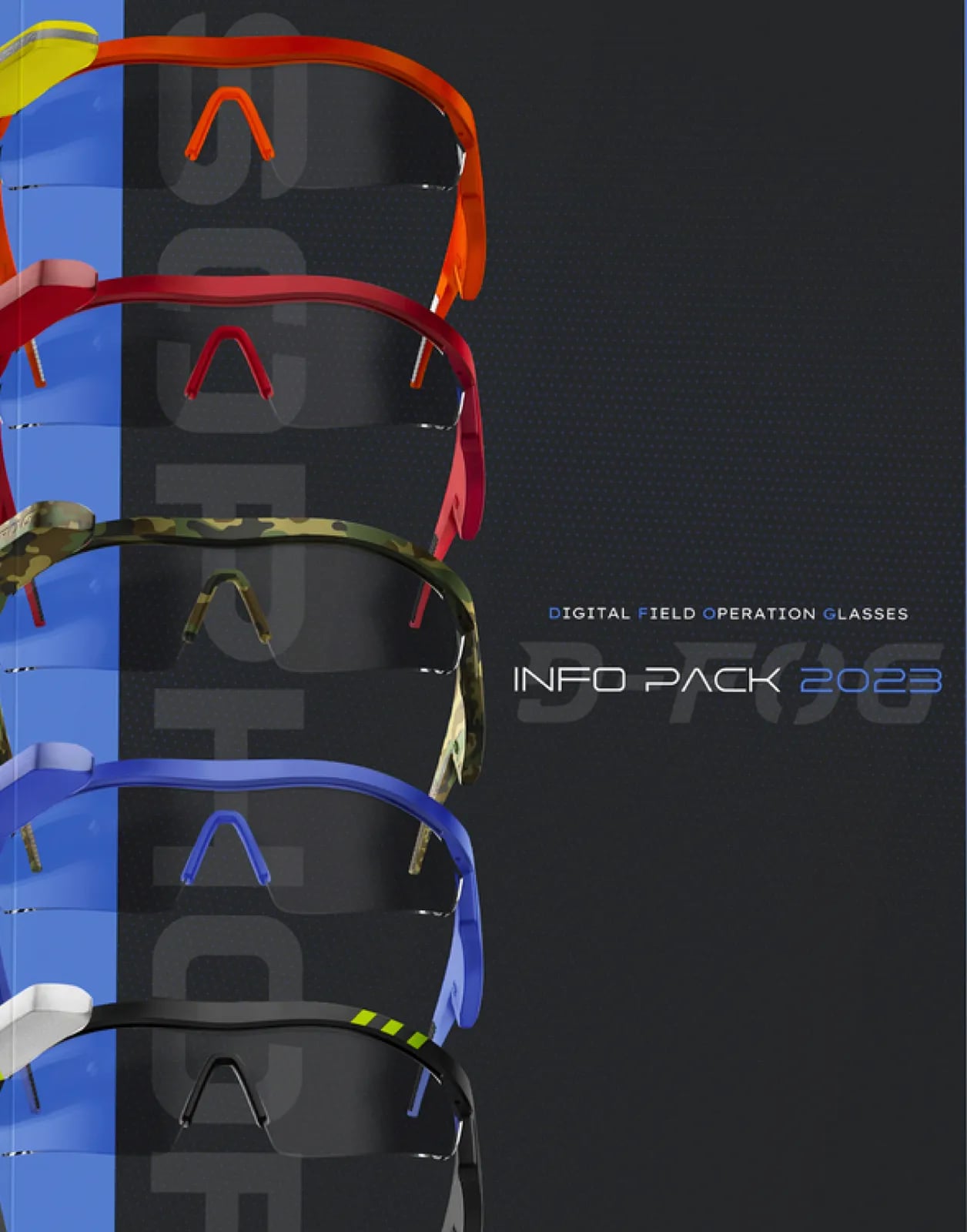
Templates and materials for digital and print.



Common questions
What did NOIZE do for Sophor?
Brand strategy, a new visual identity, brand guidelines and brand assets.
Why does a tech company need a strong brand?
Buyers often can't judge the technology at first glance. A clear brand helps them trust it.
What are brand guidelines?
A document that shows how to use the logo, colours, type and tone, so the brand stays consistent.
Your first strategy conversation is on us.
Have a chatThe brand for business.