
Jupyter: a consistent technology identity

- Client
- Jupyter
- Industry
- Technology & Security
- What we did
- Brand strategy, Visual identity, Brand applications
- Departments
- Creative
Jupyter is a technology and software business.
This case study shows the identity and applications NOIZE developed. It sticks to what the project material shows.
The short version
NOIZE developed Jupyter's identity and applied it across the touchpoints shown in the gallery. The aim was coherence: one recognisable system everywhere the brand appears. We don't claim business results that haven't been confirmed.
The brief
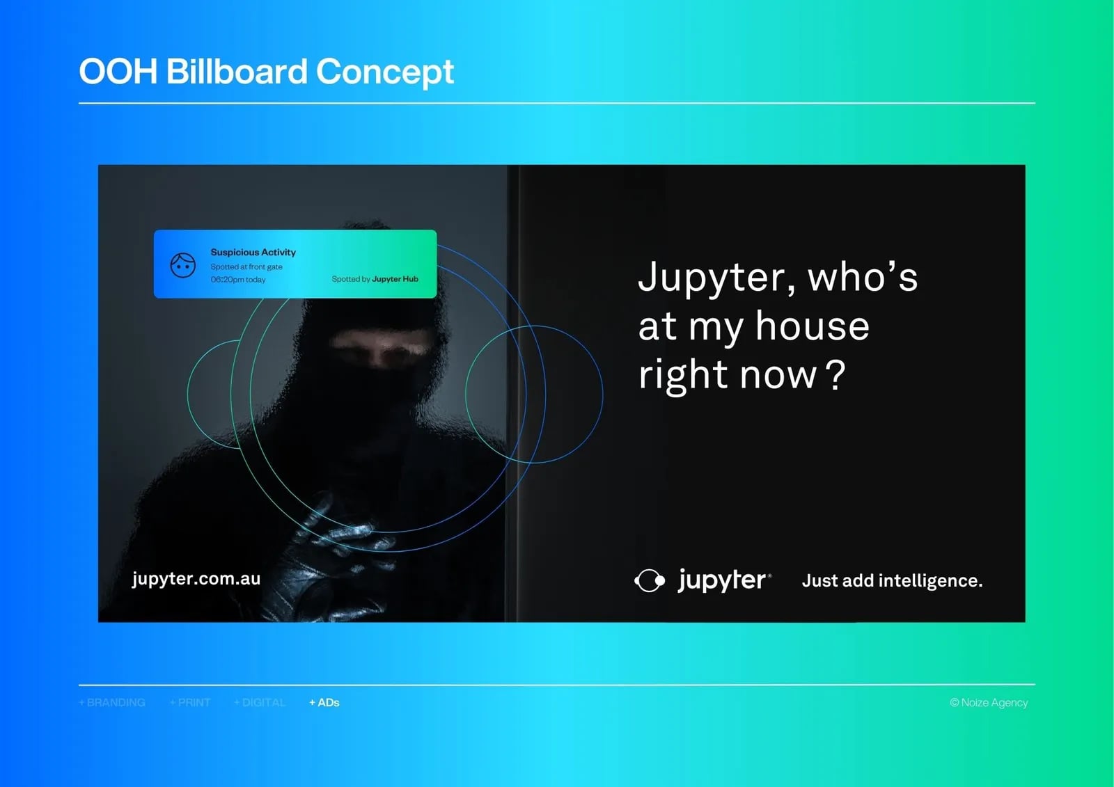
Jupyter needed a consistent identity across its digital and physical touchpoints.
The approach
01Work from the facts
The identity was built from the strategy and design material available.
02Coherence
One system across every touchpoint.
03No invented story
The case study shows the work, not unconfirmed results.



What we built
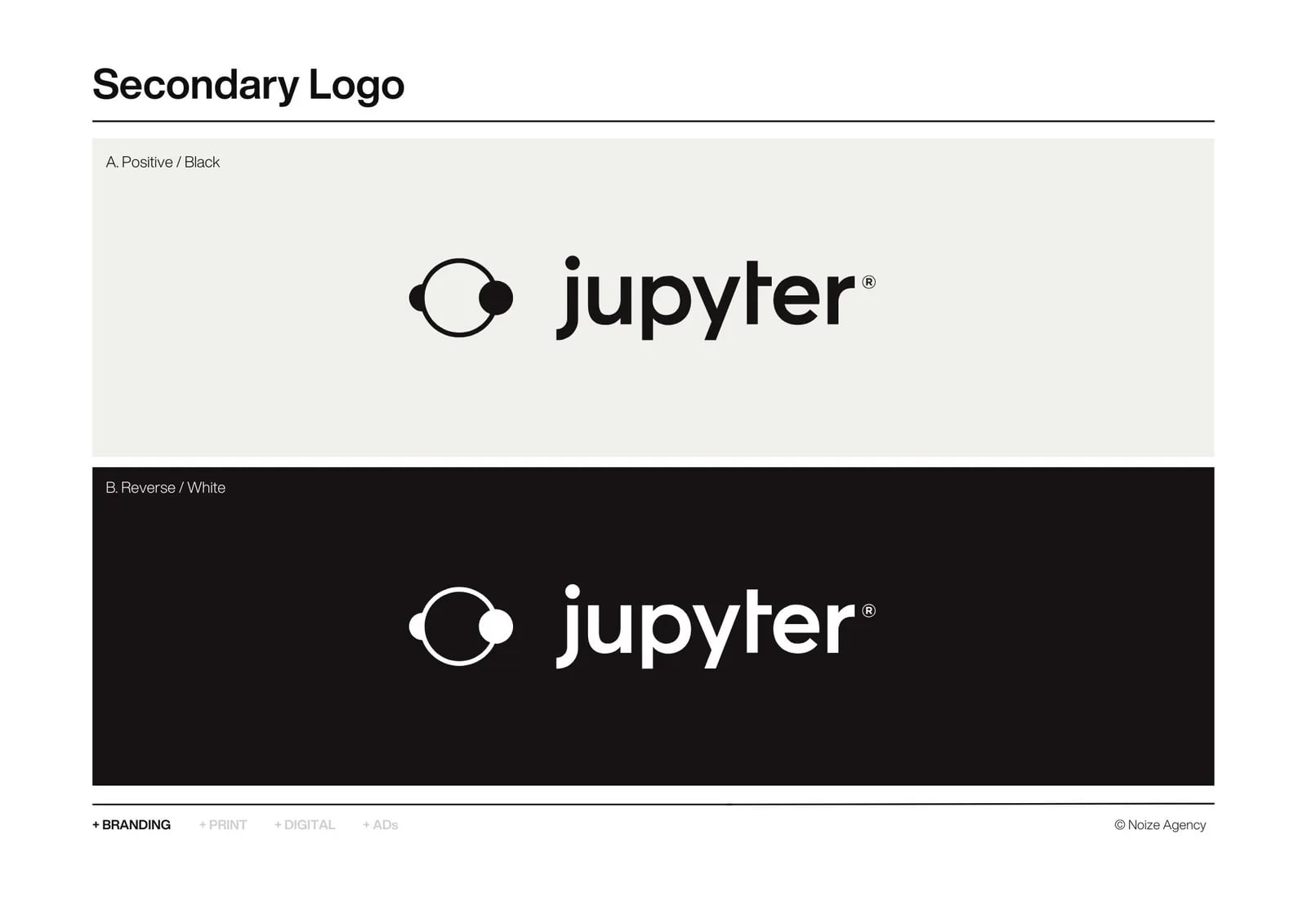
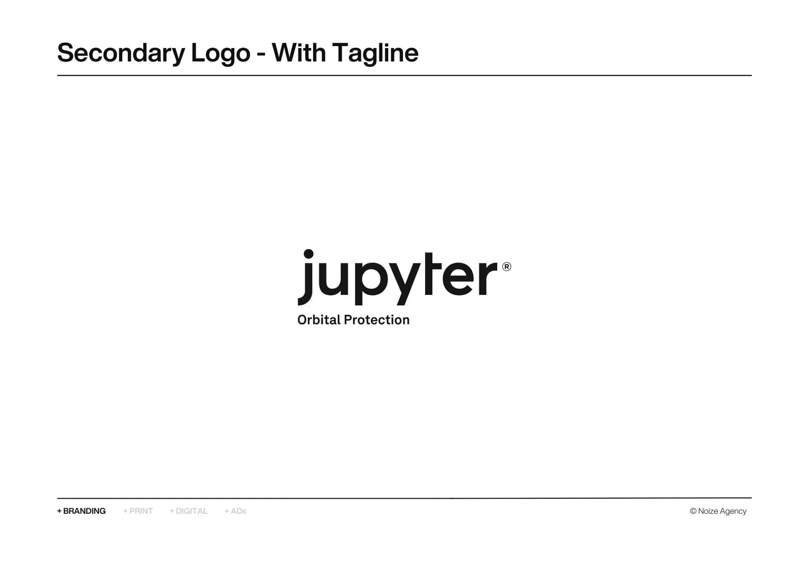
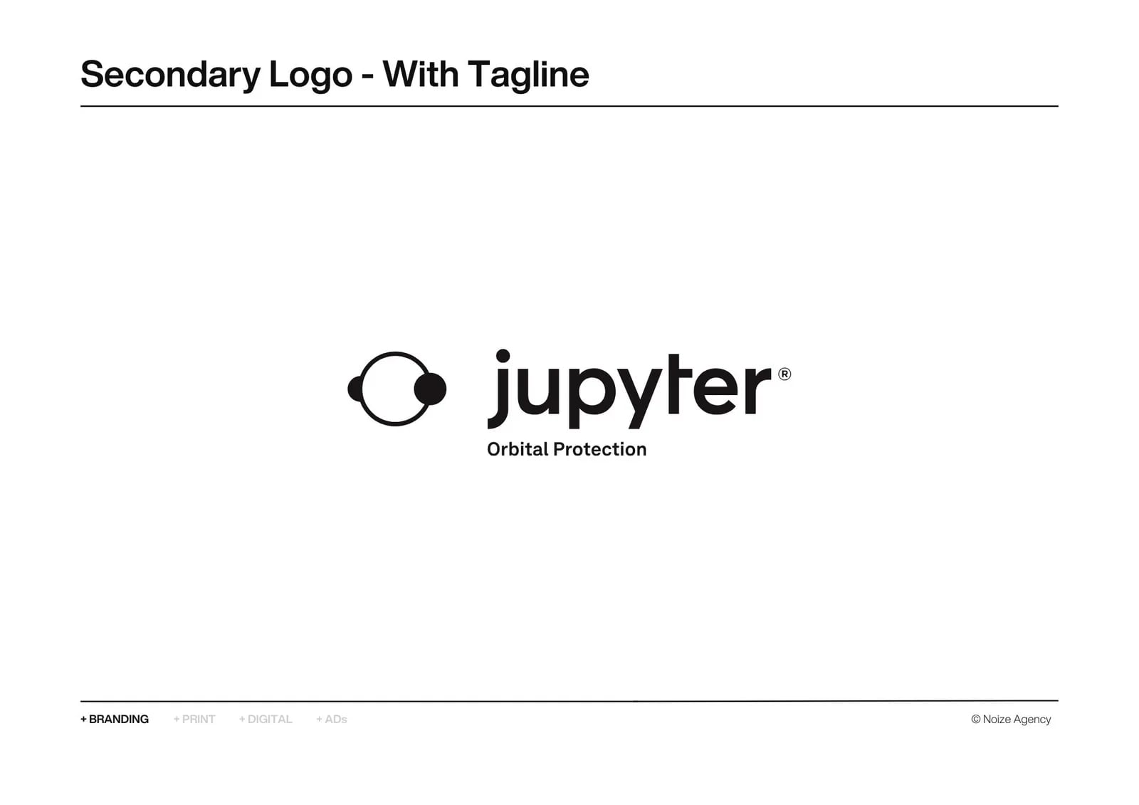
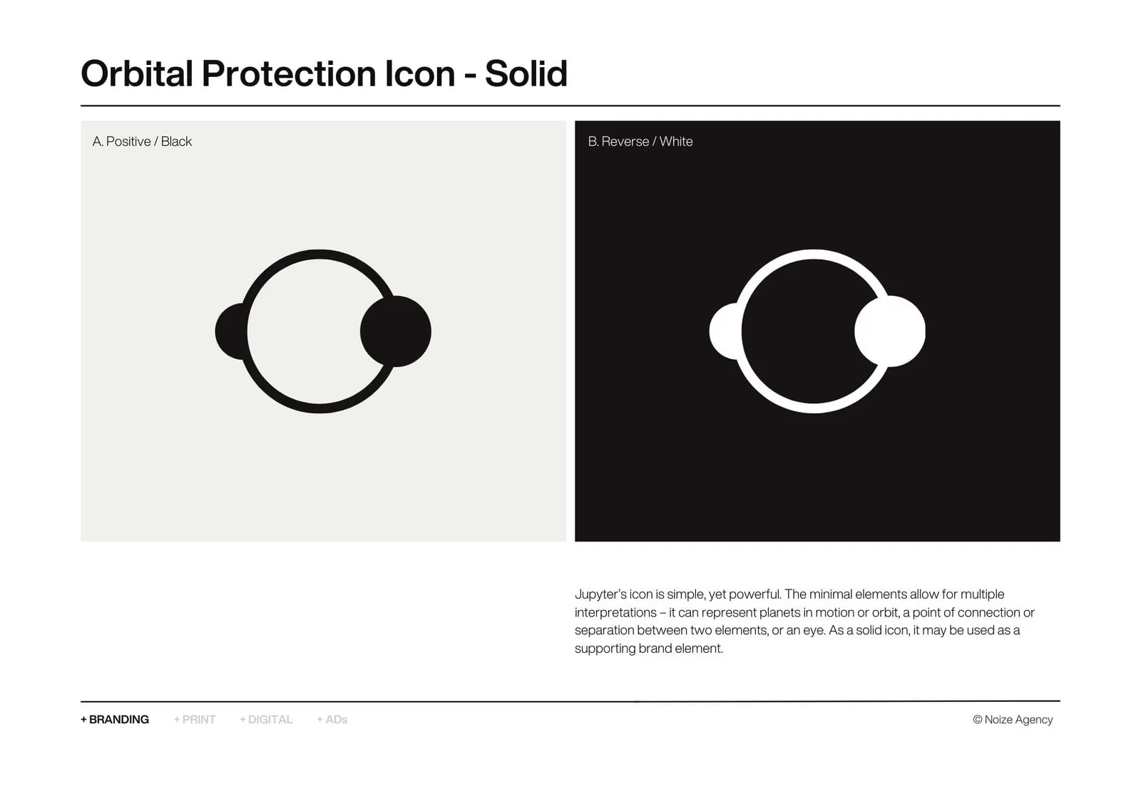
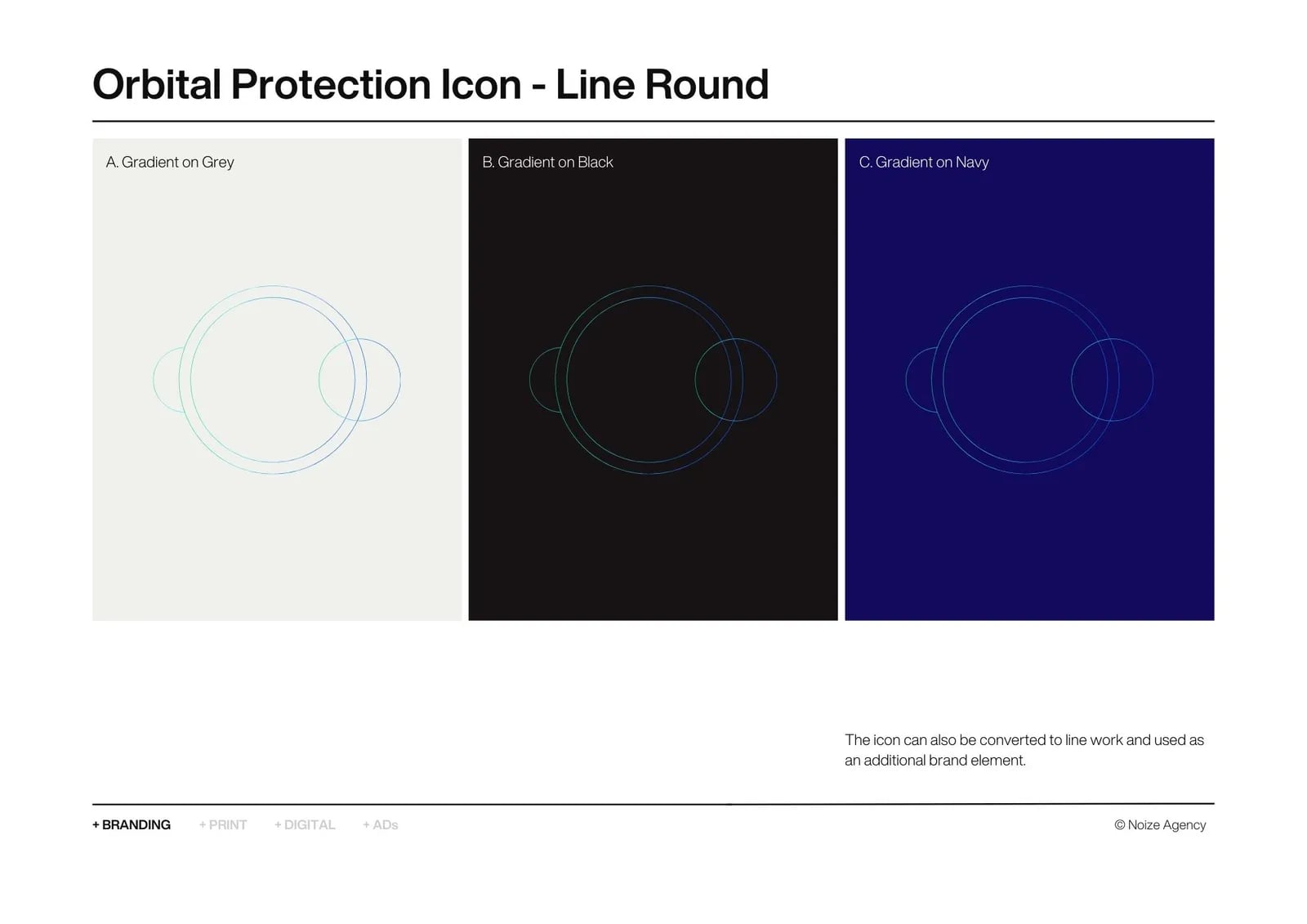
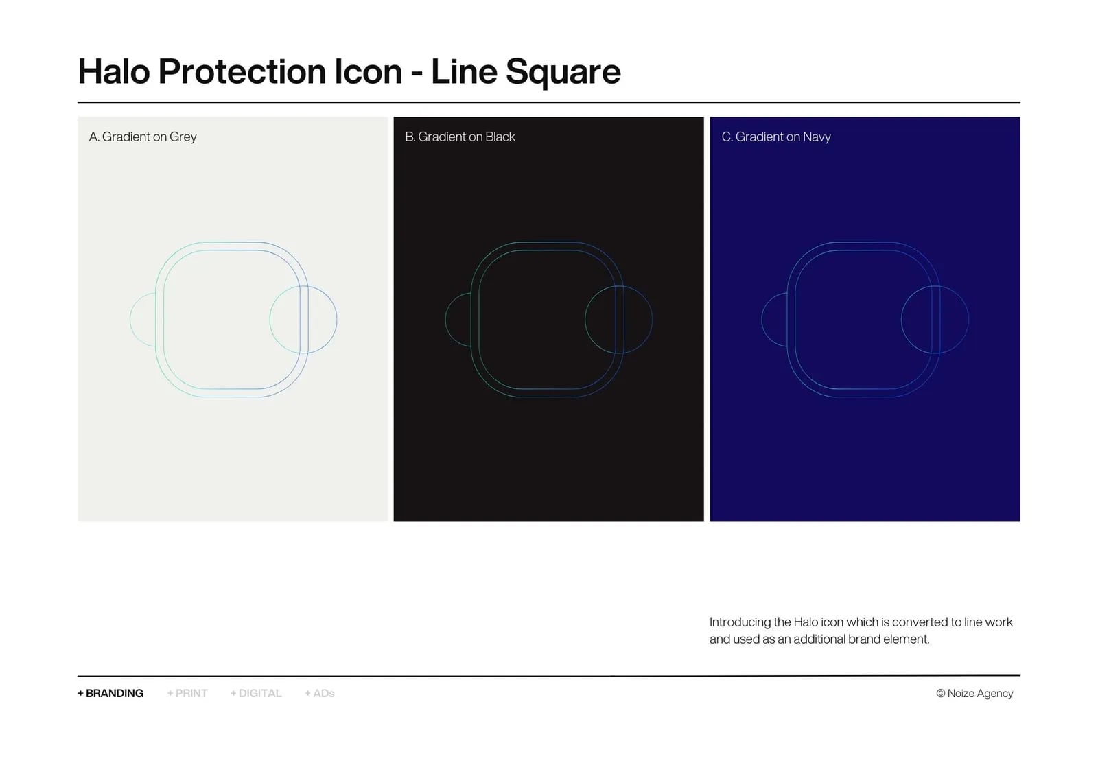
01A visual identity
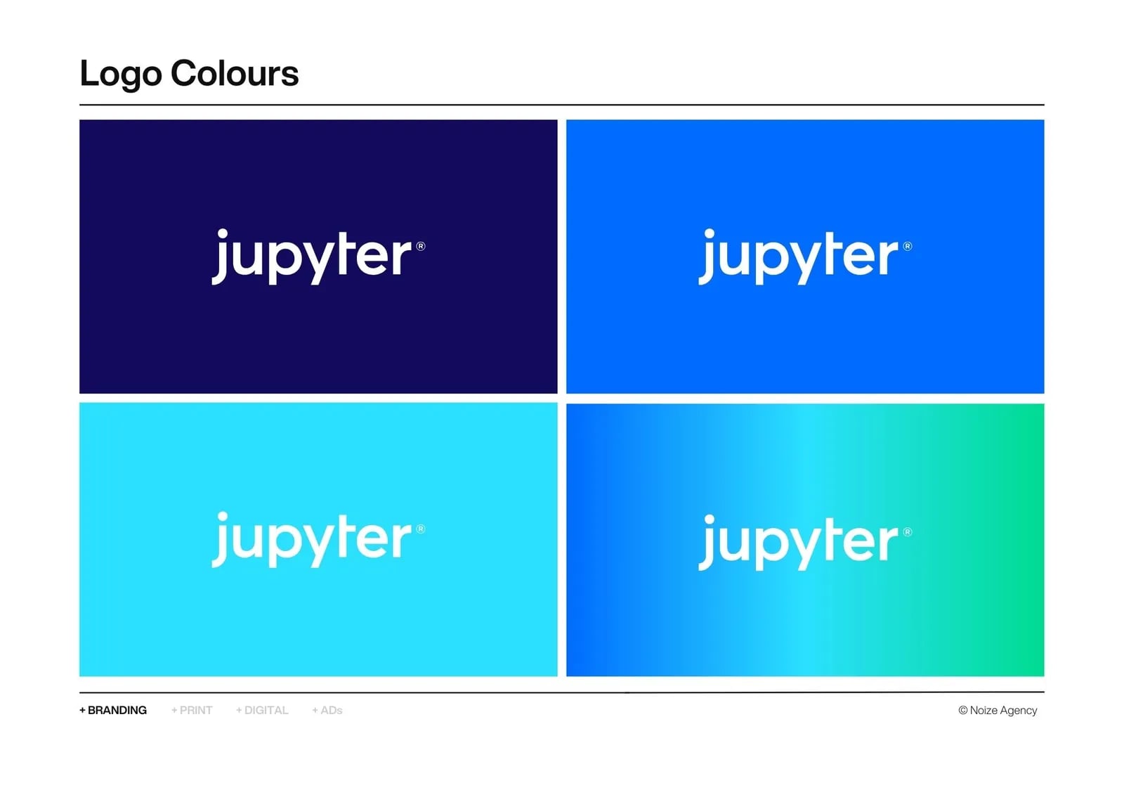
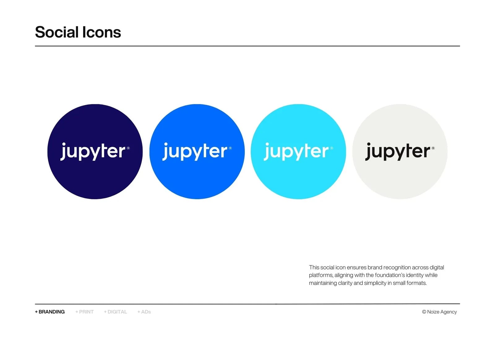
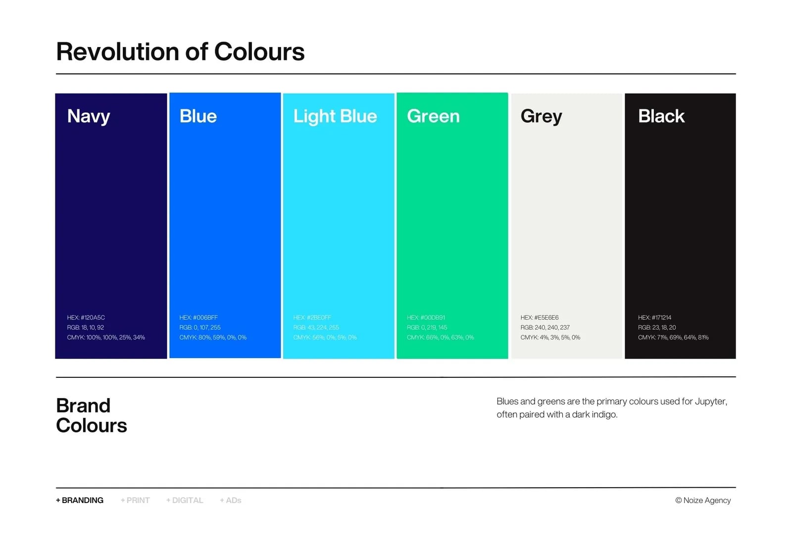
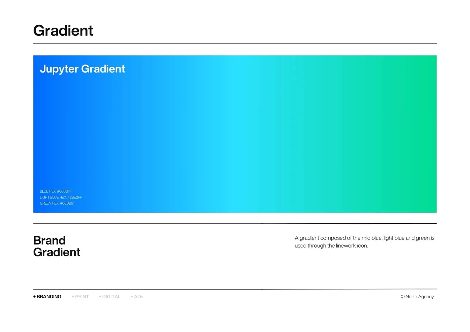
Logo, palette and type.
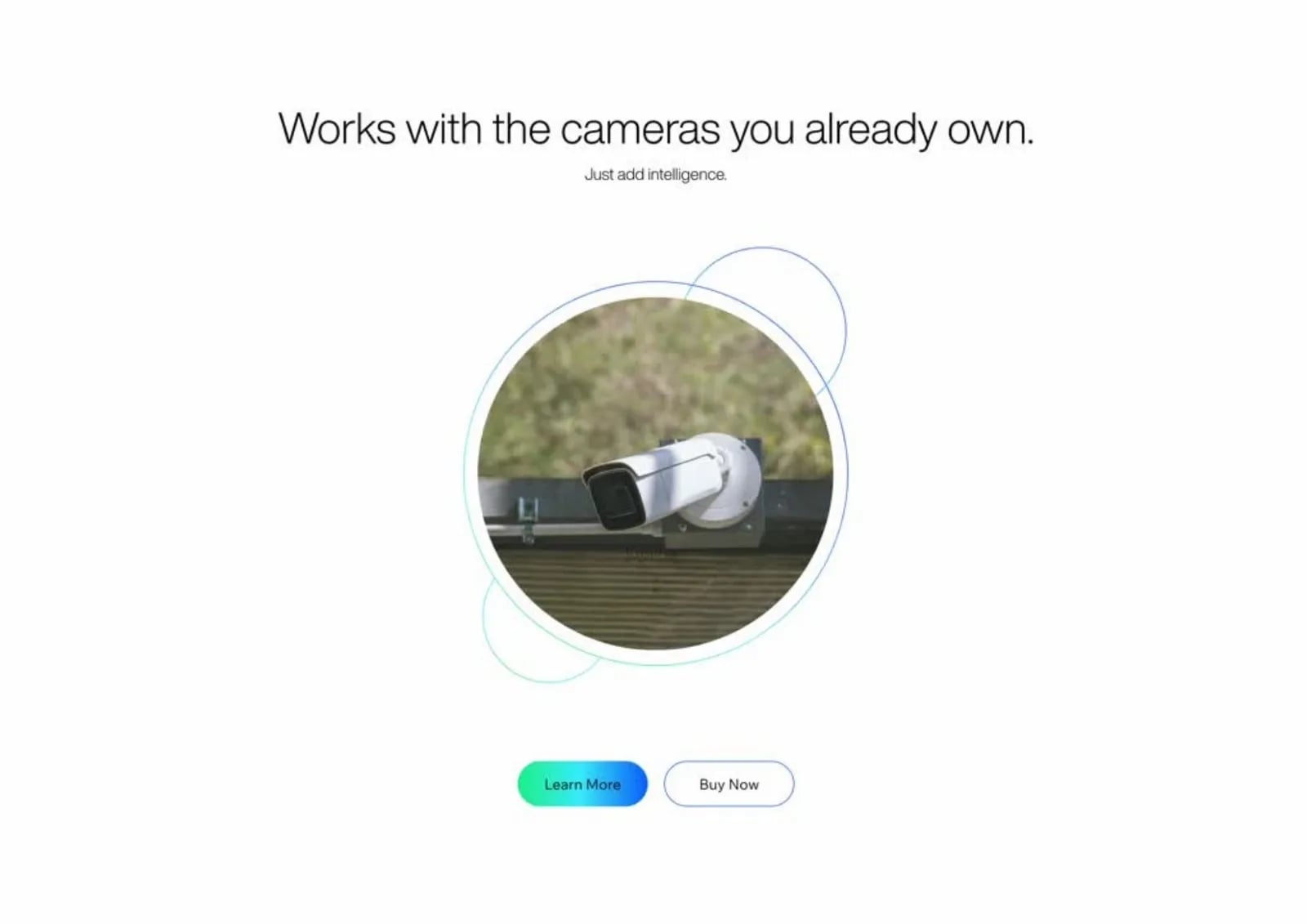
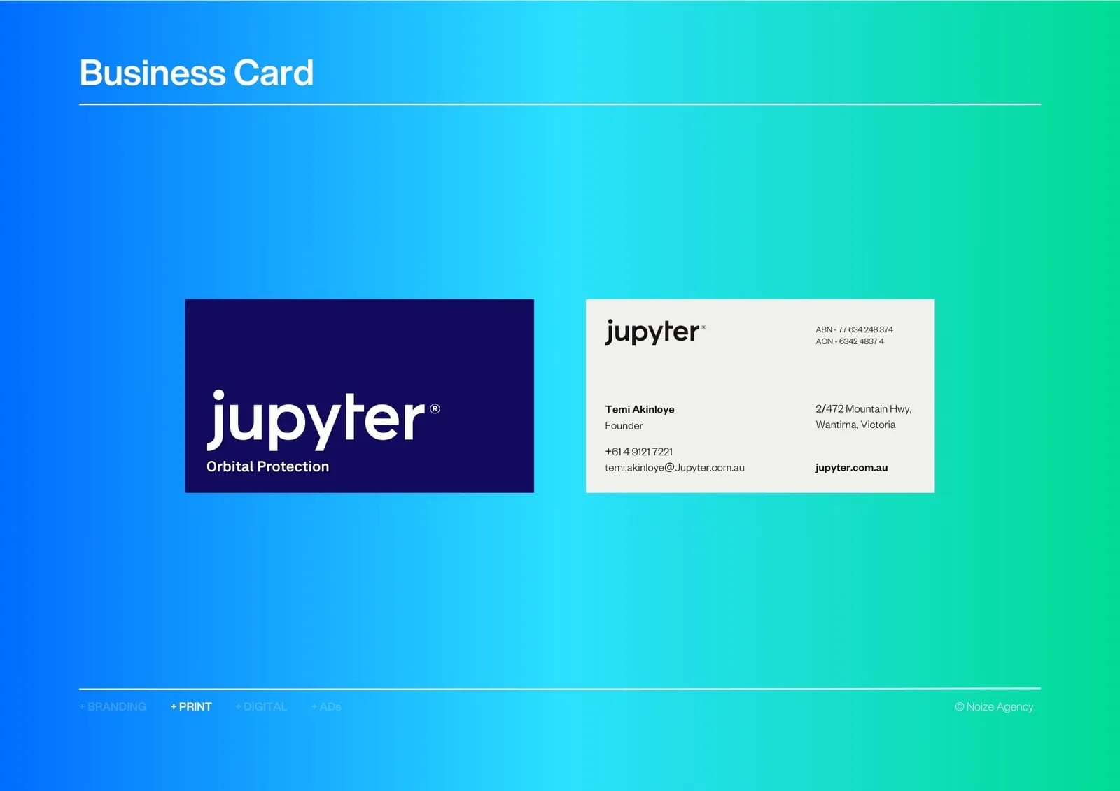
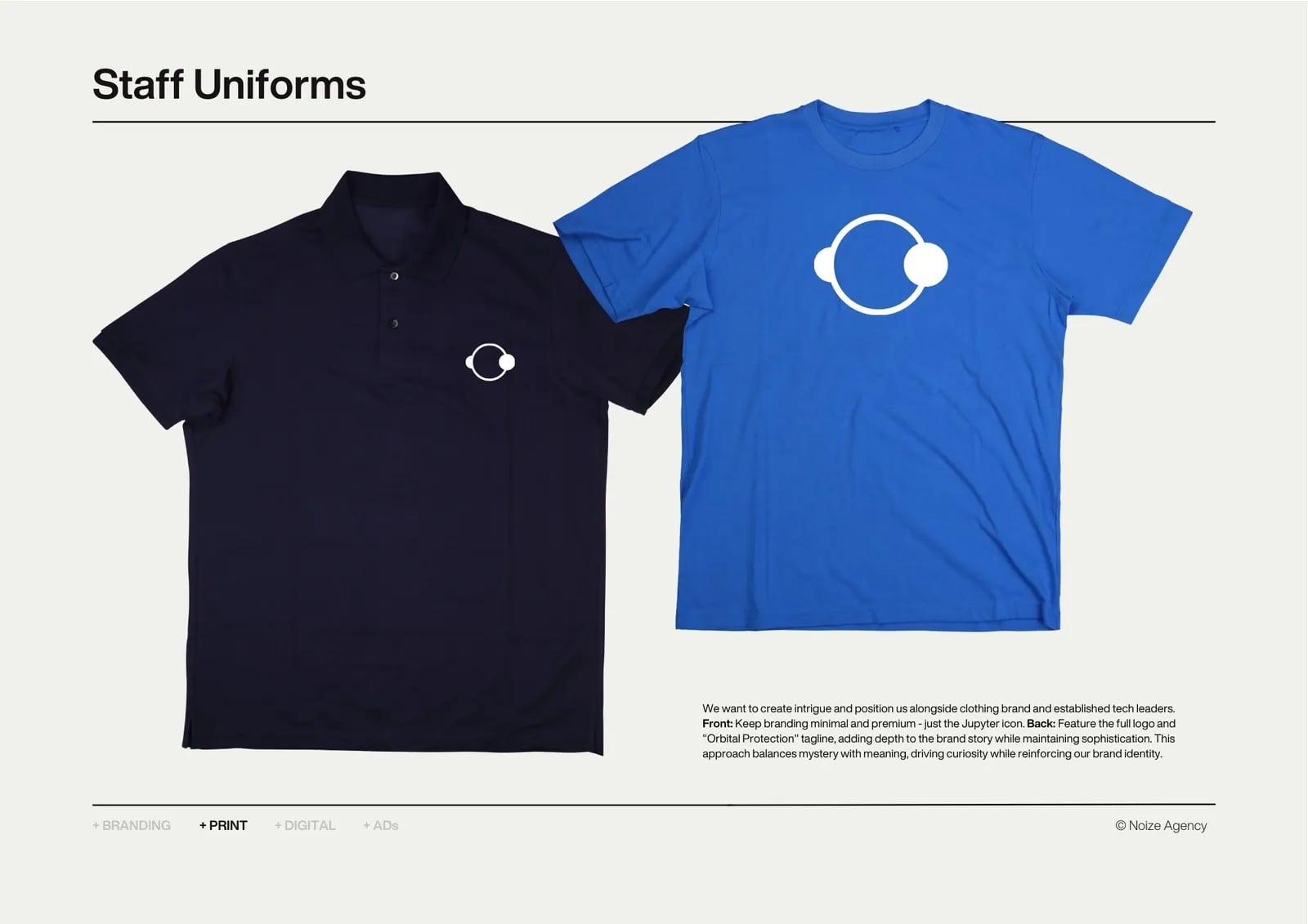
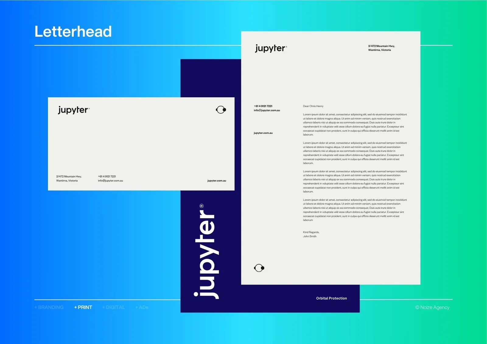
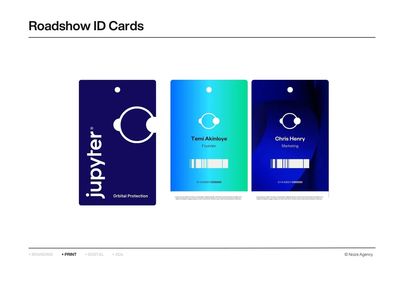
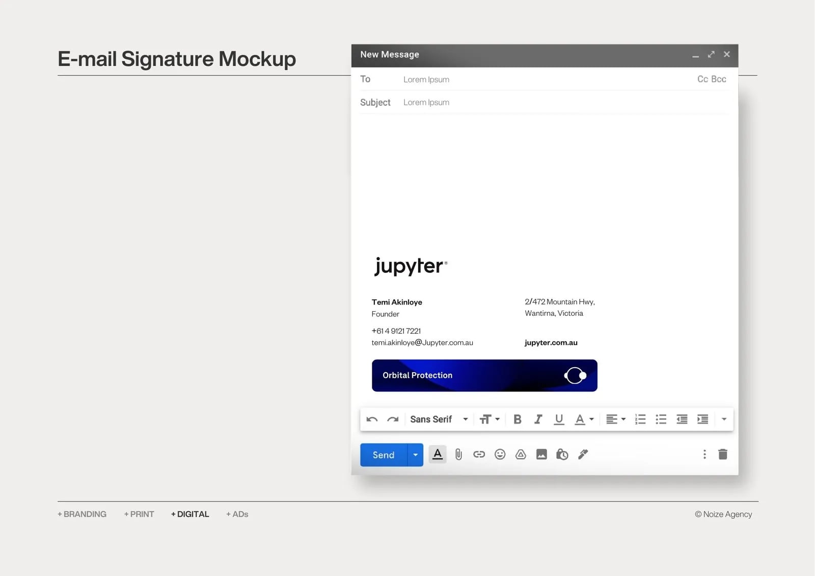
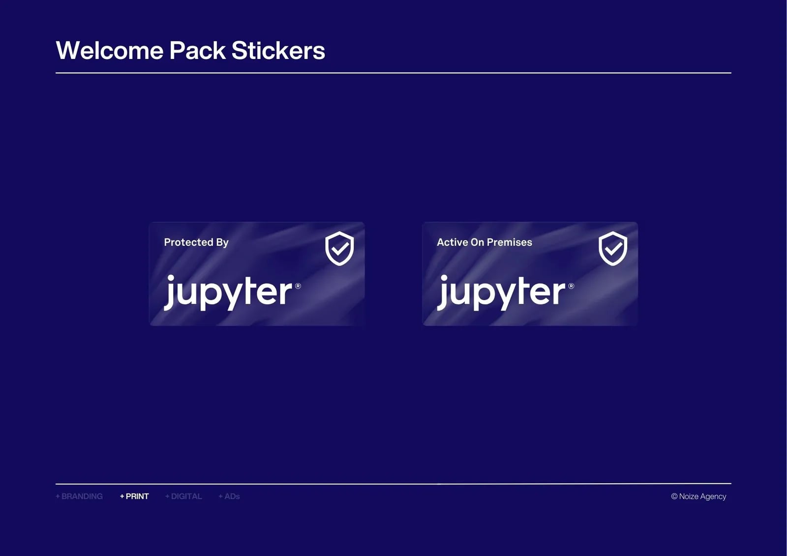
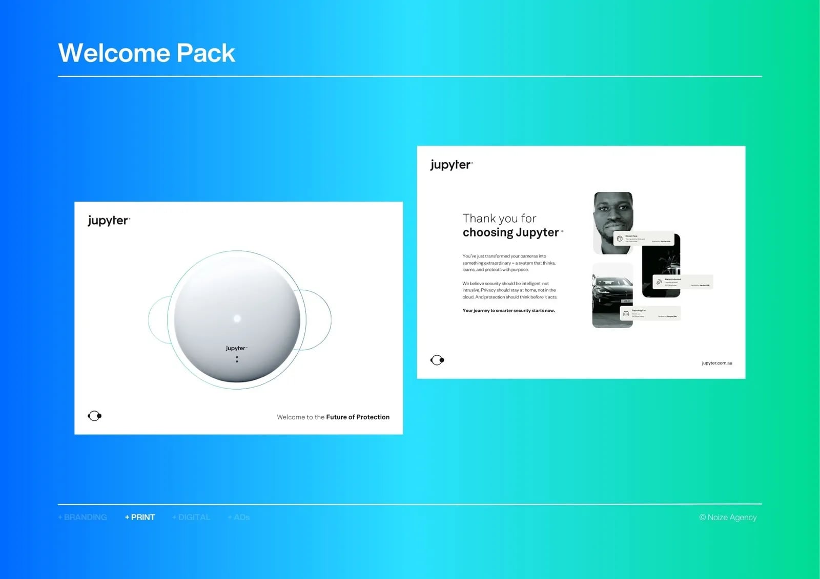
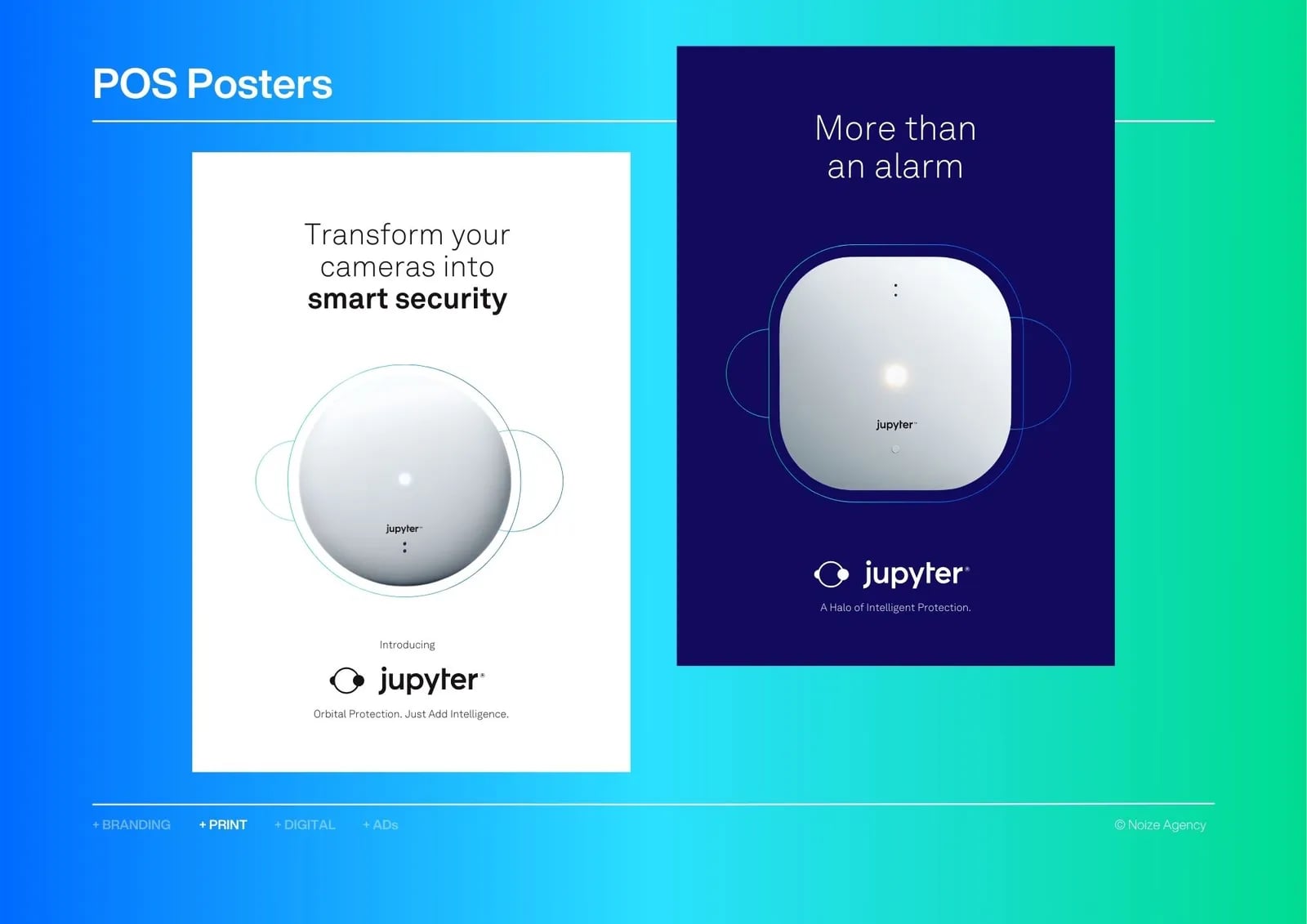
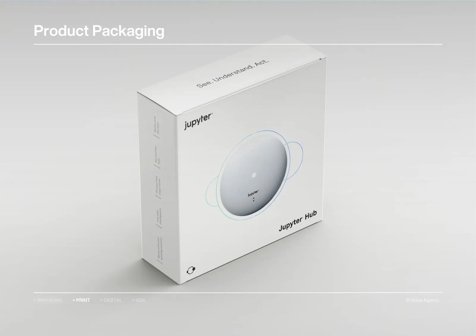
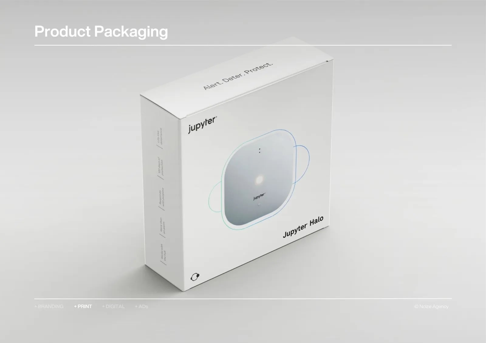
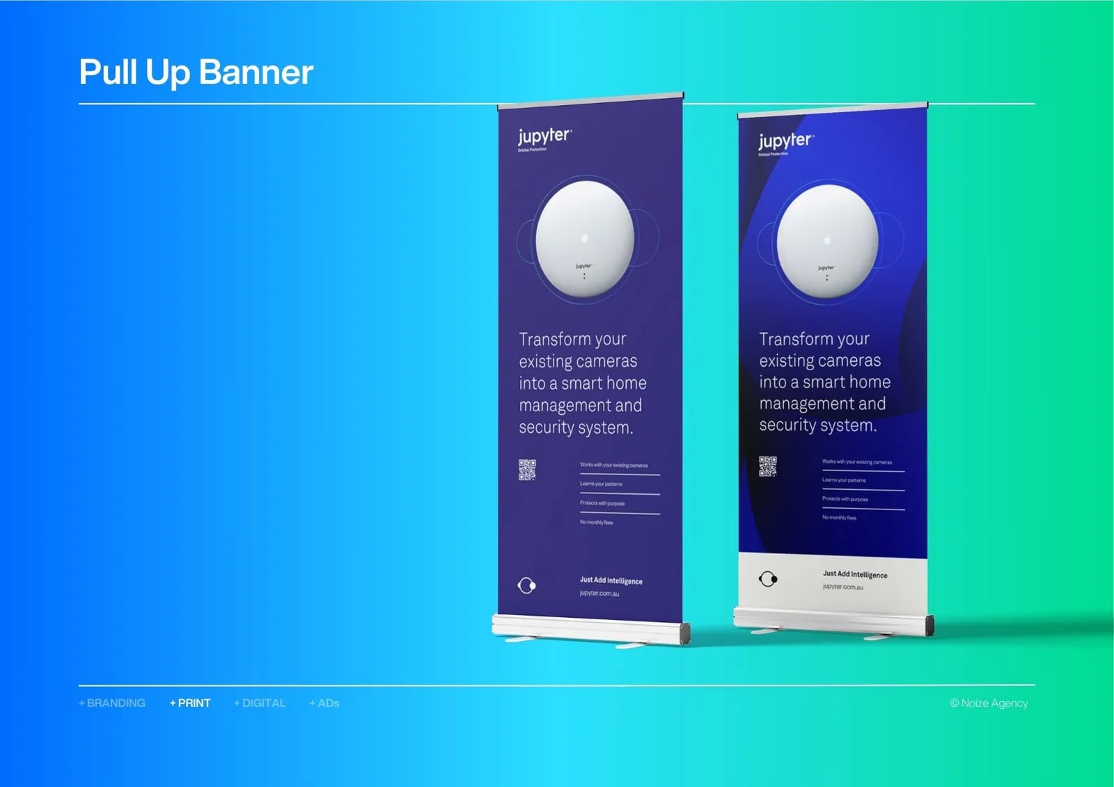
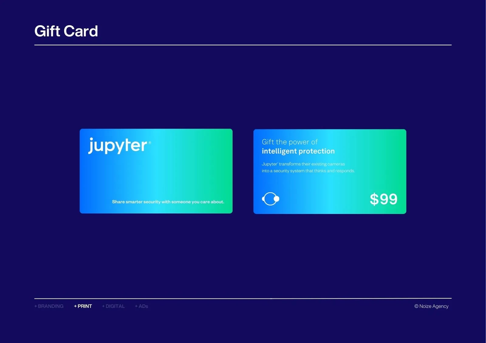
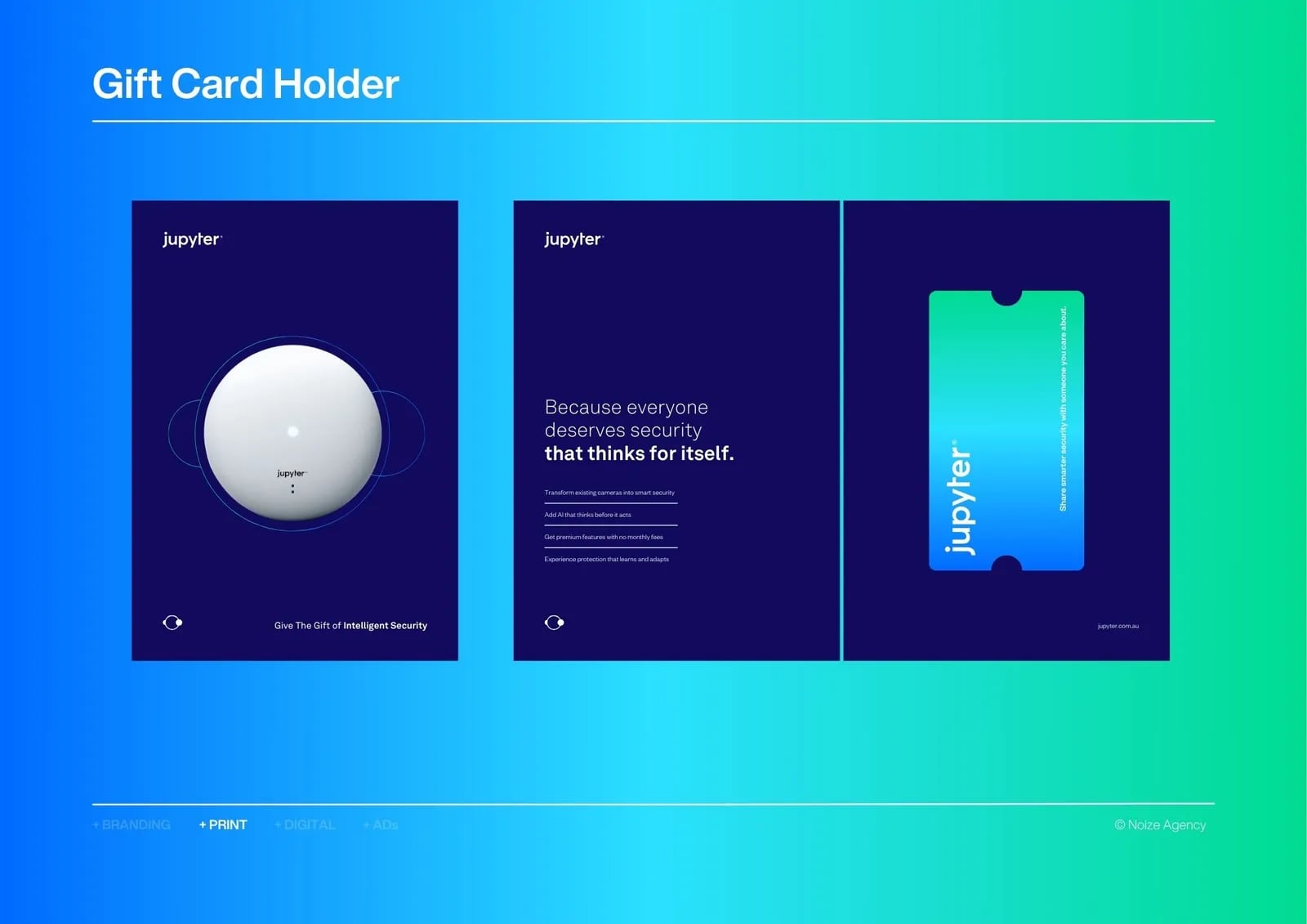
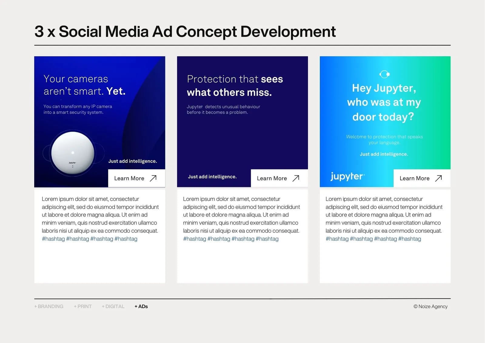
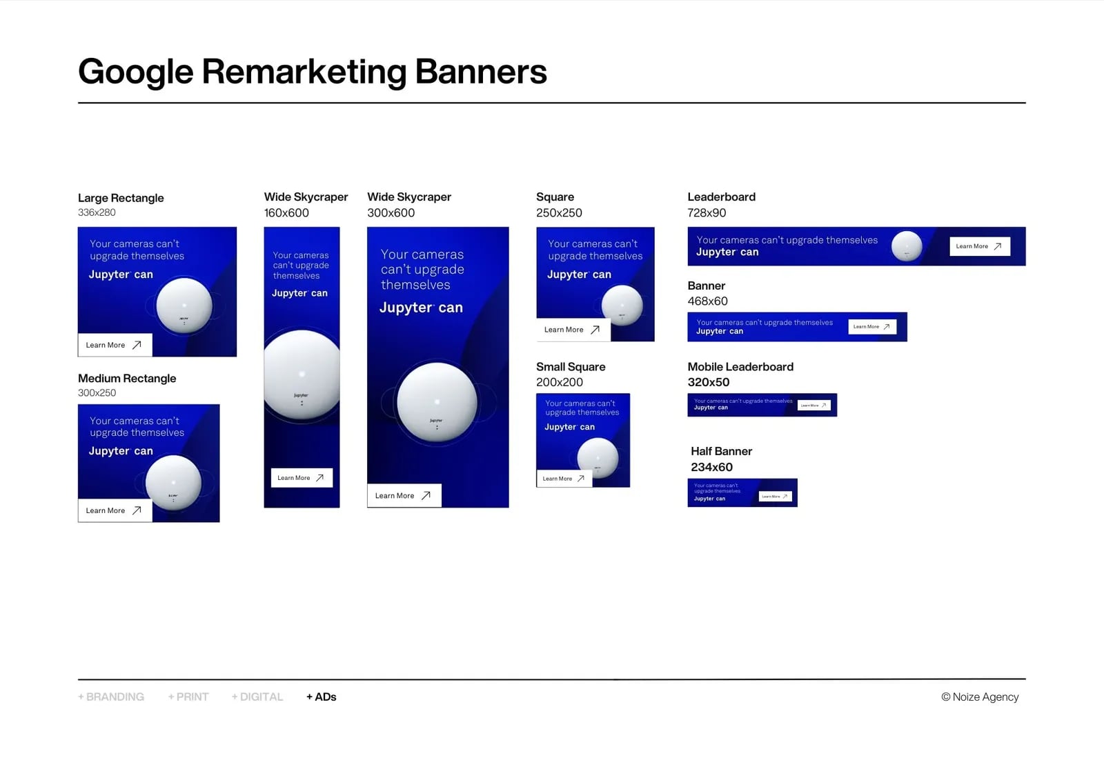
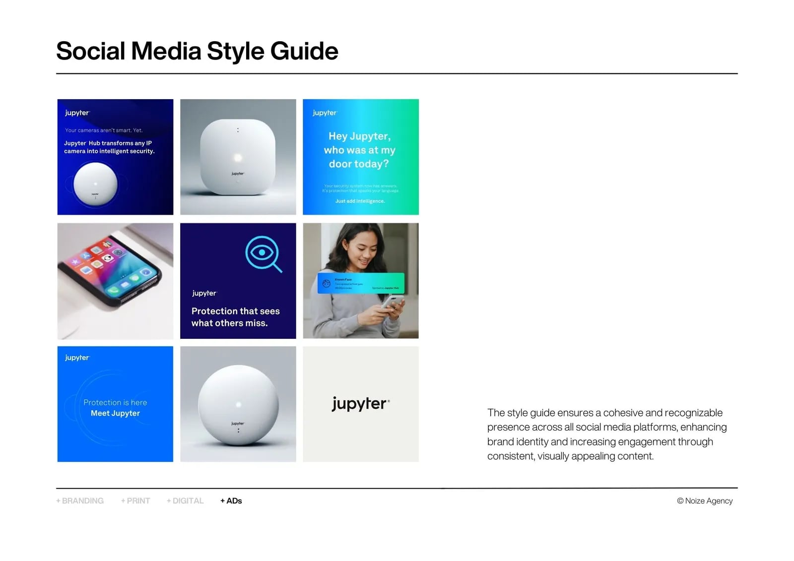
02Brand applications
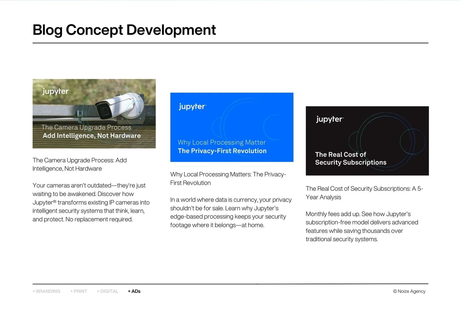
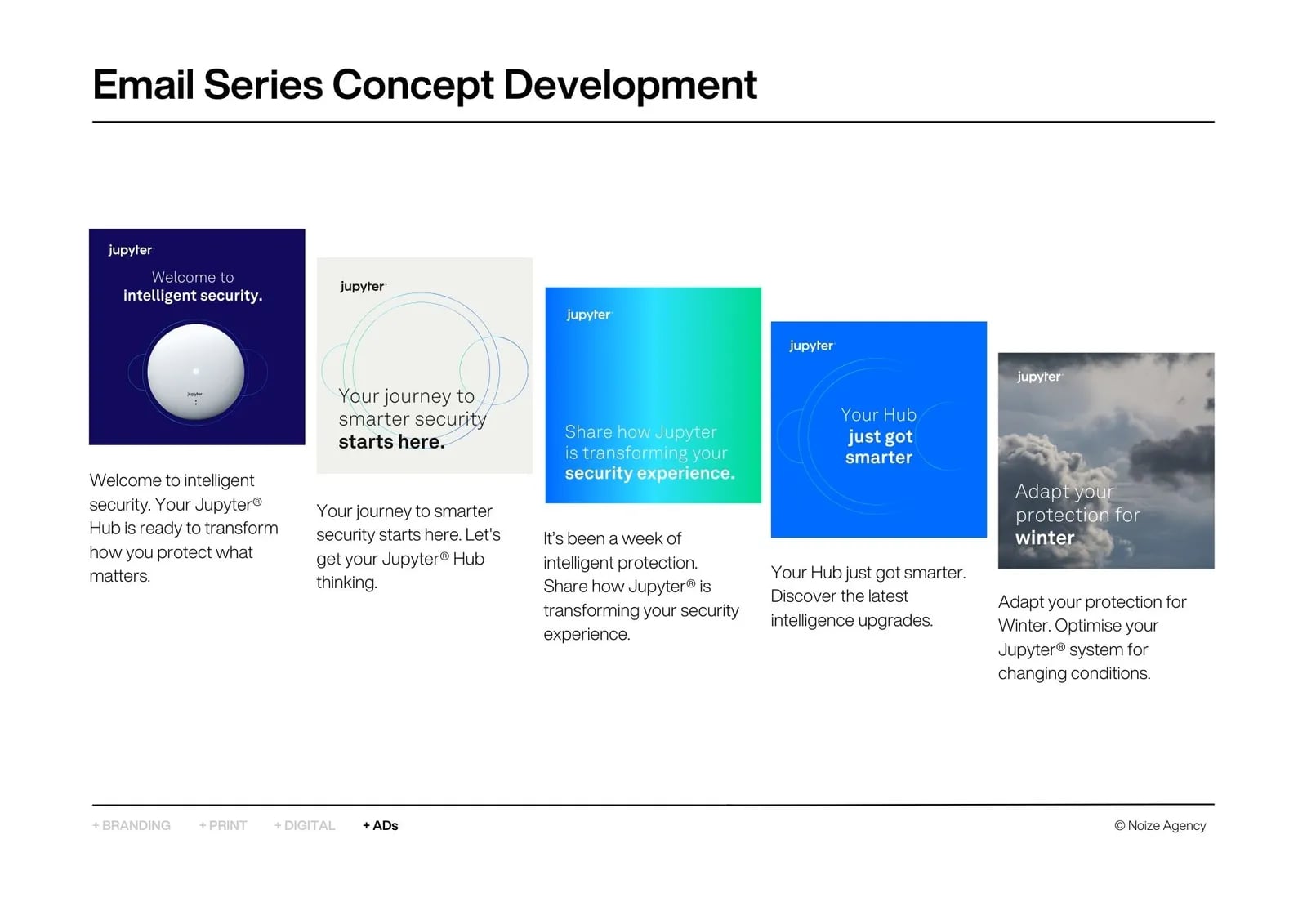
The identity applied across digital and physical touchpoints.
03Brand guidelines
Rules for consistent use.
Common questions
What did NOIZE do for Jupyter?
Visual identity and brand applications.
Why does consistency matter for a tech brand?
Customers trust brands that look and sound the same everywhere.
Your first strategy conversation is on us.
Have a chatThe brand for business.