MAARCH Architects: premium architecture, framed with precision

- Client
- MAARCH Architects
- Industry
- Building, Architecture & Trades
- What we did
- Brand strategy, Visual identity, Signage
MAARCH Architects designs residential and commercial projects and specialises in council approvals.
It needed a premium identity that supports exacting work without adding noise.
The short version
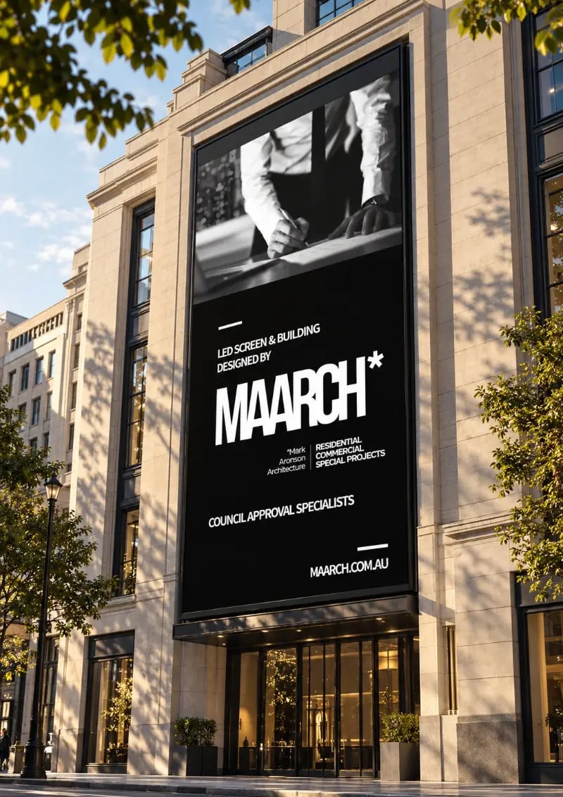
NOIZE built MAARCH's brand around space, order and precision. The bold wordmark and asterisk work on everything from a building-scale screen to site hoardings that read "Another MAARCH Project".
The brief
Architects are judged on how they think, not just their finished photos. The brand had to show that discipline everywhere.
The approach
01Space as voice
Architectural principles shaped how the brand communicates.
02A system for every project
Consistent across very different sites and scales.
03Big and simple
A mark that works at building scale.

What we built
01A new identity
A bold MAARCH wordmark with an asterisk symbol.
02Signage and hoardings
Site hoardings and large-format screens.
03Brand guidelines
Rules for consistent use.
Common questions
What did NOIZE do for MAARCH Architects?
Brand strategy, visual identity and signage.
How should an architecture firm use its brand on site?
Site hoardings are free advertising. A bold, simple brand turns every project into a sign.
Your first strategy conversation is on us.
Have a chatThe brand for business.