Don Prima: heritage and flavour in one brand
- Client
- Don Prima
- Industry
- Fashion, Beauty & Personal Care
- What we did
- Brand strategy, Visual identity, Packaging design
Don Prima is a food and hospitality brand.
It needed to stand apart from established names and new trends.
The short version
NOIZE ran a Branding DNA workshop and built Don Prima a brand that blends heritage with modern style. The identity is elegant and full of flavour, and the packaging carries it onto the shelf.
The brief
The food market is full of brands that look alike. Don Prima needed one that customers would notice and remember.
The approach
01Start with Branding DNA
A workshop defined what Don Prima stands for.
02Heritage, modernised
Tradition presented in a fresh way.
03Shelf appeal
Packaging that stands out.
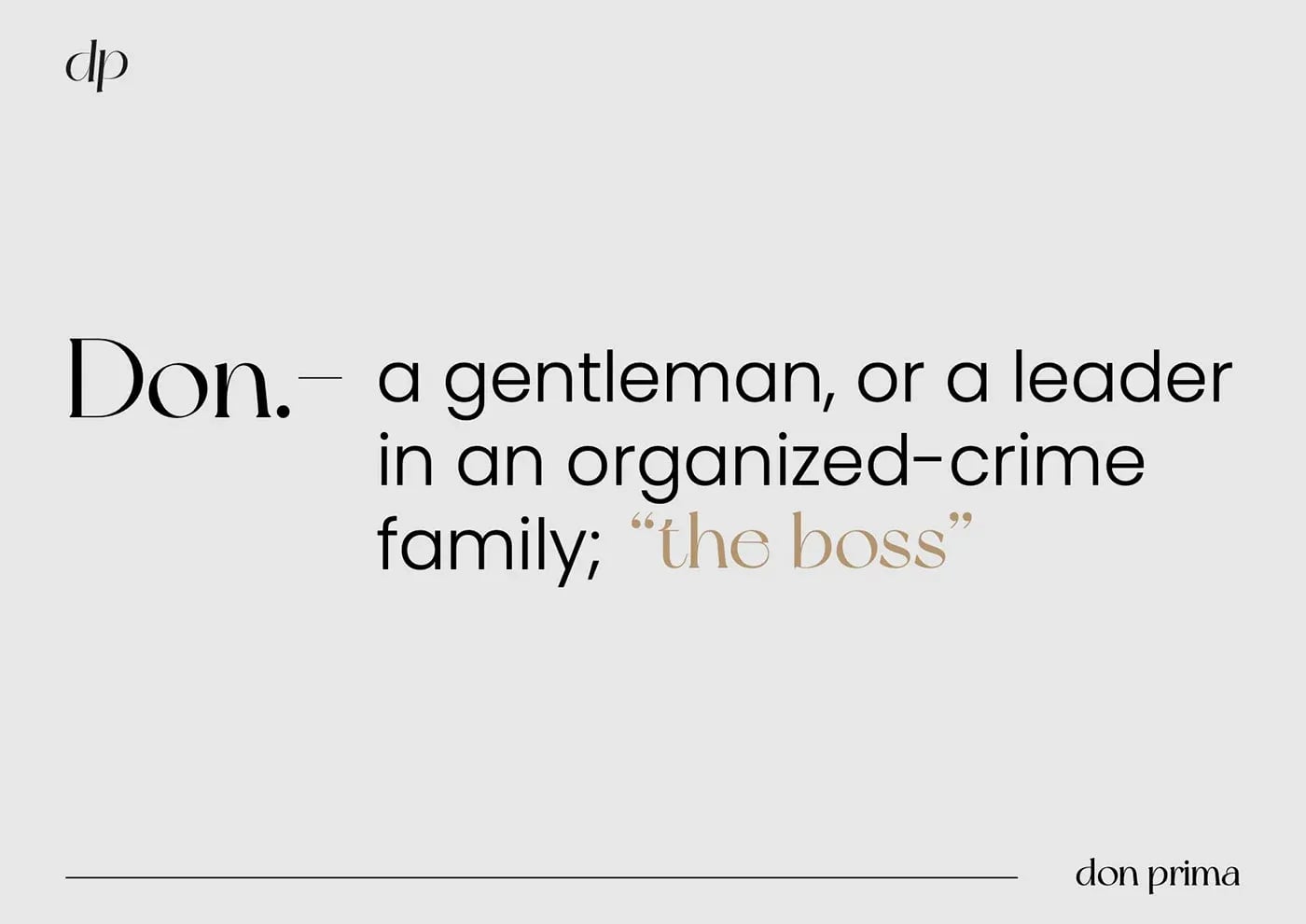
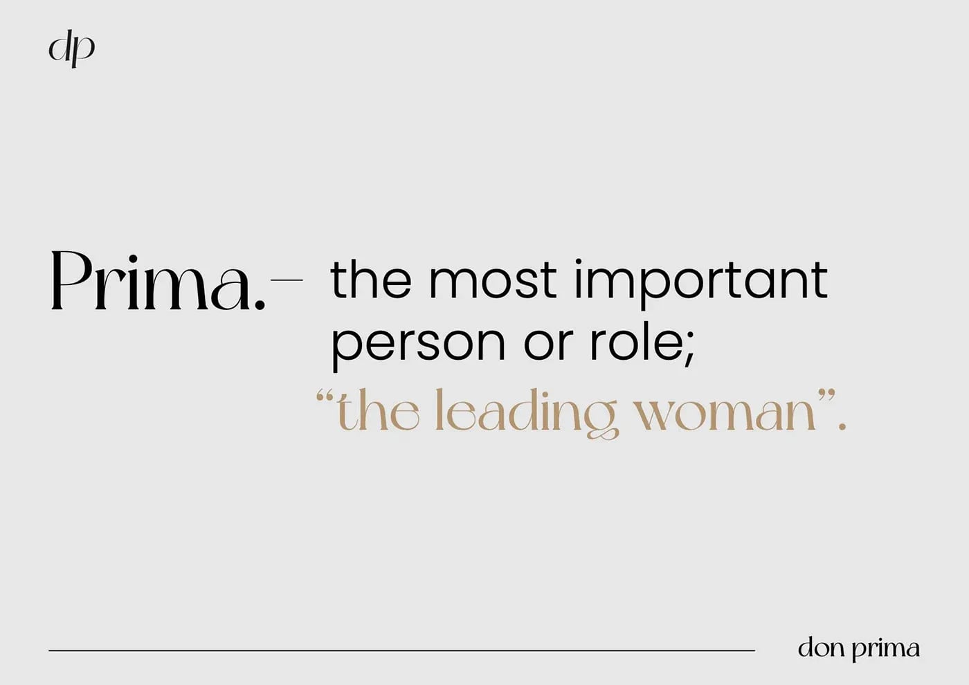
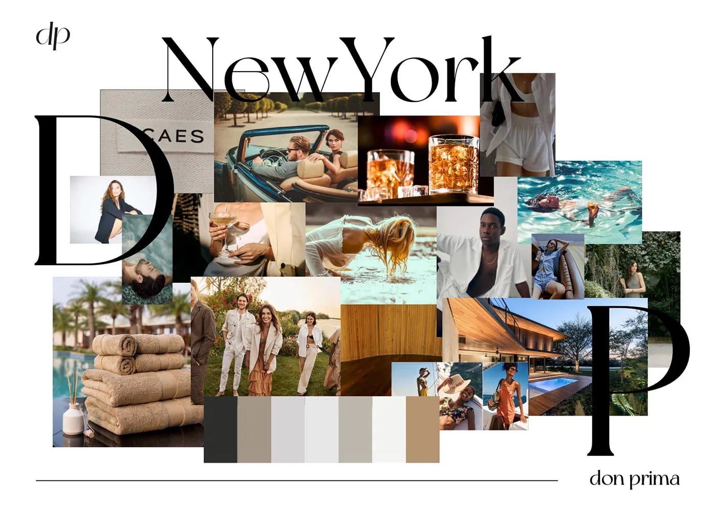
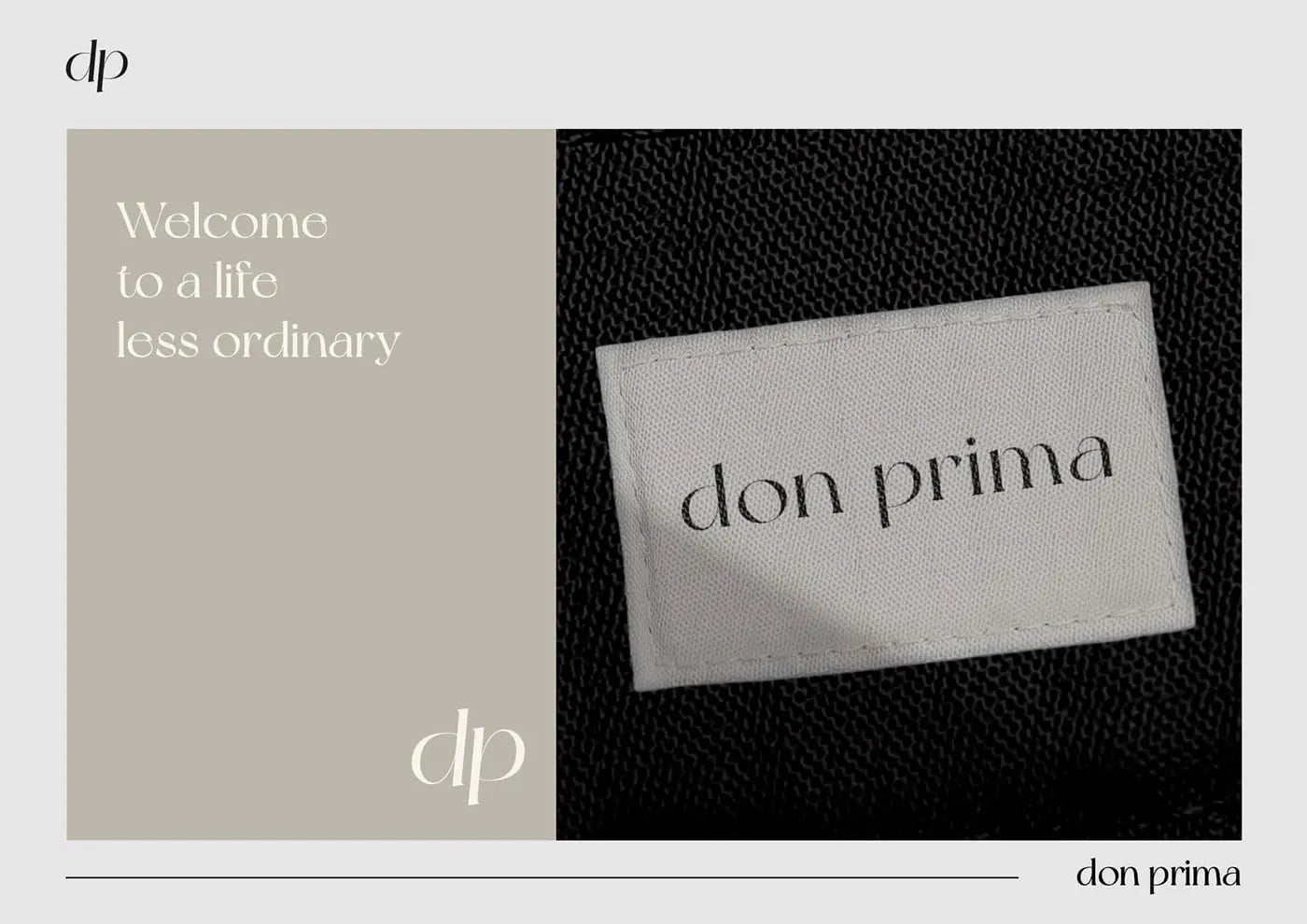
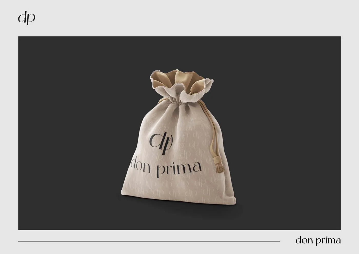
What we built
01A new identity
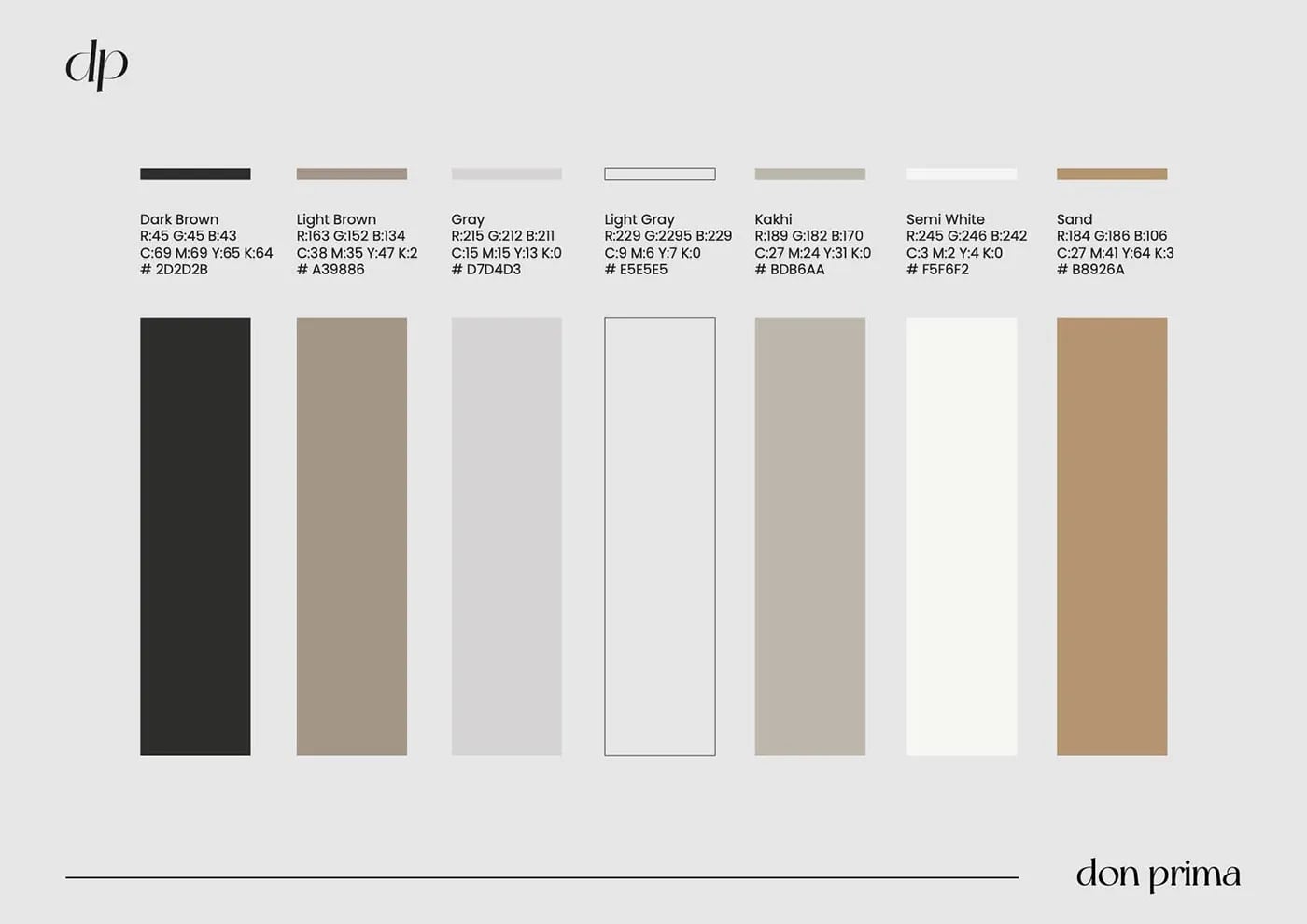
An elegant logo and palette.
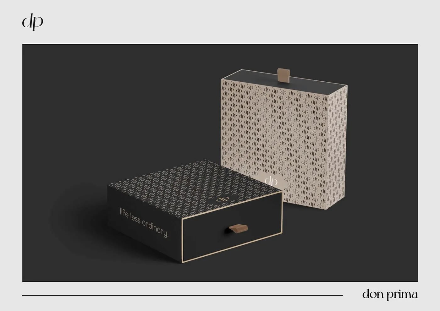
02Packaging design
Packaging for the product range.
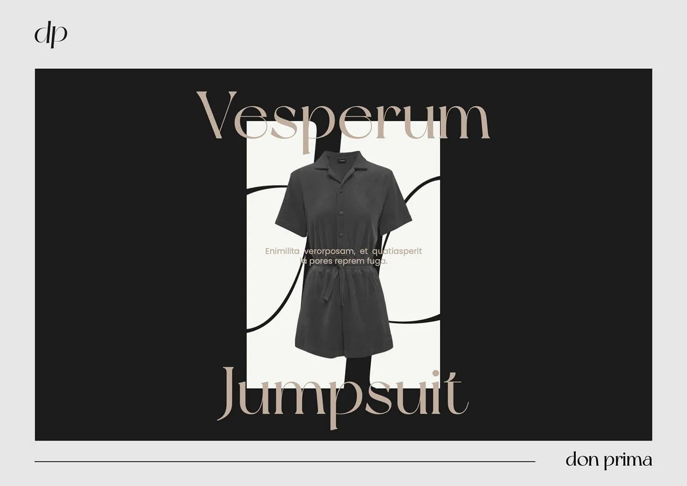
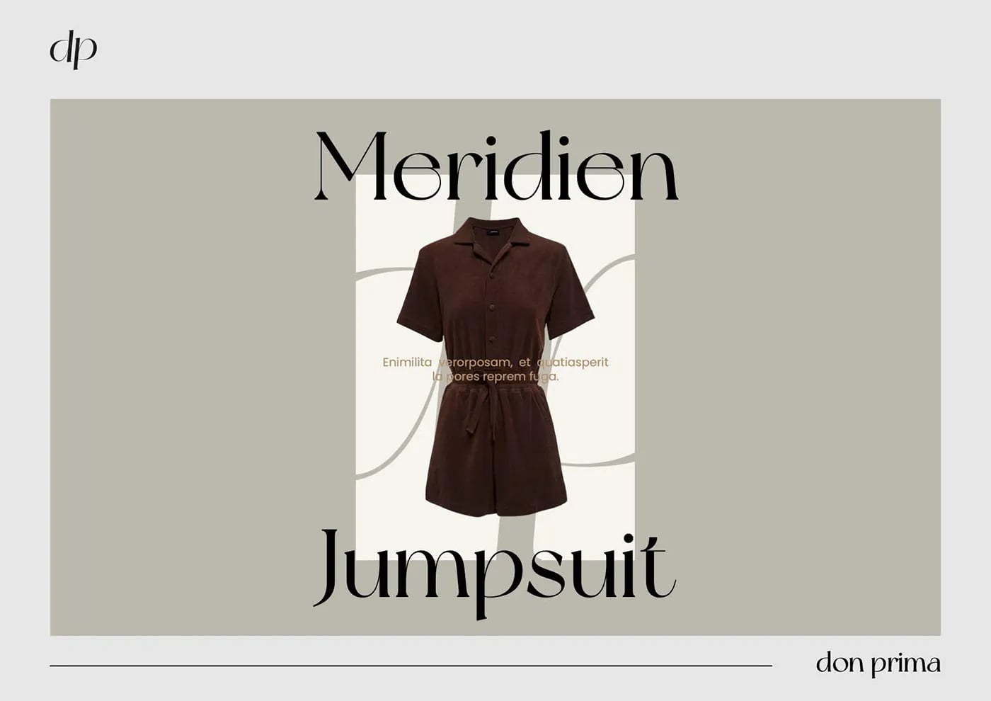
03Brand assets
Menus, signage and digital.

Common questions
What did NOIZE do for Don Prima?
Brand strategy, visual identity and packaging design.
How do you make a food brand stand out?
Find a clear story, then make the packaging look different from everything beside it.
Your first strategy conversation is on us.
Have a chatThe brand for business.