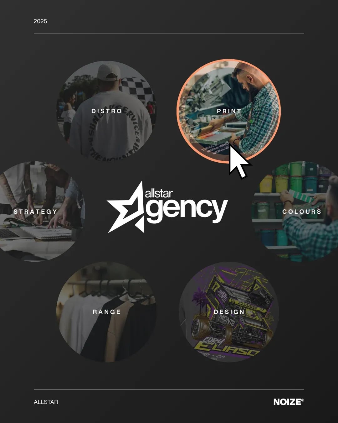
Allstar Originals: a printer brand that refuses to look like every other printer
- Client
- Allstar Originals
- Industry
- Fashion, Beauty & Personal Care
- What we did
- Brand strategy, Visual identity, Messaging
Allstar Originals is a printing business.
Its old brand looked like every other printer, so customers compared it on price alone.
The short version
NOIZE rebuilt Allstar Originals's positioning, identity and language around originality. The brand now has a recognisable creative character, which gives sales and marketing a real point of difference. No revenue results are claimed.
The brief
In a commodity market, a brand that looks the same as everyone else has only price to compete on. Allstar needed a reason for customers to choose it.
The approach
01Originality as the idea
The strategy made originality the centre of the brand.
02Character, not clichés
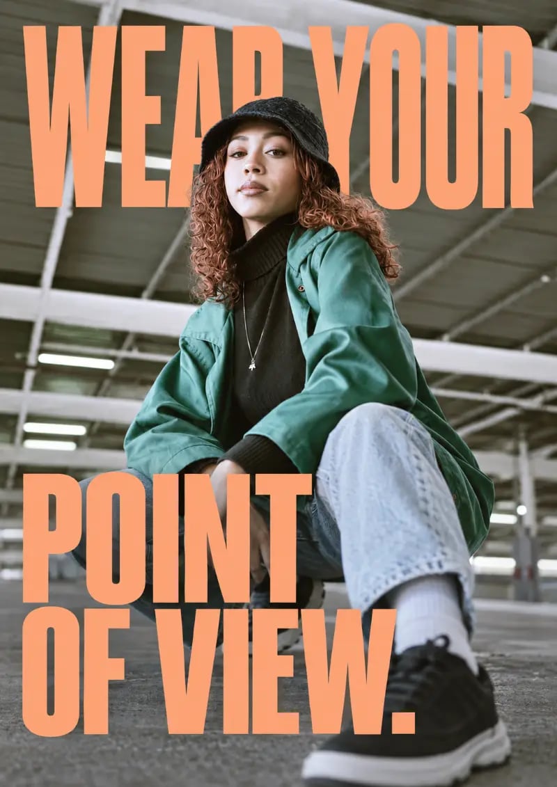
A creative, recognisable personality instead of generic print imagery.
03Words that sound different
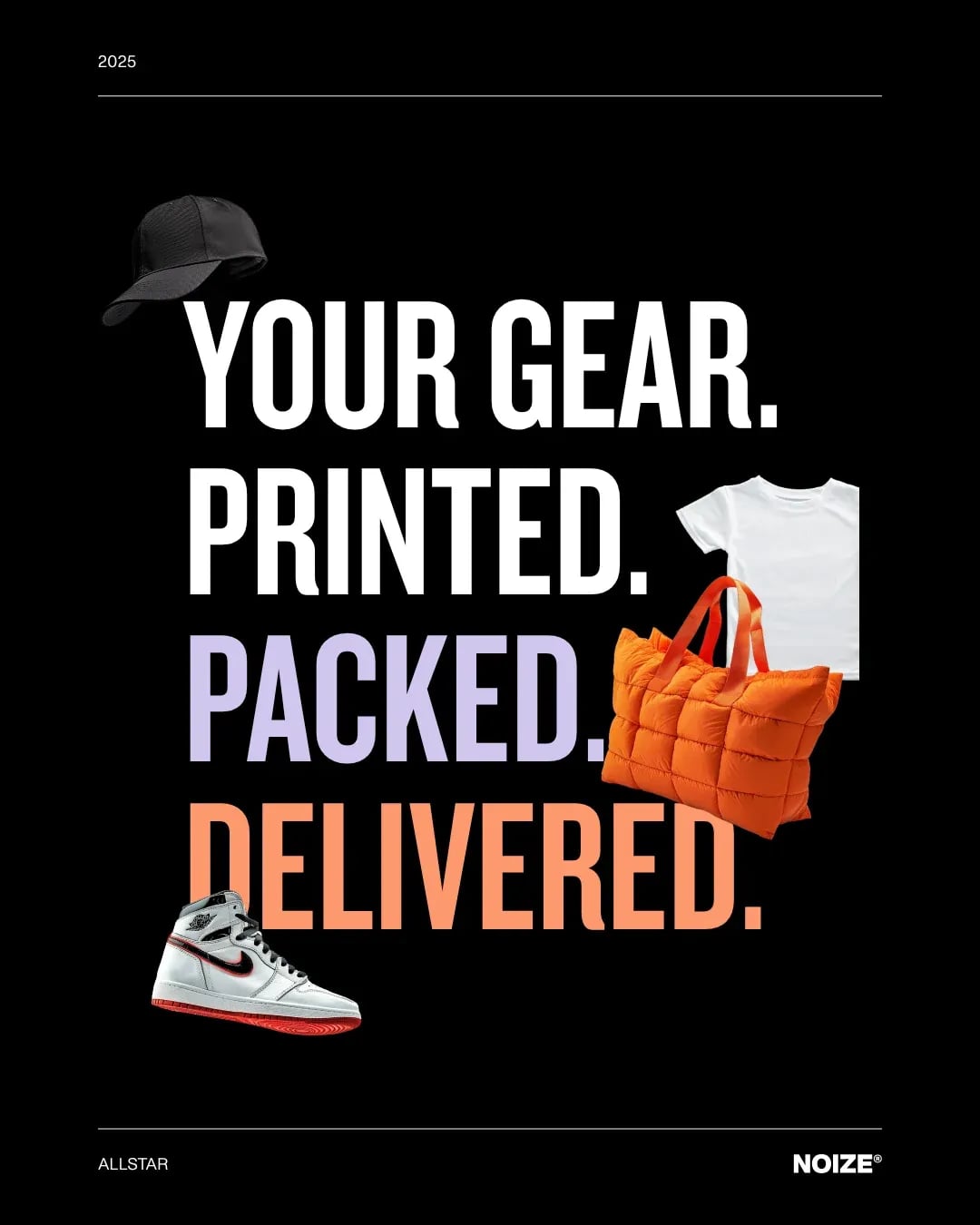
Customer-facing language with a clear point of view.
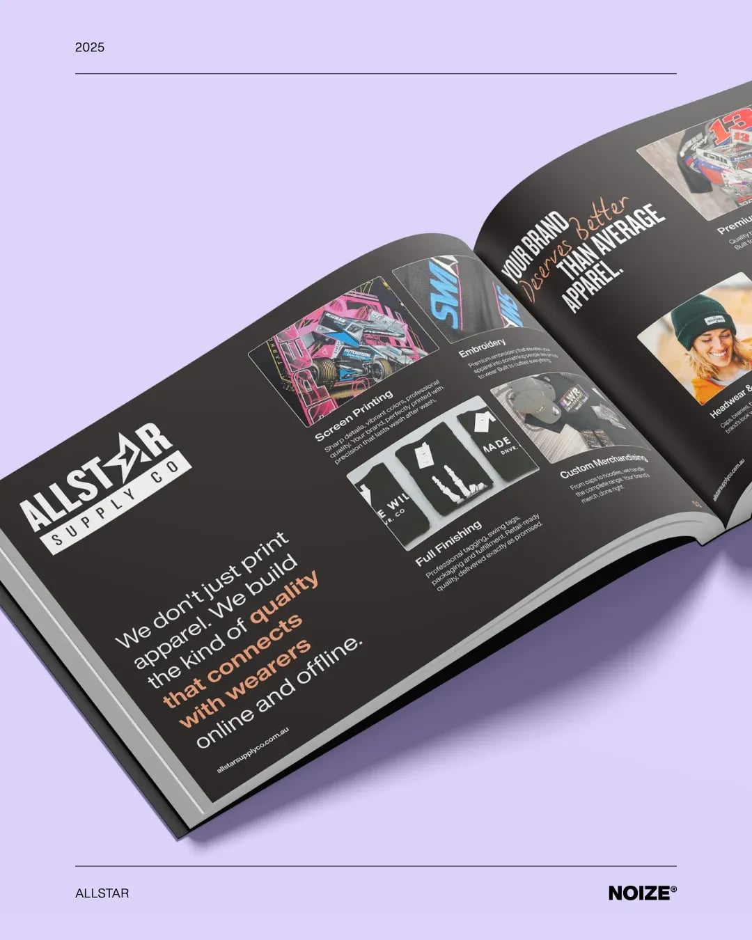
What we built
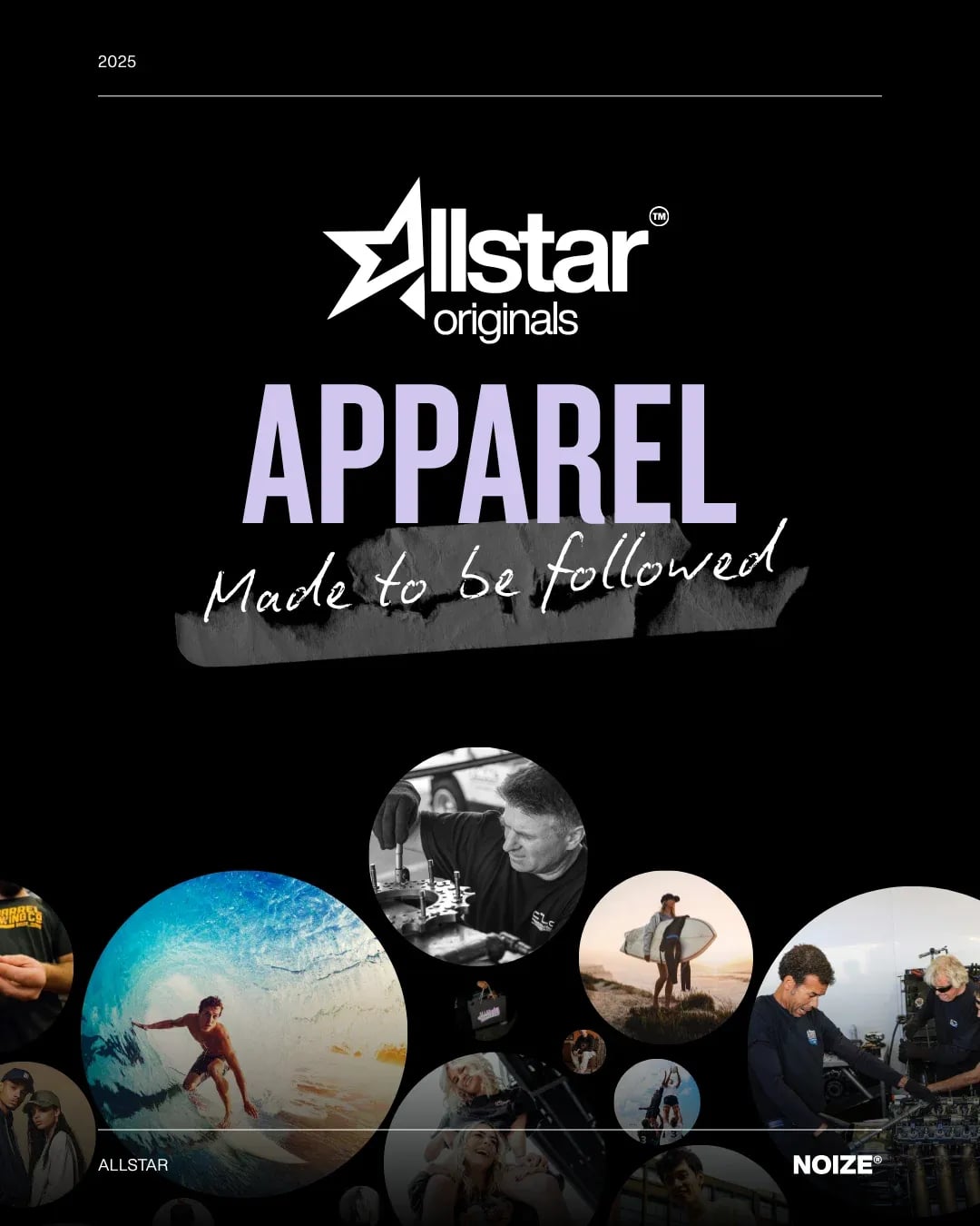
01A new identity
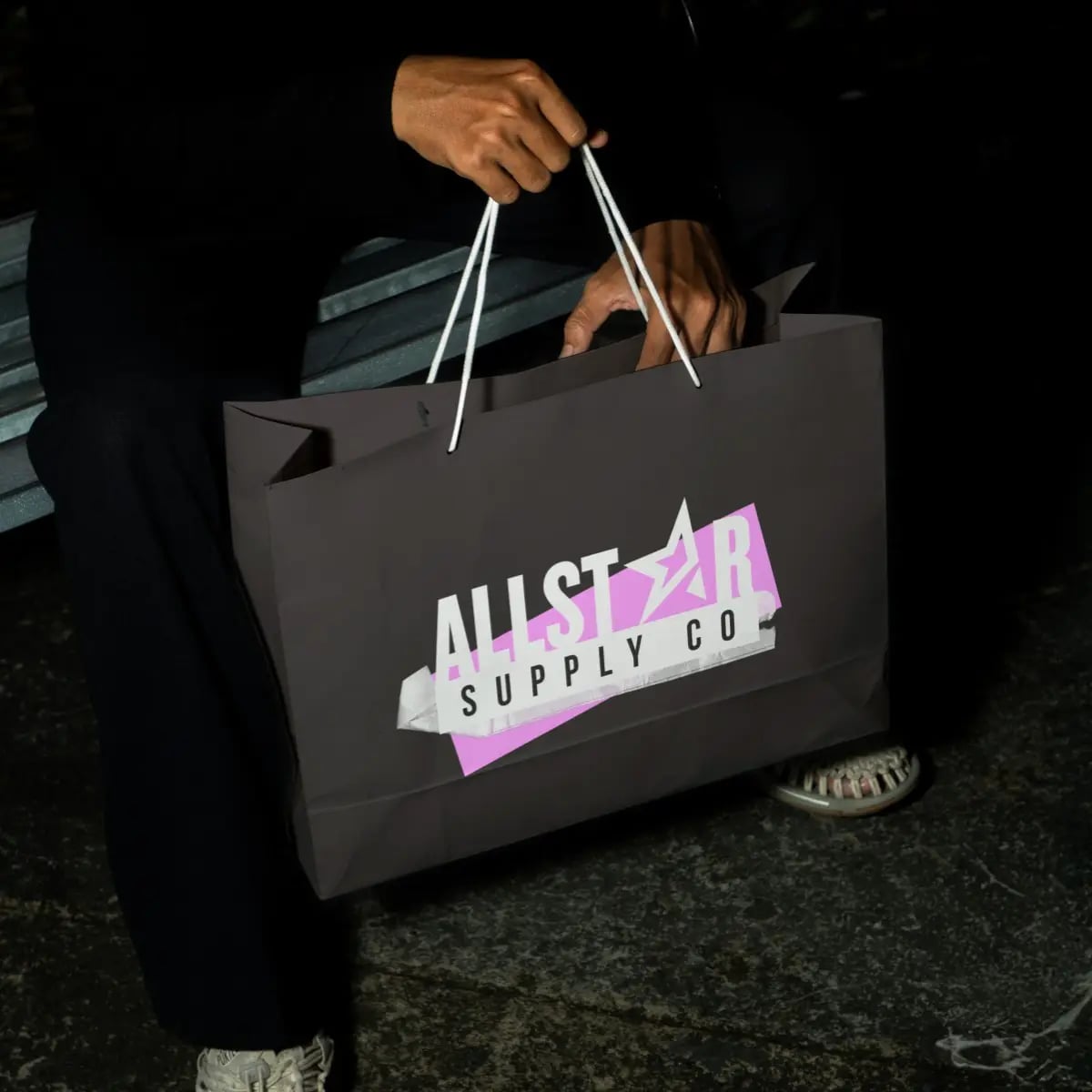
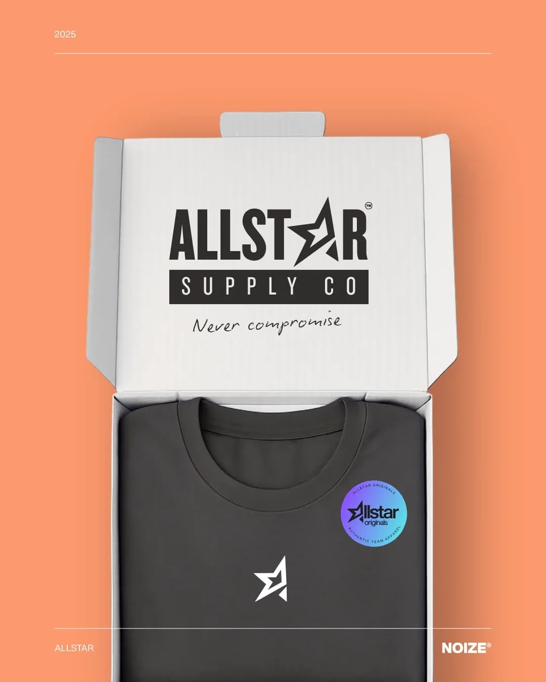
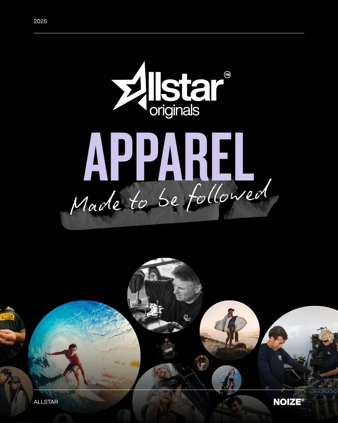
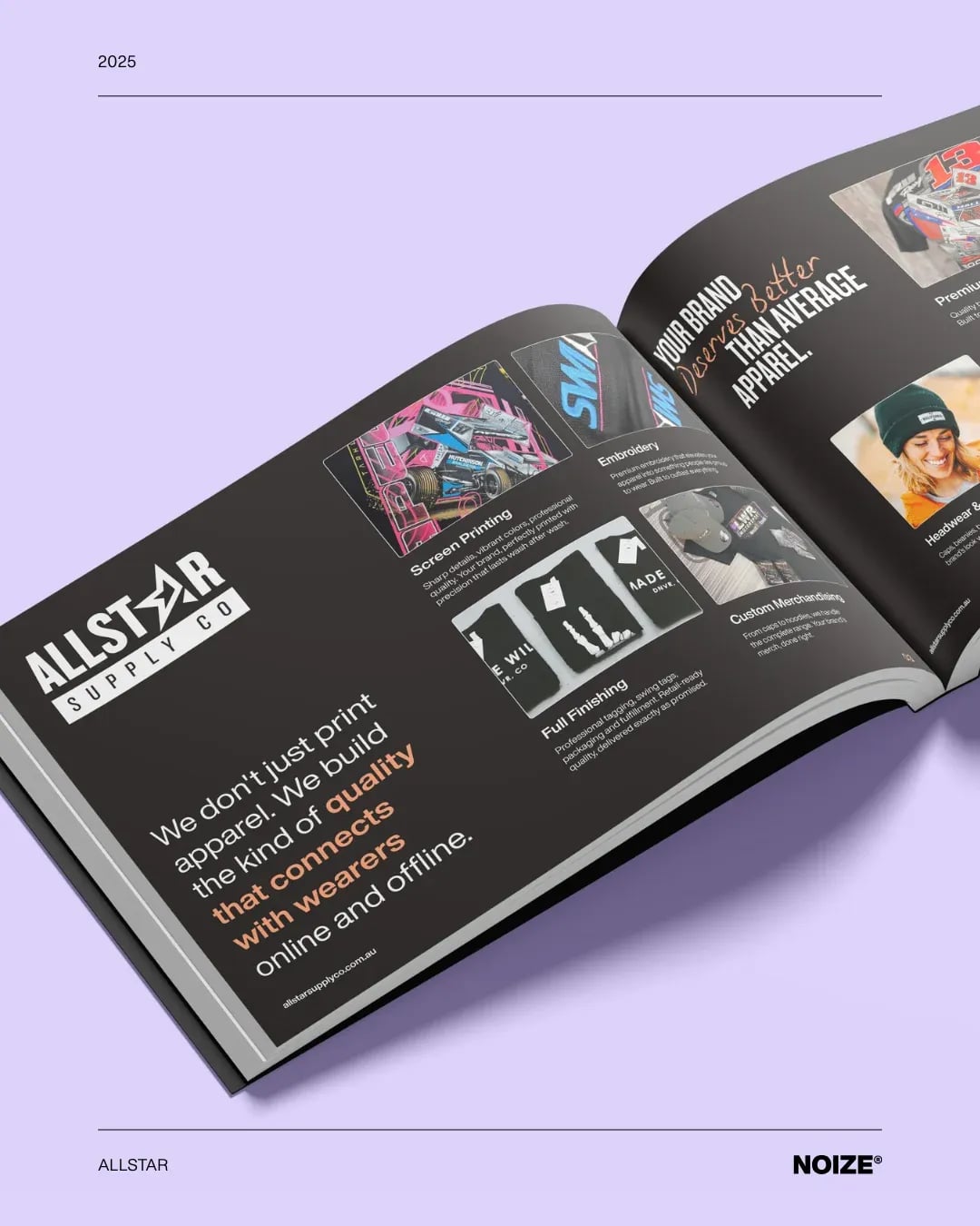
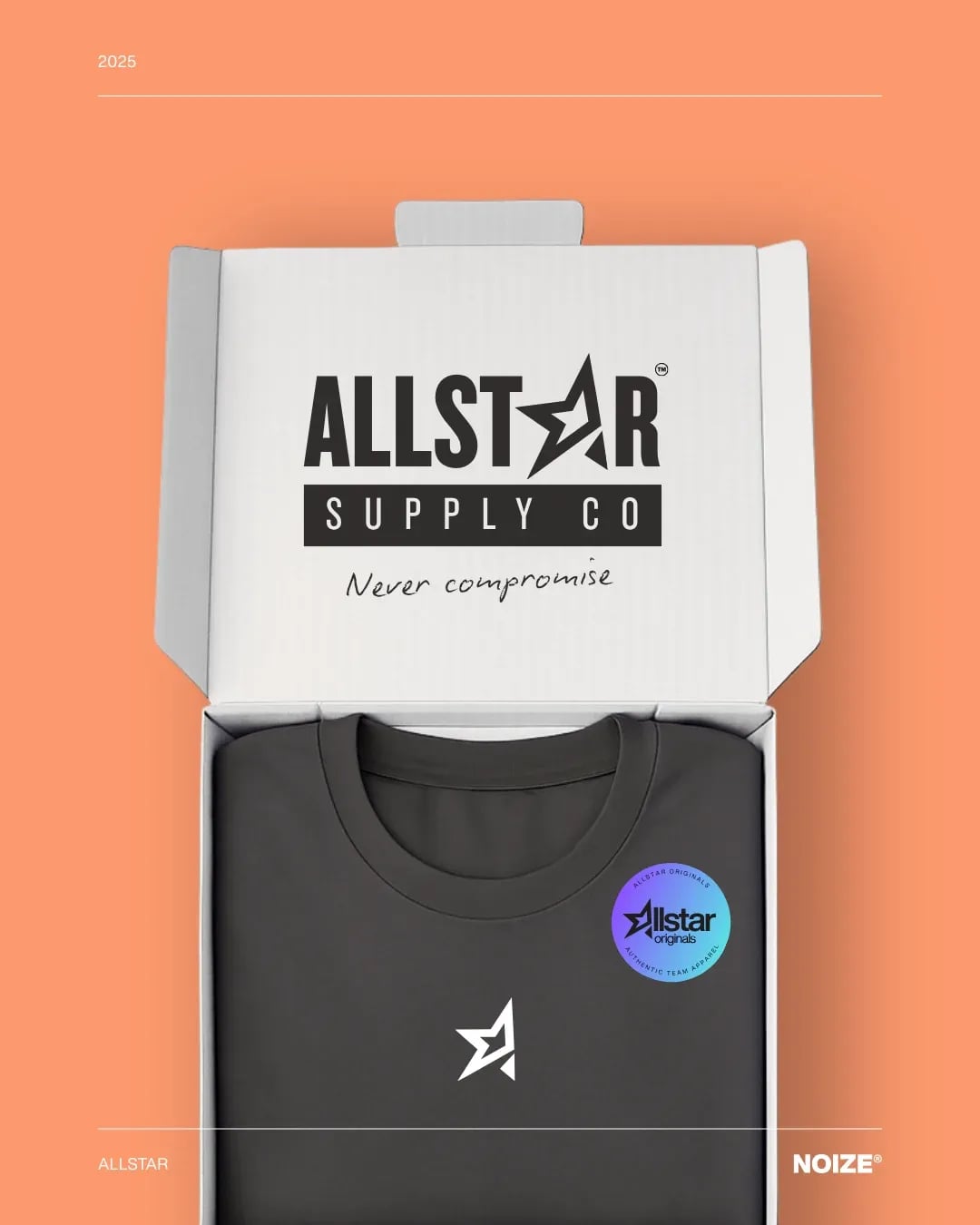
A bold identity with creative character.
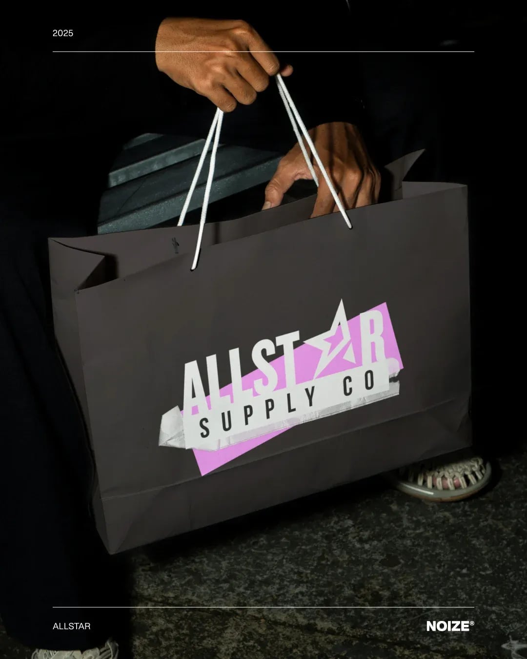
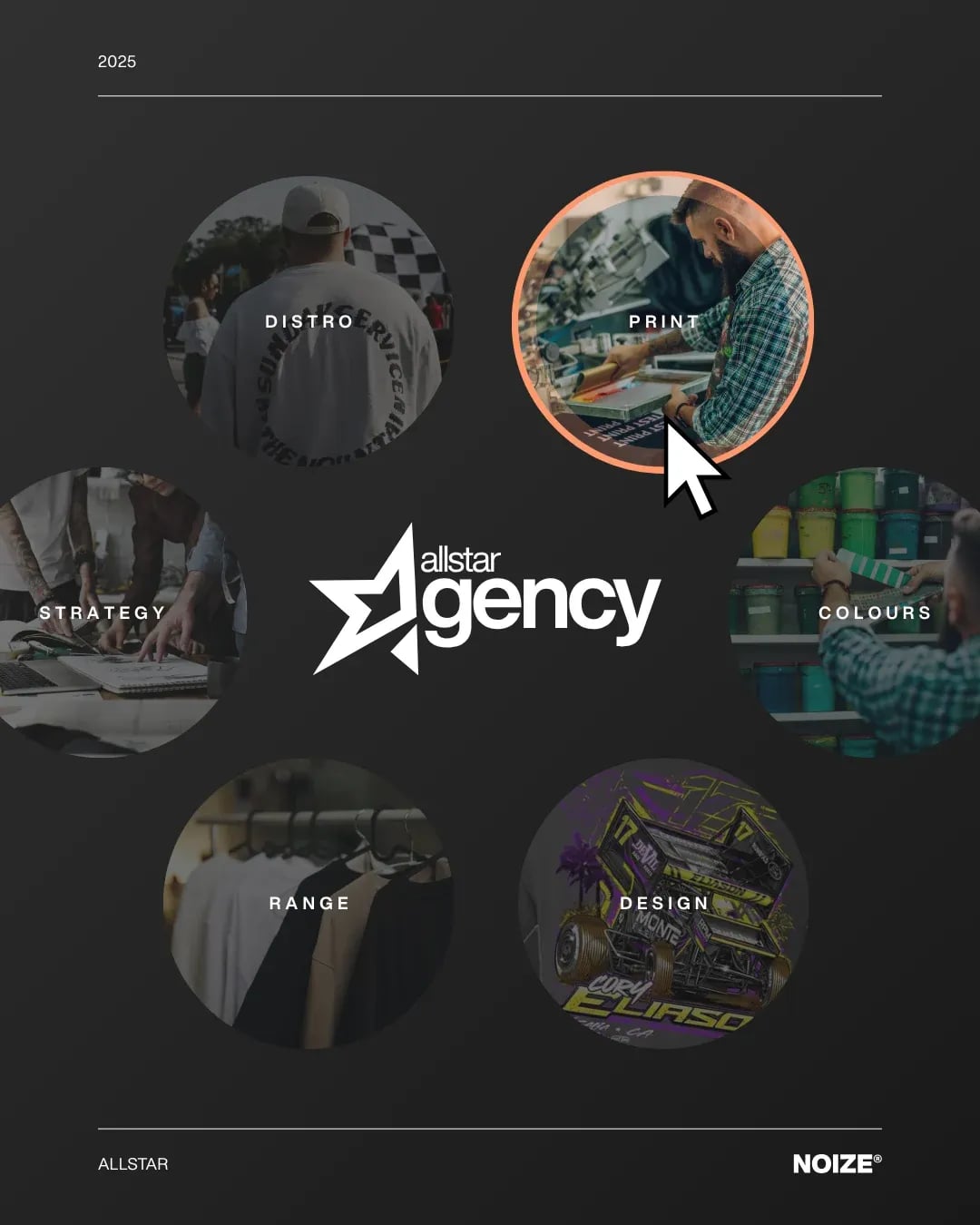
02Brand assets
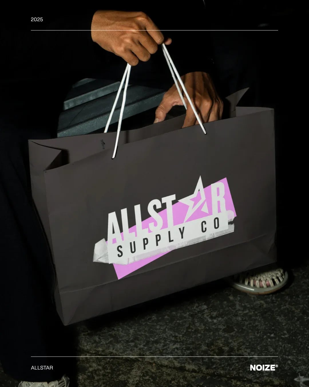
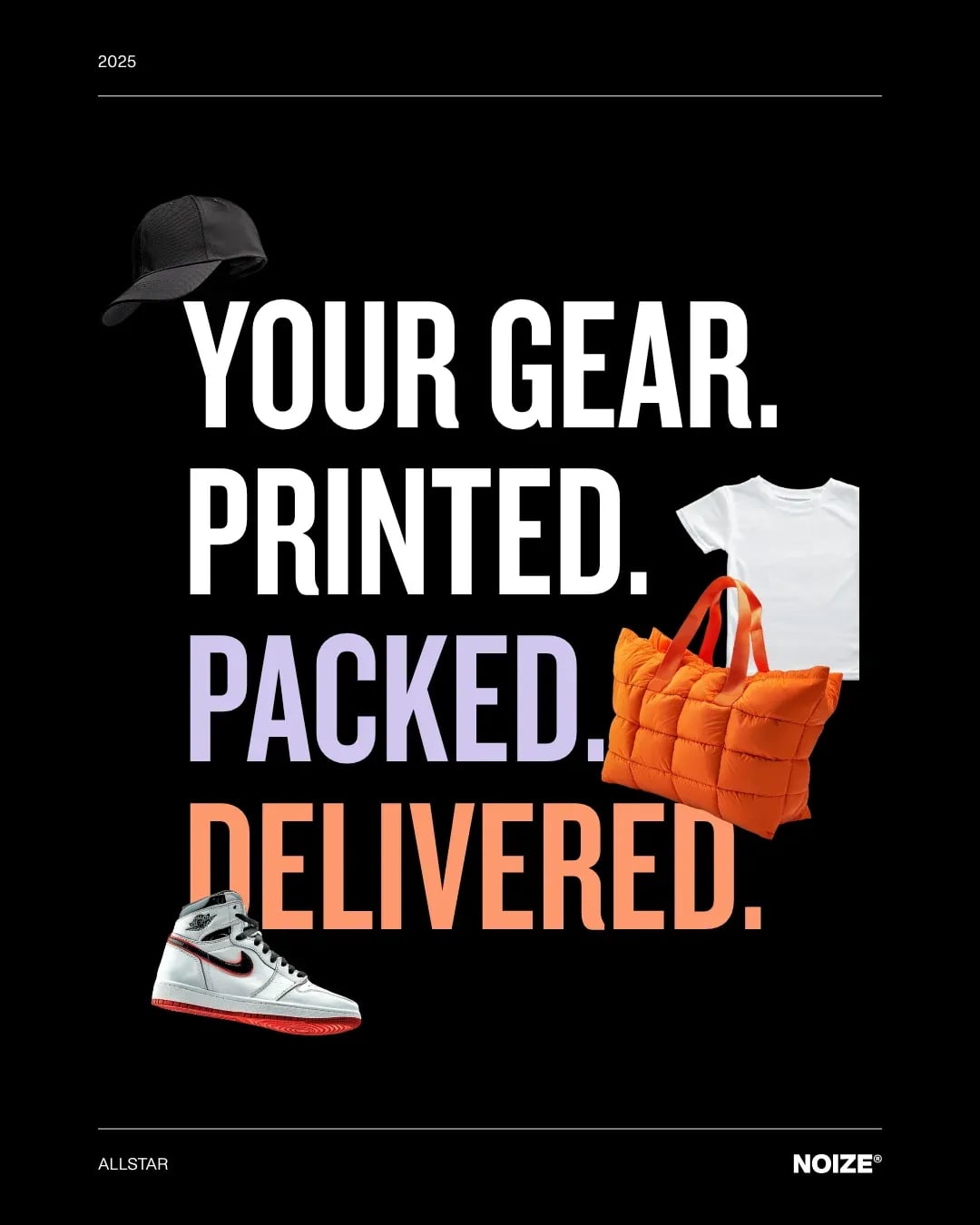
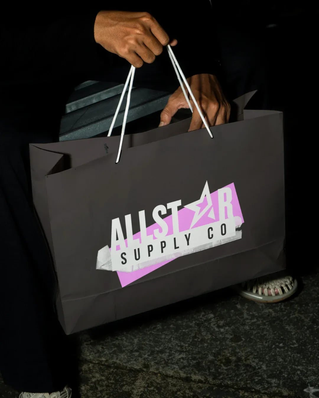
Supply bags, print and digital materials.
03Brand guidelines
Rules that keep the brand consistent everywhere.
Common questions
What did NOIZE do for Allstar Originals?
Brand strategy, visual identity and messaging.
How can a printer stand out?
By having a clear point of view and a brand with character, instead of competing on price.
Your first strategy conversation is on us.
Have a chatThe brand for business.